St George's College Activity Centre by Scott Brownrigg by Alex Upton

St George’s College Weybridge Sports Centre by Scott Brownrigg Architects. Photography: Copyright © Alex Upton

St George’s College Weybridge Sports Centre by Scott Brownrigg Architects. Photography: Copyright © Alex Upton

Just before the decade drew to an close I was commissioned to photograph the interior of a new activity centre at St George's College in Weybridge. If memories of my own schools sports hall were anything to go by, this wasn’t going to be a project to get too excited about. Upon arrival it became apparent that the school I had attended and this were leagues apart in what facilities they had to offer. This new high-tech, 6-court, 4,000m² sports hall designed by UK based architectural practice Scott Brownrigg would be befitting of an Olympic athletes training centre not just young aspiring athletes.

Innovative under floor LED system allows for quick transition between different sports activities.

Innovative under floor LED system allows for quick transition between different sports activities.

St Georges College Weybridge Scott Brownrigg

The exposed timber roof structure sweeps above the main sports hall which accommodates a variety of games due to its innovative underfloor LED lighting system. With the flick of a switch the markings on the floor can transition from a basketball court to football pitch, doing away with the need for a confusion of overlapping multicoloured delineators. Allowing some natural light to permeate the building are my clients Kalwall panels which sit just below the roof on three elevations of the hall. It was these architectural features that i was onsite to photograph. For further examples of how this product is utilised architecturally see my photography of Dale Youth Boxing Club and BH2 Bournemouth both for the same client.

Interior photography of St George's College multi-purpose sports hall.

Interior photography of St George's College multi-purpose sports hall.

Wooden timber panels constitute the primary material used throughout the interior space, with one elevation featuring a diagonal glass spacer which creates a viewing gallery for those pausing on the journey up the stairs to the buildings upper level. The sports hall was in use at the time of undertaking the internal photography which made taking some of the shots a challenge as i had to compose the image whilst simultaneously protecting my camera equipment from the odd stray basketball.

St Georges College Scott Brownrigg 4.jpg

Scott Brownrigg architects have created a wonderful high-tech sports hall which should be an inspiration for all educational institutes with the available budgets. It provides an inspiring environment in which to engage with a range of sports, with ample capacity to accommodate both pupils and spectators. The use of natural materials and lighting are employed in a manner that give the building a bright spacious feel with the undulating timber roof being the architectural focal point.

3 Broadgate by Orms Architects by Alex Upton

3 Broadgate, London by Orms Architects 2019. Photography: Copyright © Alex Upton

3 Broadgate, London by Orms Architects 2019. Photography: Copyright © Alex Upton

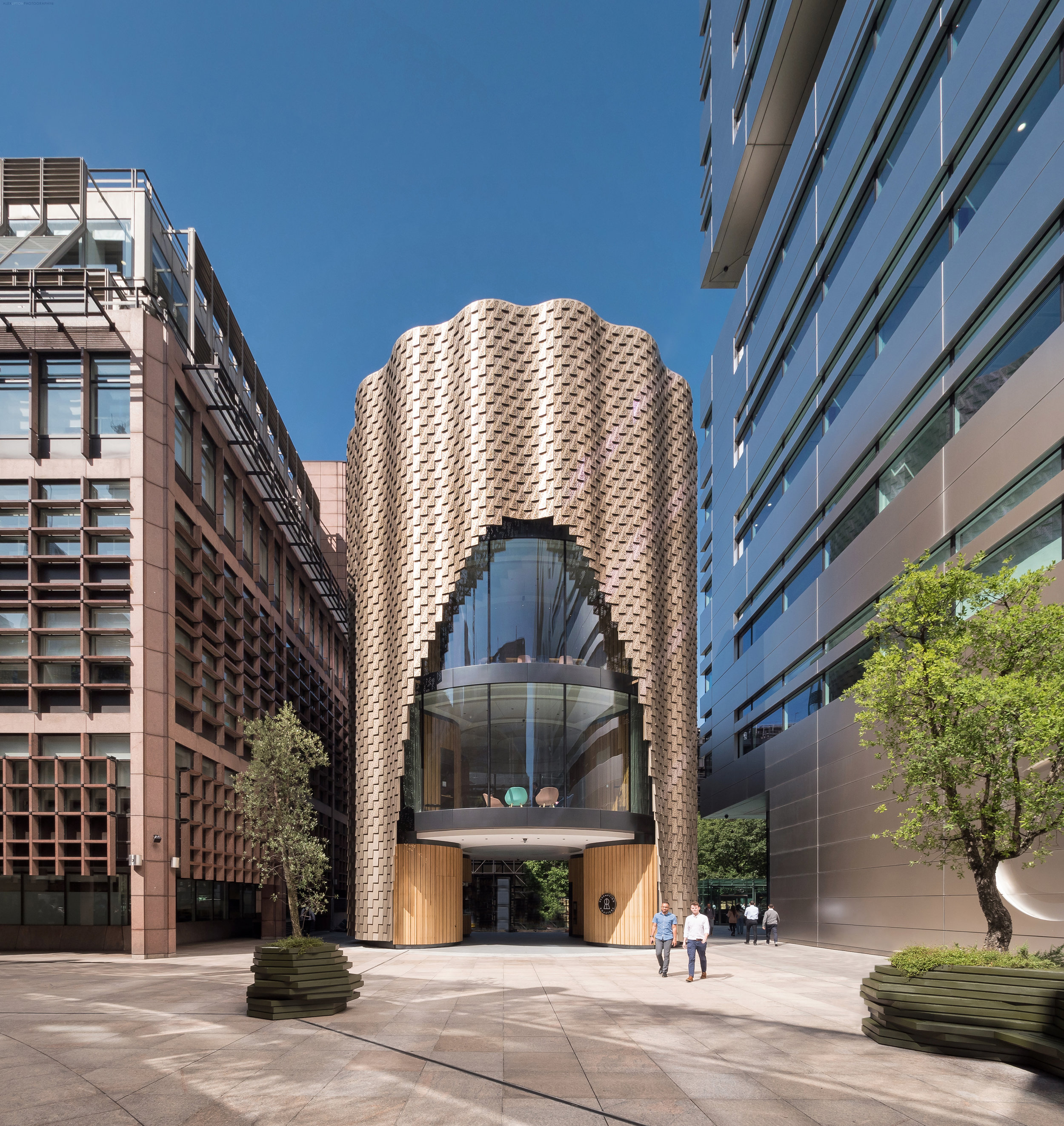
Hidden beneath the shimmering skin of Orms Architects new 3 Broadgate building is a structure descending from the 1980’s which once served as a marketing suite for the Broadgate estate. While retaining the cylindrical form of its predecessor Orms have hollowed out an archway at ground level opening the space to the public. As you are channelled through this new space a coffee shop greets you at one side while entry to the 3 floors above can be gained from the other.

Architectural photography of 3 Broadgate’s striking facade.

Architectural photography of 3 Broadgate’s striking facade.

One of the most visually arresting aspects to the building is it’s rippling facade, formed from thousands of bronze coloured aluminium panels, which I’m sure architectural photographers will be flocking to visit as it makes for some amazing images. These decorative panels trace an arch on either side of the building revealing two of the interior spaces through the glazing. In its new incarnation 3 Broadgate will continue to serve as a marketing suite for the Broadgate estate.

Thousands of perforated aluminium panels cover the facade.

Thousands of perforated aluminium panels cover the facade.

Since the building was first revealed from behind the scaffold I have paid repeated visits in anticipation that it would be ready to photograph, and while there are still some ongoing ground works - every architectural photographers nightmare - limiting certain angles, the building is mostly complete. At the time of its conception there were dissenting voices deriding the supposedly contentious plans, but seeing it complete it is hard to imagine what provoked such ire, the building is far superior to its predecessor and feels more welcoming, opening up space and creating a visual curiosity to those inclined to look in its direction.

Project Team:

Architect: Orms
Client: British Land
Main Contractor: Sir Robert McAlpine
Structural engineer: Arup
Architectural Photographer: Alex Upton

Fruit & Wool Exchange Pavilion by Sheppard Robson by Alex Upton

Sheppard Robson new Fruit & Wool Exchange Pavilion in Spitalfields , London. Photography: Copyright © Alex Upton

Sheppard Robson new Fruit & Wool Exchange Pavilion in Spitalfields , London. Photography: Copyright © Alex Upton

In late 2018 i was commissioned to photograph this small, but unique building located in Spitalfields, London by Sheppard Robson architects. The small angular pavilion their team designed is located on the perimeter of the new Fruit & Wool Exchange development and has become home to a day and night Crispin Café. The main part of the development, located behind the pavilion, opposite Old Spitalfields Market was designed by another architectural practice, Bennetts Associates.

Rear entrance to the pavilion detailing the extended angular roof

Rear entrance to the pavilion detailing the extended angular roof

From an architectural photographers perspective this was a particularly tricky building to shoot at that time of year. Its low, extended profile in context to the higher surrounding buildings meant that when the sun did meet with it’s exterior, the shadows of those buildings intermittently draped themselves over it surface obscuring from view the pavilions finer details. It was with these limitations to the architectural photography that I obtained most of the images at dusk.

Architectural Photography of the Fruit & Wool Exchange Pavilion

Architectural Photography of the Fruit & Wool Exchange Pavilion

Surrounding the cafe is a new public space with landscaping undertaken by Robert Myers Associates. The most striking external feature of the metal-clad pavilion is it’s dynamic roof design, which sweeps up from the sides of the building an meets to form a sharp, piercing point at it’s apex. The juxtaposition to the brick facade of Bennetts Associates Fruit & Wool Exchange is quite sticking, but downplayed by its low profile. While I only obtained a few photographs of the pavilion due to the size of the project and ongoing works surrounding it you can take a look at the rest by visiting the projects page above.

Project Team:

Developer: Exemplar Properties
Architect: Sheppard Robson
Photography Client: Sheppard Robson
Architectural Photographer: Alex Upton

BH2 Bournemouth by Broadway Malyan by Alex Upton

BH2 Bournemouth Leisure and Shopping Centre designed by Broadway Malyan Architects. Photography Copyright © Alex Upton

BH2 Bournemouth Leisure and Shopping Centre designed by Broadway Malyan Architects. Photography Copyright © Alex Upton

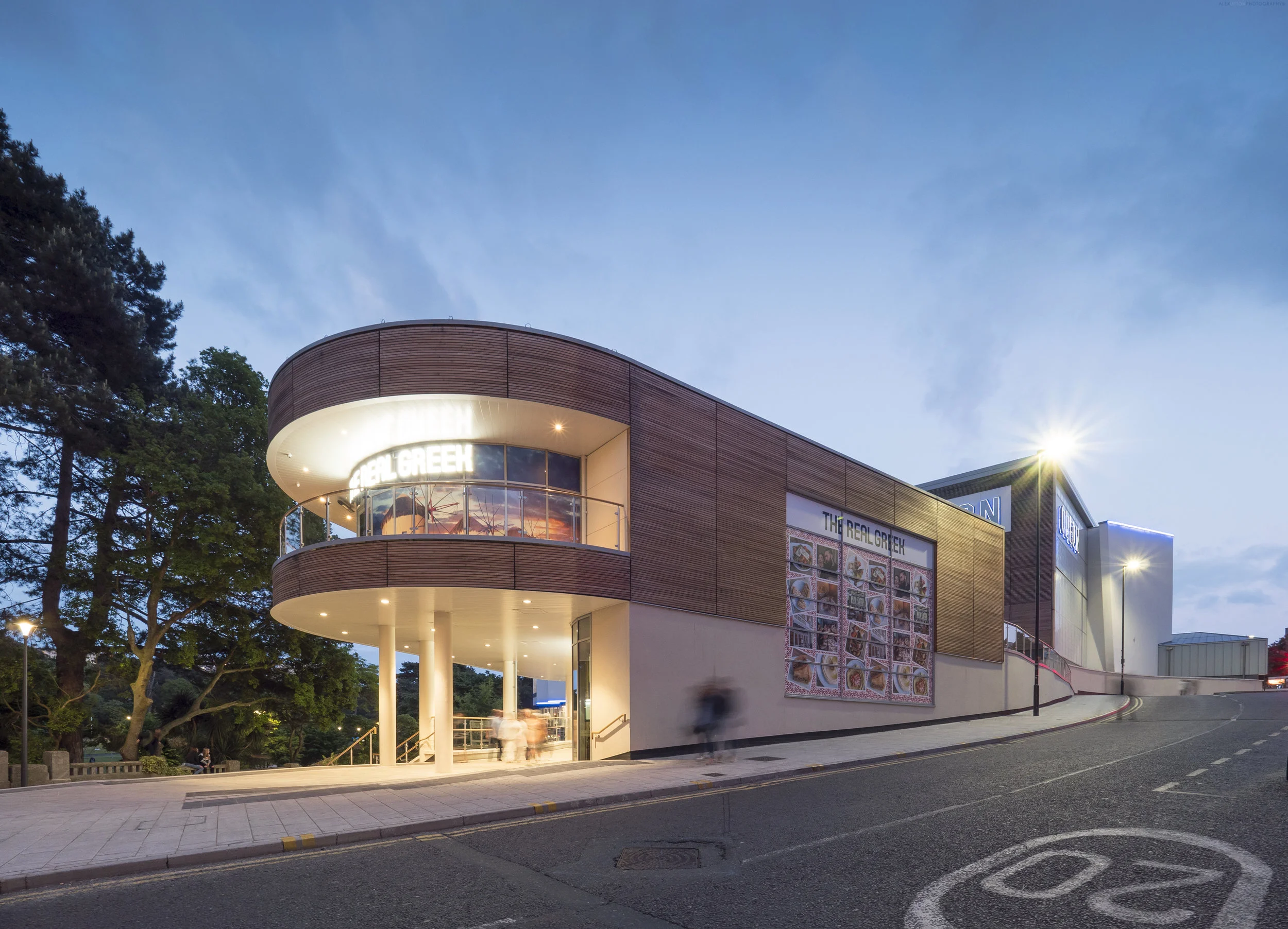
Not just working as an architectural photographer in London, occasionally I manage to escape the confines of the city and photograph projects slightly further afield. It was with enthusiasm, during the apex of the summer heat, last year, that I accepted a job in the coastal town of Bournemouth. In the town centre international architectural practice Broadway Malyan had just completed the new BH2 Leisure complex for the developer Lucrum Holdings. I was commissioned by my client Structura to go along and document the building by taking a series of external photographs showing the building in context to its central location and the site in active use by the public.

BH2 Bournemouth utilises a building material called Kalwall which allows light to permeate through the buildings facade.

BH2 Bournemouth utilises a building material called Kalwall which allows light to permeate through the buildings facade.

The BH2 Leisure complex houses a state of the art Odeon Cinema with 10 screens, a variety of restaurants for shoppers needing to recharge after a few hours of energy draining retail therapy and an array of shops alongside a spacious car park. The development is located adjacent to Bournemouth’s Lower Gardens, an idyllic haven of green and multifarious flora where one can relax after having visited the leisure centre. In several of the photographs of BH2 Leisure centre a Church is visible in the background, as pictured above, in a slightly unrelated fact, this turns out to be now utilised as a night club.

BH2 Leisure offers both retail and shopping facilities.

BH2 Leisure offers both retail and shopping facilities.

Architecturally the building utilises a number of materials and contrasting forms throughout its large footprint. As well as sections of curved timber panelling and screens, the building makes use of Kalwall’s translucent facade panels. Regular readers of this blog maybe familiar with them as they have featured in a number of projects I have previously photographed for the same client, these include photography of both Dale Youth Boxing Club and Benenden Hospital. The panels mostly feature around the section of the building which houses the Odeon cinema. Since they can only be appreciated fully towards the evening when they allow the buildings interior light to permeate the outer structure, I waited until dusk to carry out most of the architectural photography.

Architectural Photography of BH2 Leisure centres Odeon Cinema.

Architectural Photography of BH2 Leisure centres Odeon Cinema.

From an architectural photographers perspective the building presents a few challenges, the large trees of the Lower Gardens park, that encompass the building on one of its main elevations, limited the distance the camera can be setup from it, meaning it was very tricky to take images from certain angles. Another aspect was the amount of people around the leisure centre itself, inevitably such places are busy, and while clients want to show their buildings in use, images with too many people in can often look cluttered, so waiting for that harmonious balance of architecture with just the right amount of people can require some patience.

The roadside elevation of the BH2 development leading to the main entrance.

The roadside elevation of the BH2 development leading to the main entrance.

Having spent a whole day photographing the leisure centre I became well acquainted with the shops, restaurants and the environment in which it is situated. Architecturally Broadway Malyan have made good use of the site on which it sits, allowing the building to organically following the contours of the park. The alternating forms and materials keep the building interesting as one navigates around and through it, with certain areas and their utilisation delineated by these changes. As with all the other buildings I have photographed which utilise the unique glowing facade system the material really adds an extra dimension to the structure, bringing it to life in the evening. I can only hope that I am commissioned to photograph more buildings in such nice coastal towns in the future.

The restaurants and path around the leisure centre with Lower Gardens to the right.

The restaurants and path around the leisure centre with Lower Gardens to the right.

Project Team:

Architect: Broadway Malyan
Client: Legal & General (Lucrum Holdings)
Main Contractor: Vinci Construction
Photography Client: Structura UK / Kalwall
Architectural Photographer: Alex Upton

Barts Square Residential by Sheppard Robson by Alex Upton

Barts Square Residential Buildings by Sheppard Robson Architects. All images Copyright © Alex Upton

Barts Square Residential Buildings by Sheppard Robson Architects. All images Copyright © Alex Upton

Here is another London architectural photography project I recently undertook for my client Sheppard Robson Architects. This article provides a selection of preliminary images I took of the Barts Square residential development, a scheme currently taking shape in the City of London, just north of St Paul’s Cathedral. I say preliminary since it is a rather large 3.2 acre phased development, comprising offices, retail and the aforementioned residential units, 236 to be precise. The project is being master planned under the direction of lead architects Sheppard Robson who have brought in architectural practices Maccreannor Lavington and Piercy & Company to act as sub-consultants on the scheme.

Contrasting the old and new architectural details that form the facade of the Barts Square residencies.

Contrasting the old and new architectural details that form the facade of the Barts Square residencies.

The residential aspect of Barts Square comprises an assortment of architecture where historically significant buildings have been retained and woven into the fabric of the contemporary structures surrounding them. In keeping with the strict guidelines for developments in sensitive areas of the City of London the materials and designs of the new builds are high quality and reference both the historic and environmental context in which they find themselves situated. The new buildings snugly fit into the existing narrow street patterns creating enclaves of privacy for the residents and a labyrinth like structure intrinsic to Victorian-era urban planning, causing all but the savviest Flâneur to retrace their steps as they wonder how on earth they entered the complex and if they will ever make their exit.

Architectural Photography of the Piercy & Company designed building at Barts Square.

Architectural Photography of the Piercy & Company designed building at Barts Square.

The apparent tranquility seen in the architectural photographs presented here belie the hustle and bustle of what is still a partially active construction site. Once again my already depleted reserves of patience were put to the test as each time I positioned my camera and tripod to take a shot, a fluorescent clad worker or delivery truck would, as if by magic, manifest within my field of vision. During such testing circumstances it is often only a split second, where the perfect conditions align and sun, pedestrians, architecture all fall into an evanescent, harmonious synchronicity, before instantaneously collapsing before the lens back into the cacophonous muddle of urban life.

The architectural details on the Barts Square Apartments reference surrounding historic buildings.

The architectural details on the Barts Square Apartments reference surrounding historic buildings.

These photographs of Barts Square were commissioned by my client Sheppard Robson to capture the completed buildings from the first phase of the development. While limited in the scope of what could be captured on that day, hopefully they offer a glimpse into what will be a high quality development when all eventually comes together in the final stages of construction. When time permits I will add a more comprehensive set of images showcasing some of the luxurious interiors designed by Johnson Naylor in the residential buildings, which are now partially occupied.

Project Team:

Architects: Sheppard Robson (Piercy & Company, Maccreannor Lavington)
Client: Helical PLC
Main Contractor: McLaren
Structural Engineer: Waterman Group
Landscape Architect: Gross Max
Interior Architect:
Johnson Naylor
Architectural Photographer: Alex Upton

London Tall Buildings Survey 2019 Feature by Alex Upton

NLA Tall Buildings Publication

Since London shook off its stuffy, conservative hostility towards tall buildings at the dawn of the new millennium, a change in attitudes initiated by the arrival Norman Foster’s curvaceous 30 St Mary Axe (The Gherkin) skyscraper in the City of London. The public and many of the cities decision makers rapidly, if somewhat reluctantly, embraced taller structures and designated special areas for their cultivation. The intention being that they wont impinge on valued historic buildings and the demarcated sight-lines that guard them. In an attempt to document these new vertical structures the Independent centre for London’s built environment, New London Architecture (NLA), has put together a yearly publication which provides a ‘comprehensive analysis of all tall buildings, over 20 storeys, which are proposed, in planning or under construction in London.’

Image used in the article: 52 Lime Street by Kohn Pedersen Fox Associates

Image used in the article: 52 Lime Street by Kohn Pedersen Fox Associates

If you are to pick up a copy of the 2019 London Tall Buildings Survey and make it to page 103 you will glimpse a photograph I took of Kohn Pedersen Fox Architect’s 52 Lime Street Building (The Scalpel), a 42 Storey, 190 meter tall, skyscraper located in the City of London just a stones throw from the The Gherkin skyscraper where all this reverence for height began. The publication is available to download for free, or you can pick up a physical copy by dropping into the The Building Centre near Goodge Street station in central London.

BBC DIY SOS: Dale Youth Boxing Club by Featherstone Young by Alex Upton

Architectural Photography of Dale Youth Boxing Club

Architectural Photography of Dale Youth Boxing Club

Location: North Kensington, London, UK.
Developer: BBC and Westway Trust
Architect Featherstone Young
Photography Client: Kalwall UK

Located in the shadow of the elevated A40 road in North Kensington is Bay 20, a plot of land owned and operated by the Westway Trust. The contentious history of the site and the multifarious visions that came and went with the years that it intermittently lay in a state alternating between occupation and dormancy, are well documented in an article by Isabelle Priest in the RIBA Journal. In the wake of the tragedy that was the Grenfell Tower fire in 2018, these unused spaces were utilised by the local communities as places to convene, although the Bay 20 plot remained inaccessible; a dark, desolate space that prompted avoidance.

Rear Entrance to Bay 20 and Dale Youth Boxing Club

Rear Entrance to Bay 20 and Dale Youth Boxing Club

Fortunately this state of impasse was to come to an end when, after the fire, directors at the BBC’s show DIY SOS decided to create something for the community in the area. Working within a two to three week build time the project sought to involve the local residents in the project as much as possible, consulting their opinions at various stages throughout the design process. The suppliers of materials and building contractors, all charitably offered their services free of charge and the architectural practice Featherstone Young were approached to create designs for the two buildings that were to occupy the site.

Reception area for Dale Youth Boxing Club

Reception area for Dale Youth Boxing Club

One of the buildings, it was decided, was to be the new home to the Dale Youth Boxing Club, which had formerly been based in the first floor of Grenfell Tower. This was the particular building for which I was commissioned to photograph both the interior and exterior spaces, by the client Kalwall UK, whom I had previously worked on a number of interesting projects with, such as West Croydon Bus Station and the Benenden Hospital Redevelopment. For the client this was an unique project as it saw their Kalwall curtain walling integrated seamlessly with intermittent panels of glazing, the product making up nearly the entirety of the external structure. As with the previous projects I had photographed by day these semi-opaque panels allowed natural light to gently permeate the buildings interior, while at night inverting this effect.

Dale Youth Boxing Club Exterior

Dale Youth Boxing Club Exterior

Dictated by the contours of the site the new Dale Youth Boxing Club fits snugly underneath the flyover and features, over its two floors, a fully equipped training area, boxing ring and changing rooms. On my final visit to photograph the project in the early evening it was great to see the local residents, especially the children, making use of both the new walkway that the site has opened up and the facilities it offers -uninhibited by the anxiety that the site once projected. In the evening the space really comes to life with the gym’s internal light illuminating the building and the colourful panels of the community centre opposite creating a welcoming environment.

Training facilities inside Dale Youth Boxing Club

Training facilities inside Dale Youth Boxing Club

For those interested in seeing the project come to life, it’s conception, design and construction was featured over two episodes of the BBC’s DIY SOS programme. Like all new developments, their is often an air of apprehension and distrust in the local community as to how much they will benefit from them, but it is safe to say from my own visits to the site that these fears have been allayed and the locals, especially the children have really embraced the project and are already making great use of it.

BBC DIY SOS Dayle Youth Centre 7.jpg

In terms of both architecture and materials Bay 20 and The Dale Youth Boxing Club exemplify the transformative power of architecture and what can be done with limited resources, space, and a potentially oppressive location. The hard work of all those involved and their charitable donations have created a wonderful space where the local community can come together and experience a place that they helped to shape. It is sometimes these smaller, community based projects that make architectural photography such a rewarding profession; witnessing the local children and parents utilising and having fun in the space is surely sign of a successful endeavour.

Brunel University Wilfred Brown Building by Sheppard Robson by Alex Upton

Brunel University Wilfred Brown Building.jpg

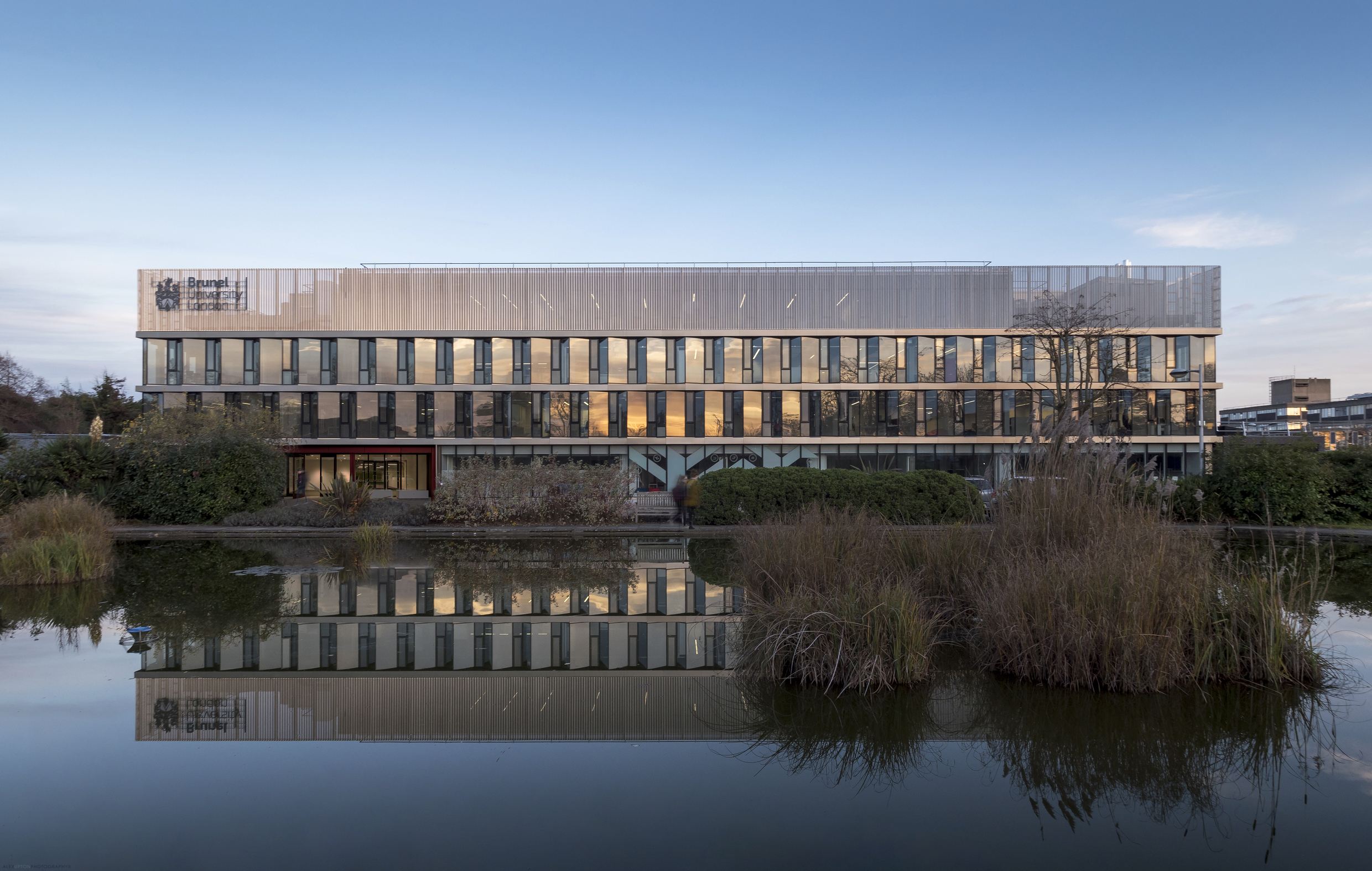
Delving once again into the architectural photographers archive here is yet another project I have unearthed; Brunel University’s refurbished Wilfred Brown Building by the London-based Sheppard Robson architectural practice. Almost immediately after completing the photography of One Creechurch Place in late 2017 for the same client another completed project awaited me, this time in the form of the Wilfred Brown Building which houses the College of Engineering, Design and Physical Sciences for Brunel University. The project can be found situated amongst the University’s large campus located on the fringe of West London in the town of Uxbridge.

brunel-university-wilfred-brown-building.jpg

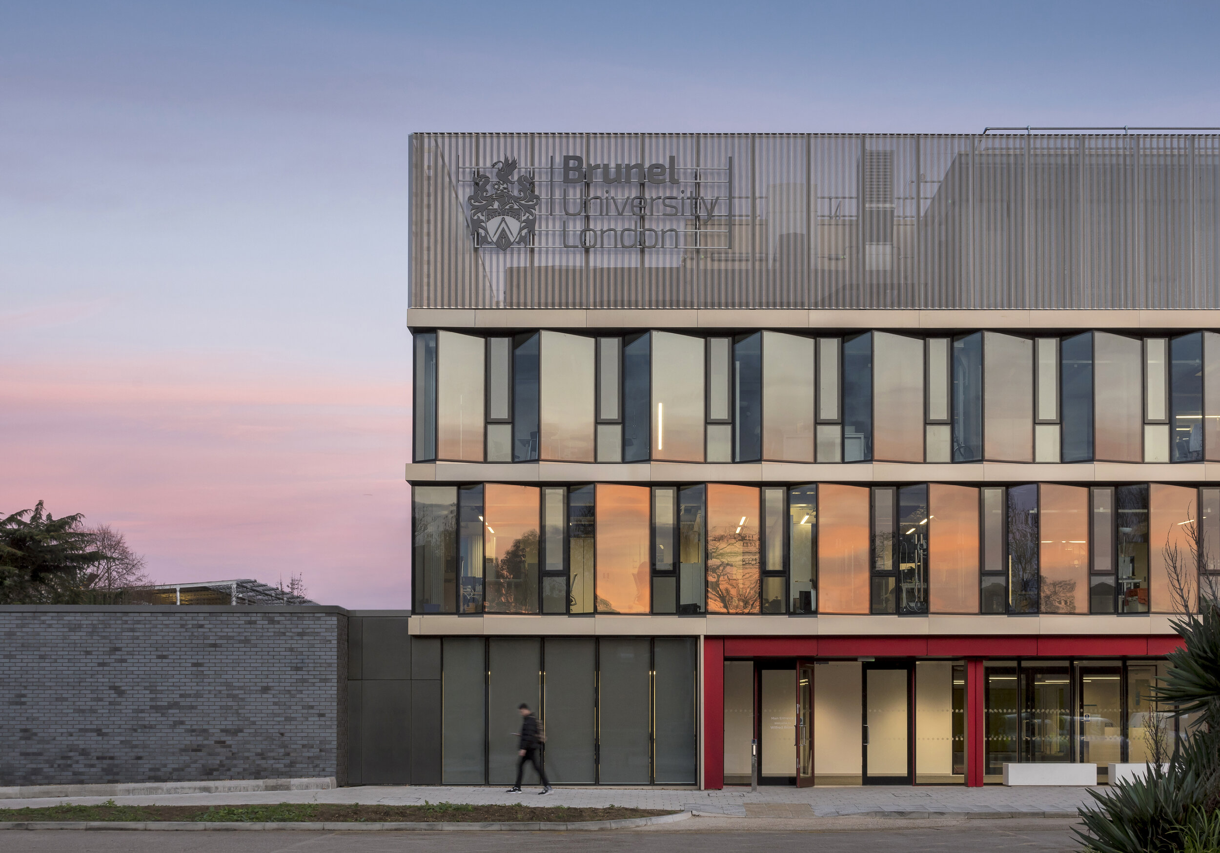
The Wilfred Brown Building was originally delivered by Sheppard Robson in 1968 followed by a rooftop extension in 1990. Like many Universities, findings itself amidst a flux of expansion in student numbers and a need to accommodate cutting edge learning facilities Brunel commissioned a modernisation of the building. Relieved of its aging skin the structure was stripped back to its concrete frame and re-clad with a ‘saw tooth’ facade, which according to Sheppard Robson is comprised of a ‘north-west facing clear glazing and west, south-west facing glazing with interstitial architectural mesh to provide solar shading’. Situated above this is a crown of perforated profiled metal which compliments the glazing below.

Brunel University Wilfred Brown Building 3.jpg

The building, situated on the universities western boundary is accompanied by a quaint pond - home to several ducks and a scattering of Water Lilies - creating an idyllic microcosm amidst the hustle and bustle of campus activity. For any trivia buffs, an episode of the BBC comedy Cuckoo was filmed outside the building when the families son attended an unnamed University. When photographing the building it came to my attention that one of the aesthetic qualities the jagged facade expertly accentuates is a reflected sunset, as seen in the Miami-esque shades of pink and orange intermittently captured along the glazed panels.

Brunel University Wilfred Brown Building 4.jpg

Internally the building is fitted out by Sheppard Robson’s interior design department ID:SR. Due to its multiple uses, a variation in the design elements and application of colour make an intuitive and easily navigable space. Corridors and open spaces are punctuated by both private and public study areas, formed from colourful sofas and chairs which offer both comfort and a level of concealment. Other rooms are home to more specialised equipment, assessment, interview and meeting rooms, as well as several large spaces for lectures and faculty meetings. As when having photographed other University buildings in the past, a brief exposure to campus life is enough to draw on a sense of nostalgia for a simpler, more fun, albeit debt driven way of life, compelling one to abandoned the strictures and ennui of working life and take up a lengthy degree course.

Location: Uxbridge, London, UK.
Developer: Brunel University
Contractor: ARJ Construction
Architect / Photography Client: Sheppard Robson