Second Wallpaper* Magazine feature this month with images from a shoot of Dior’s Paris-inspired pop-up takeover of Harrods with a giant ‘Plan de Paris’ motif featured across the facade and several popup spaces for the arrival of MariaGrazia Chiuri’s AW 2023 womenswear collection.
Celine Parfumerie Harrods Wallpaper* Magazine /
My Images from a recent shoot of Celine’s new Parfumerie installation in Harrods can be seen in Wallpaper* Magazine.
Velvet Corinthia Wallpaper* Magazine /
This June’s issue of Wallpaper* Magazine features a glossy double page spread image from my photography of David Collins Studio’s Velvet cocktail bar in the luxury Corinthia London Hotel.
The Stock House London Office By Orms Architects /
The Stock House by Orms Architects. Images: Copyright © Alex Upton
Proceeding on from my previous blog entry, with the chasm in between filled by 382 rising and retreating motions of the sun, those disposed to pick up on such details - most notably Google’s search algorithms, which have undoubtedly interpreted my dormant blog as a measure of irrelevance and relegated me to the basement of search results for architectural photographers - might be led to deduce an extended period of inertia on my part. But for any of those visitors venturing beyond this blog you may have noticed the incremental addition of new photographs to my portfolio of projects. So, to dispel any of these notions and to once again court favour with those omnipotent search algorithms I will endeavour to follow up some of these projects with brief write ups on my blog, starting with my photography of Orms architects Britton Street office development.
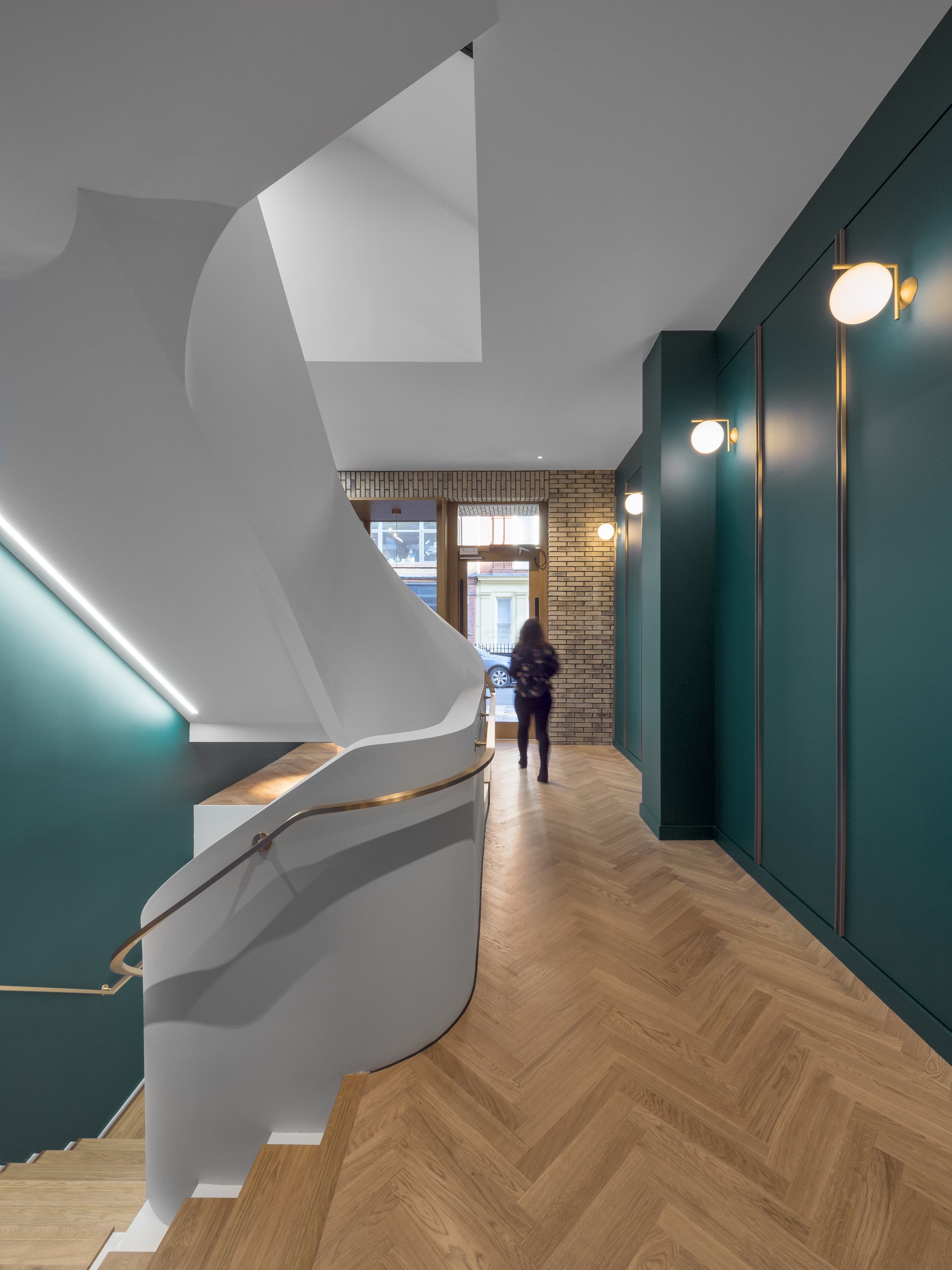
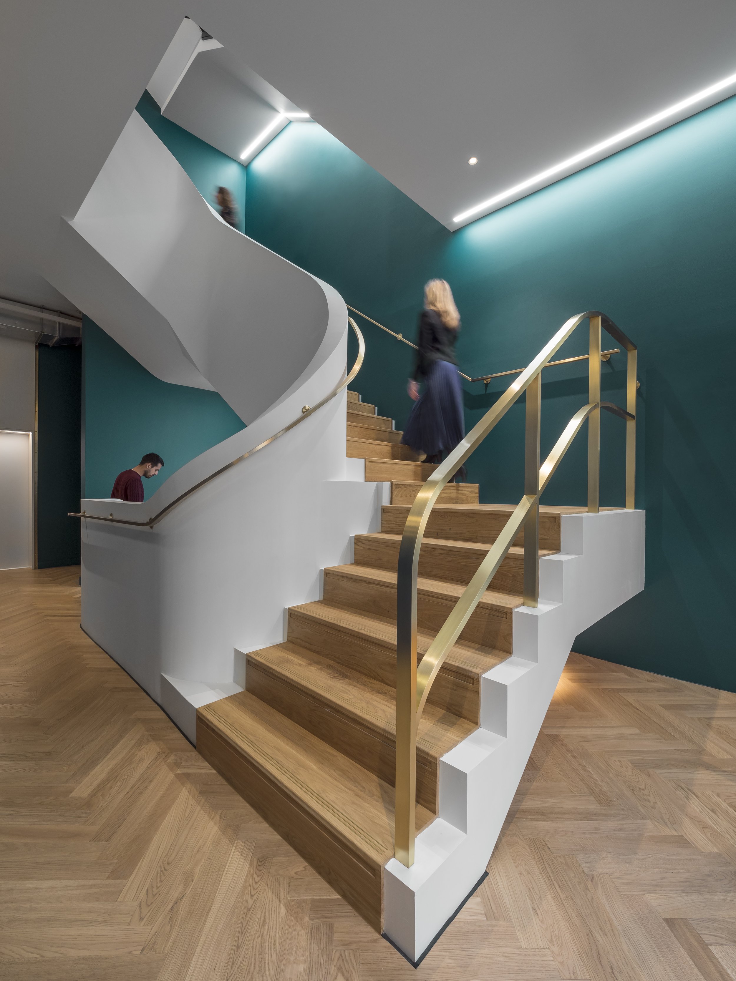
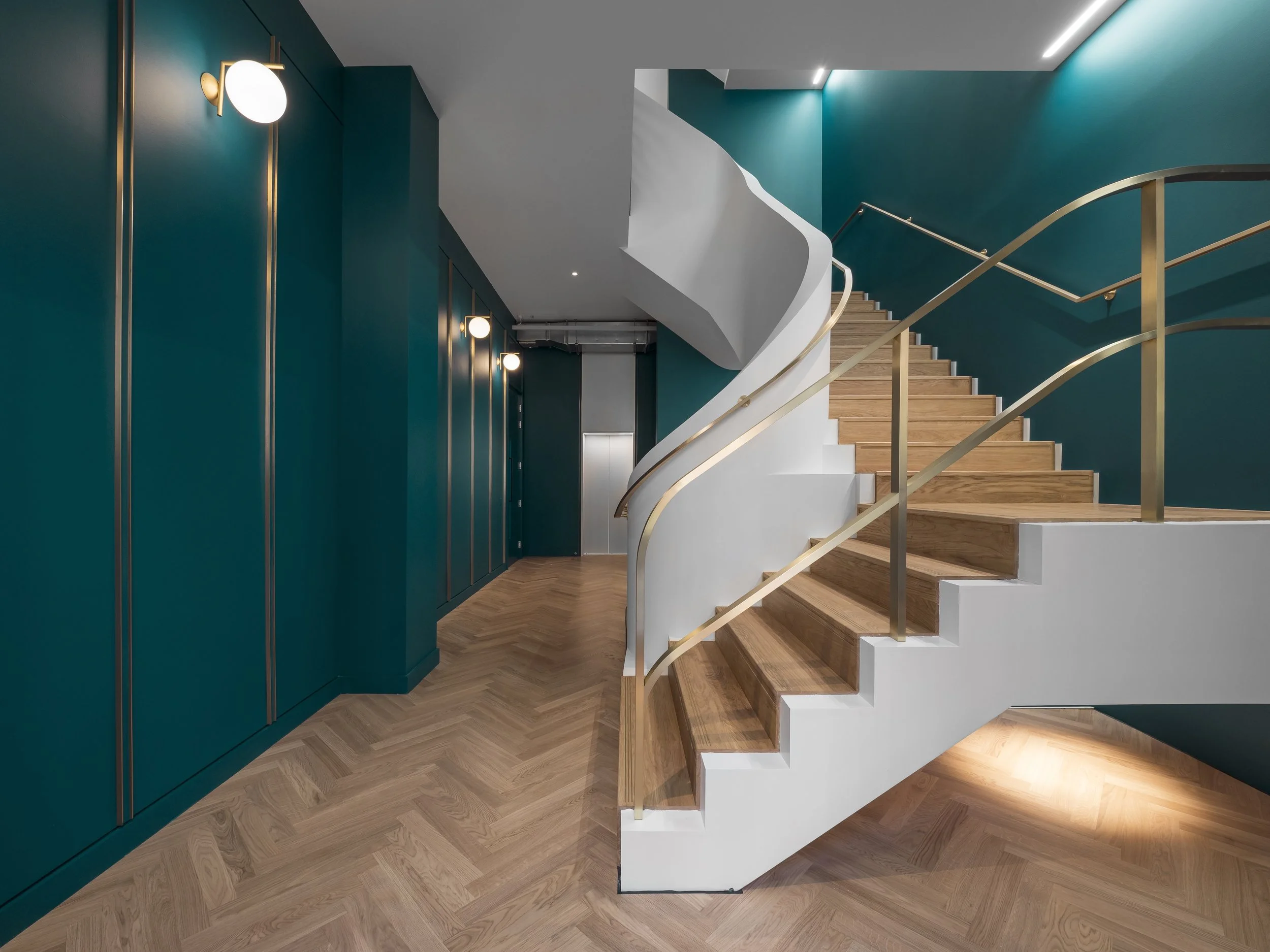
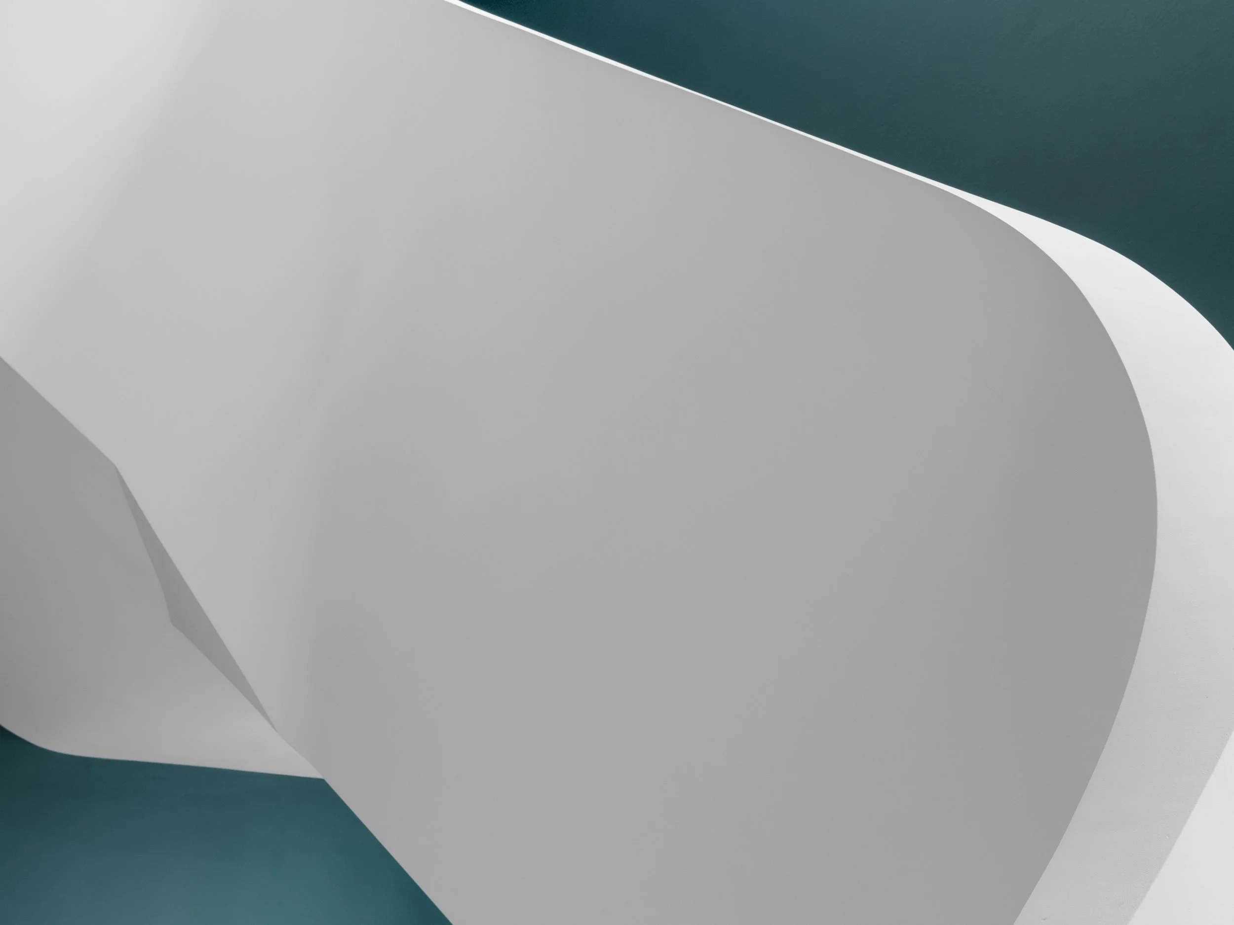
Architectural photography of the 17-18 Britton Street office development, more recently named The Stock House, was commissioned by London based architectural practice Orms, for whom I had previously captured images of their 3 Broadgate project. The Stock House is a small 5-storey office development located in the Clerkenwell conservation area of Farringdon, London. The photography predominately focuses on the interior spaces with one of the key features being the elegant, curved white balustrade which greets anyone visiting via the main entrance. Throughout attention to details and materials are evident with teal coloured walls and gold trimming adding a sense of refinement to the space.
A brief history of the office and it’s location can be found on the developers website:
“Laid out and built up between 1718 and 1724, Britton Street was originally called Red Lion Street after the Tavern of the same name on the street. Built in 1914–16, No. 18 and 19 are believed to have been a five-storey warehouse o factory of yellow brick. In a nod to this -the building is named after the original yellow London stock brick.”
Moving on from this It’s latest refurbishment by Orms architects was carried out on what was essentially a 1980’s office building. The entire façade was replaced and reconstructed using handmade clay bricks from the Petersen brickworks in Denmark. Internally on the main office floor plates exposed steel and concrete soffits and columns still hint at the buildings industrial past.
For a wider selection of images from my architectural photography of The Stock House please visit the projects section of my portfolio. Now with the completion of this latest photography update I will endeavour not to let such an expanse of time pass before the next one, as I have a number of exciting projects to share with you.
City of London Office Interiors by ID:SR /
100 Bishopsgate, Interior office design by ID:SR. Images: Copyright © Alex Upton
In the early autumn of 2020, when normality, accompanied by a faithful companion complacency, appeared to have tentatively returned to our daily lives. A time when workers were finally jettisoning their ‘work from home’ attire - lower-body: pyjamas, upper-body: vaguely presentable shirt - and relinquishing the prospect of conducting any further business meetings through a pixelated portal from the comfort of their beds, I was commissioned by Sheppard Robson architects to photograph the new office spaces their interior design team, ID:SR, had created for a prestigious international client. The offices were located across several floors of the recently completed 100 Bishopsgate tower in the City of London financial district, where the workers were set to return.
The tower itself, a mixed use development rising over 172 meters, with 40-storeys of office space, was designed by Allies and Morrison architects. With each occupant having different requirements for their work spaces, the interior design work was to be taken up by a design team chosen at the tenants discretion. As regular visitors to my blog will know - or visitor - I have worked with Sheppard Robson on a number of architectural photography projects. With previous commercial commissions, such as the offices at One Creechurch Place, the individual floors plates are usually austere shells awaiting the clients before they are fitted out, so in this case it was nice to be able to focus my camera on the interior design work and not solely the structural details.
Before elaborating any further on the particulars of the building and extolling the qualities of the interior design, I feel obligated to draw your attention to one, not so inconspicuous fact. It might soon, if not already, have come to the perceptive viewers attention, that several of the people in the photographs reappear throughout the various settings. This was neither a coincidence nor the result of several office workers clamouring for stardom before the lens by following me from one location to the next. No, this was the result of an entirely different set of circumstances, ones which necessitate the artifice behind much architectural photography. While I favour capturing a space in an uncontrived as possible manner sometimes it is just not practical to do so.
The office was still several days from being fully occupied and with interior photography it is often optimal to begin the work before such an occasion occurs, for in a matter of minuets a neat and orderly office can descend into a cacophony of hurried bodies and out of place furniture. Once clear shelves become a cascade of spilled pages, desktops submerge beneath mounds of spreadsheets, all precariously crowned with a slightly broken, but faithful office mug. So in some cases it is therefore preferable to enlist the help of models - in this case several of the interior architects whom worked on the project.
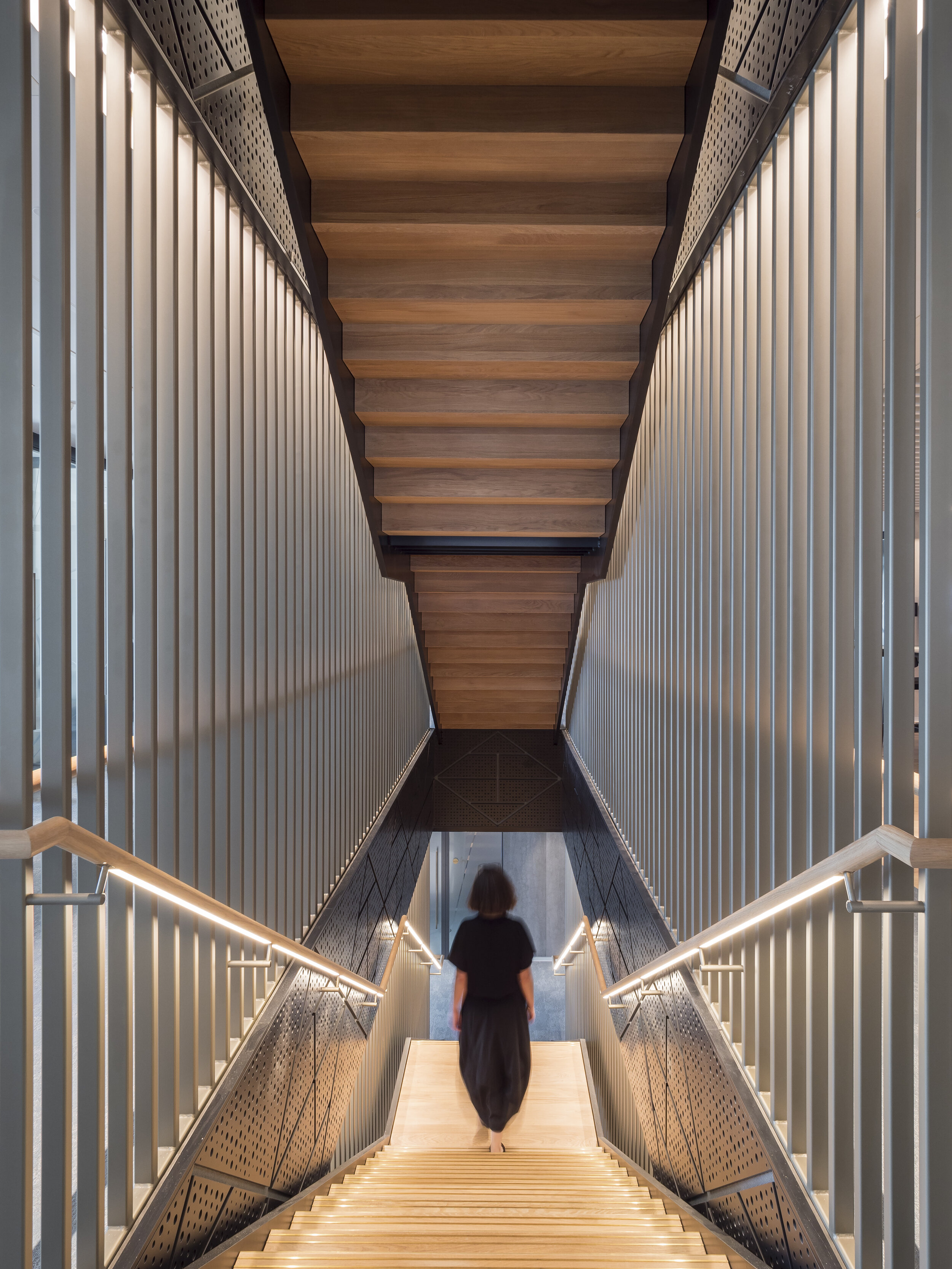
The first significant change ID:SR made to the original floor plates was the installation of staircases connecting the company offices at each level, saving employees from having to make repeated trips in the lift. Personal offices with glazed fronts surround the perimeter of the space, each with amazing views looking out onto the emerging cluster of skyscrapers. Moving inward towards the buildings core are a variety of private consultation rooms, collaborative work spaces and meeting rooms. Amongst these are kitchen and dining areas and less-specified seating areas where work or relaxation can take place individually or collaboratively. Notable is how the architects have made each space feel both distinct but also part of a cohesive whole and the variety of work spaces offer flexibility of use eschewing the conformity of old.
Colours, materials and furniture vary throughout, but each distinct area of use often replicates similar design features distinguishing their intended purpose, even if size and layout differ slightly. Having spent a considerable amount of time exploring the building and photographing each space I came to the conclusion that I could happily take up residence in one of the private offices overlooking the City, whether I could get much work done while gazing out upon the urban vista is another matter entirely. With the current situation still ongoing it sadly may be some time before these sophisticated, well designed offices are fully occupied. So for now they remain a fragment of hope in the minds of workers relegated to their kitchen table desks and daily zoom briefings. For readers wishing to see the complete set of interior photographs of 100 Bishopsgate, they can be found in the projects section of my portfolio.
Architecture Under Lockdown: Part 2 /
The Mole House by Adjaye Associates. Images: Copyright © Alex Upton
While trying to stifle the ever encroaching sense of ennui which was permeating my inner being during the final stages of the first lockdown, and before an existential crisis peaked, I decided to pick-up my camera, mount a Boris bike and venture out into the last days of what had been a wonderful summer (in terms of weather). Heading for Hackney with a friend, we decided to seek out some of the local, off the beaten path, architecture. Browsing through the latest architectural and design publications you would be forgiven for coming to the conclusion that every London street is punctuated by a bespoke home designed by an award winning architect. In reality they are much harder to come by and need some carefully planned research to locate - or a architect friend who is willing to put in the hard work for you. Hackney, being the vibrant, bohemian borough that it is, offered up plenty of architectural curiosities for our expedition.
First up on our tour was the Mole House design by recipient of the 2020 RIBA Royal Gold Medal David Adjaye. Deriving its name from the locally infamous, burrowing engineer, whom had a penchant for tunneling beneath his own home, the property came with a unique story; perfect foundations on which Adjaye Associates could build. The house conspicuously assimilates it’s imperfections; distressed and eroding materials; layers of history evidencing the dilapidation that once nearly concluded its existence. Exposed concrete smooths over the scared surface of the buildings original fabric, while not completely consuming it, creating a satisfying contrast between what was and what is. The project was commissioned by and is now home to artist Sue Webster.
The Sunken House by Adjaye Associates.
Next up, and only a short stroll away, was another David Adjaye designed home - somewhat discrediting my earlier statement regarding the proliferation of bespoke London homes - this one dating from 2007 and known as the Sunken House. The partially submerged three-storey home is clad with dark-stained cedar. The form, materials and minimal aesthetic are an aberration in the familiar brick townhouses and Jacobethan style architecture of De Beauvoir Town, Hackney. The property is home to luxury brand, design and architectural photographer Ed Reeve who commissioned David Adjaye back in 2003 to design the property. The home also functions as a space to hire out for photo and video shoots for those interested in exploring beyond the walled perimeter.
Hoxton Press by David Chipperfield & Karakusevic Carson Architects
The final destination to conclude our architectural expedition - cut short due to the stifling heat - was the Colville Estate in Hackney, home to two hexagonal towers designed by David Chipperfield Architects in collaboration with Karakusevic Carson Architects; the team responsible for the redevelopment of the entire estate. The two Hoxton Press Towers, while similar in form are differentiated in both height and brick colour -handmade, water-struck Belgian bricks no less - one being clad in red the other a dark grey. Both are austere and minimal in form as one expects from David Chipperfield’s practice, but at the same time, are executed in a manner that utilises restraint and a limited palette to great effect.
Under normal conditions it’s often the architectural photographers aim to capture a building with a limited number of people in the frame; just enough to offer some context, sense of scale and suggestion of how the space is navigated, without it looking overcrowded and compositionally unsatisfying. Ironically with lockdown in place and new photography commissions dwindling due to restrictions, it was becoming difficult to find even a solitary figure to take on this unwitting role. The lone figures that did emerge into the frame, if only briefly, were a reminder of the new mode of existence that had enveloped the city.
Architecture Under Lockdown /
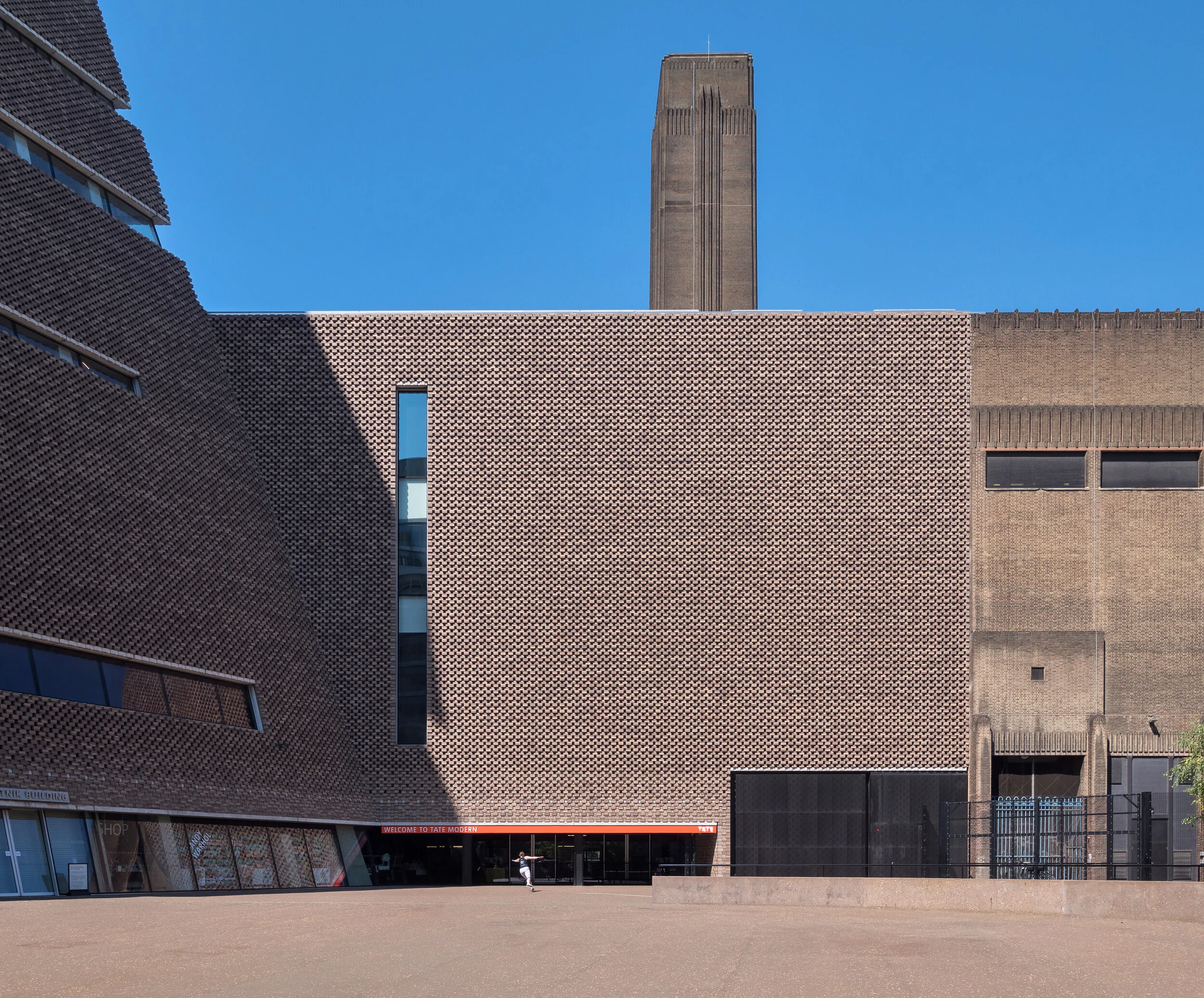
Architecture under lockdown: The Tate Modern. Images: Copyright © Alex Upton
Inner cities under the lock-down quickly transformed into spectral voids of human activity. With the actors gone, only the stage was left, the props and backdrops to life patiently awaiting the next act. With the gradual easing of restrictions, people cautiously reemerged back into the spaces they once inhabited, only to find the buildings they frequented now existing as no more than architectural sculptures; without utility. No longer possessing a familiar function, an unconscious dérive began to take place - a re-purposing of space and changing relation to the urban environment.
As an architectural photographer often working in central London, this opened up opportunities to photograph the city as it is rarely seen. Normally, photographing buildings amidst the hustle and bustle of city life can often be a challenge; just as you have your subject perfectly aligned within the frame, a passerby in situ, the afternoon sun deploying it’s architecture enhancing rays, a large white van, or citizen, unconcerned with the evanescent nature of the decisive moment, will pass before the lens rendering what could have been a moment of eternal beauty into a fragment of memory and rising sensation of ire.
So it was with this rare opportunity, on a trip through London to photograph several projects for a client, that i decided to direct my camera towards some of London’s iconic architecture. Working just a short walk from the Tate Modern, a building which I have photographed a number of times, I came across a roller skater skillfully traversing the vast empty space near the rear entrance. It was a similar story along its western elevation, where crowds usually descend into the Turbine Hall, that on this occasion, only a lone cyclist, replete with wicker basket and red helmet passed by. Admittedly the tranquillity of these images belie the true nature of events, as the riverside entrance was teaming with life; kids dangling from the steel cables of Foster’s Millennium Bridge, skateboarders leaping down staircases and sunbathers huddled in socially distanced groups, soaking up the summer heat.
Japanese Restaurant Yen London by Sybarite /
At a time when visiting a restaurant seems like a distant memory and the sound of the Ocado van pulling up outside is about as close to a culinary rush of euphoria that we can expect, what better than to reminisce over the settings of an opulent fine dining experience. The interior photography I completed of Yen London - a high-end Japanese restaurant - for interior architects Sybarite can be your catalyst into this journey of fine dining nostalgia.
Originally completed in 2017, interior designers Sybarite commissioned me to photograph the space in late 2019 before a possible change of hands for the business. Located at 190 Strand near the Thames river, the restaurant is situated above a luxury residential development designed by GRID architects. The restaurant is the second venture after the success of the original, 17 year old Yen Soba restaurant in Paris, owned by Japanese fashion company Onward Holdings.
Arriving at the restaurant, guests enter the bar and waiting area on the restaurant's mezzanine level. This space contains booths for guests to drink and socialise before descending to the main L-shaped dining area below. Once seated, guests can see as their fine Japanese cuisine is prepared before their eyes at the exposed kitchens. The interior design itself incorporates traditional elements of Japanese architecture in a contemporary setting. Surrounding the walls of the lower floor are traditional Japanese paper screens which Sybarite made using handmade Japanese paper and back-lit LED lighting.
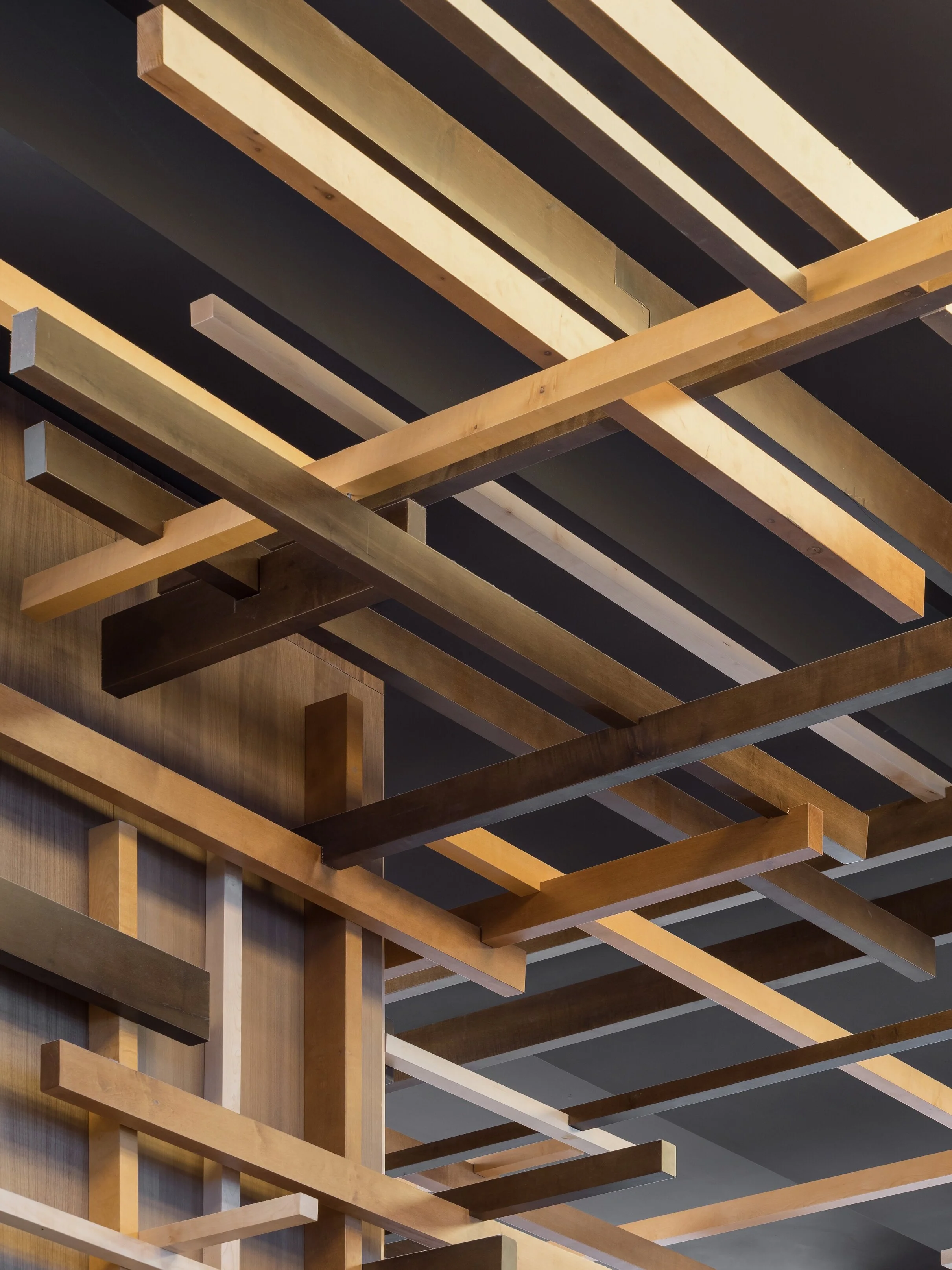
The building’s high ceilings allowed the designers at Sybarite to make full use of the additional space by installing suspended timber frames and large clusters of bamboo, which in their words, evoke the feeling of a tranquil bamboo forest. The timbers that make up the distinctive staircase are repeated throughout the space, notably the ceiling, which is traversed by a assortment of intersecting vertical and horizontal panels. This is all accented by lighting which enhances the interplay of light and shadow between the recessed timber panels.
With photography of the restaurant taking place between dining hours there was a rush to get all of the camera equipment setup and each area photographed before customers appeared for their lunch. Yet, as every interior photographer will surely appreciate, setting up the camera equipment is often the easy part of the job. Every stray object, misaligned chopstick or asymmetrical chair arrangement needs repeated nudges and obsessive readjustments so as to fall into harmony before lens; satisfying the architectural photographers disposition for a rigorously ordered microcosm.
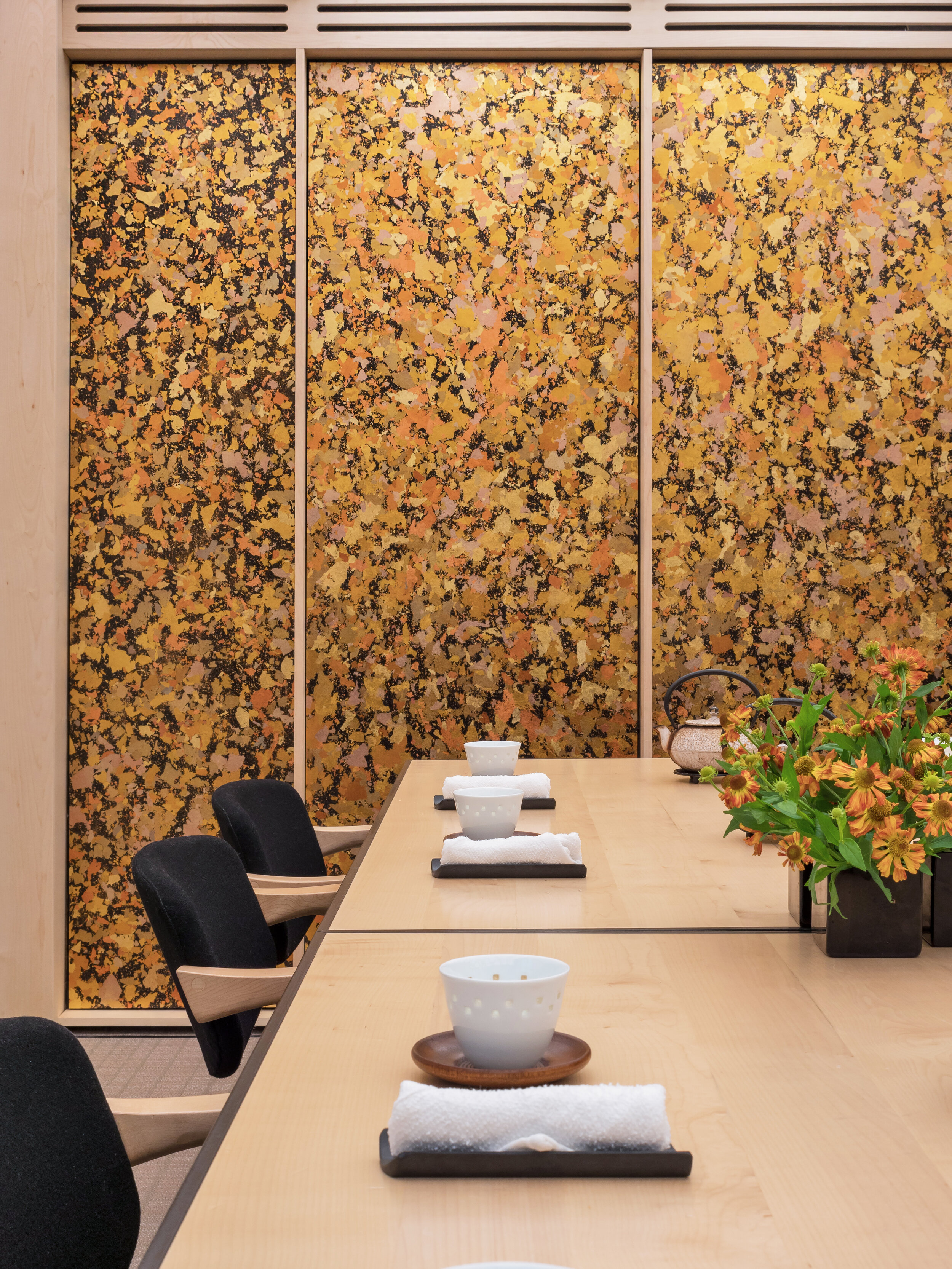
Another aspect of the design incorporates a private dining room with tatami flooring made from Bolon's woven vinyl and black runner trims, with more traditional paper screens adorning the walls and ceiling. It was in this calming space that those of us involved in the shoot were treated to a delicious bowl of Miso soup to end a long day. If the opportunity ever presents itself, the restaurant is well worth a visit, both to experience the food and the great design work carried out by Sybarite.
Interior Design: Sybarite
Client: Onward Holdings
Photography: Copyright © Alex Upton


