Architecture

Architecture Under Lockdown: Part 2 by Alex Upton

The Mole House by Adjaye Associates. Images: Copyright © Alex Upton

The Mole House by Adjaye Associates. Images: Copyright © Alex Upton

While trying to stifle the ever encroaching sense of ennui which was permeating my inner being during the final stages of the first lockdown, and before an existential crisis peaked, I decided to pick-up my camera, mount a Boris bike and venture out into the last days of what had been a wonderful summer (in terms of weather). Heading for Hackney with a friend, we decided to seek out some of the local, off the beaten path, architecture. Browsing through the latest architectural and design publications you would be forgiven for coming to the conclusion that every London street is punctuated by a bespoke home designed by an award winning architect. In reality they are much harder to come by and need some carefully planned research to locate - or a architect friend who is willing to put in the hard work for you. Hackney, being the vibrant, bohemian borough that it is, offered up plenty of architectural curiosities for our expedition.

First up on our tour was the Mole House design by recipient of the 2020 RIBA Royal Gold Medal David Adjaye. Deriving its name from the locally infamous, burrowing engineer, whom had a penchant for tunneling beneath his own home, the property came with a unique story; perfect foundations on which Adjaye Associates could build. The house conspicuously assimilates it’s imperfections; distressed and eroding materials; layers of history evidencing the dilapidation that once nearly concluded its existence. Exposed concrete smooths over the scared surface of the buildings original fabric, while not completely consuming it, creating a satisfying contrast between what was and what is. The project was commissioned by and is now home to artist Sue Webster.

The Sunken House by Adjaye Associates.

The Sunken House by Adjaye Associates.

Next up, and only a short stroll away, was another David Adjaye designed home - somewhat discrediting my earlier statement regarding the proliferation of bespoke London homes - this one dating from 2007 and known as the Sunken House. The partially submerged three-storey home is clad with dark-stained cedar. The form, materials and minimal aesthetic are an aberration in the familiar brick townhouses and Jacobethan style architecture of De Beauvoir Town, Hackney. The property is home to luxury brand, design and architectural photographer Ed Reeve who commissioned David Adjaye back in 2003 to design the property. The home also functions as a space to hire out for photo and video shoots for those interested in exploring beyond the walled perimeter.

Hoxton Press by David Chipperfield & Karakusevic Carson Architects

Hoxton Press by David Chipperfield & Karakusevic Carson Architects

The final destination to conclude our architectural expedition - cut short due to the stifling heat - was the Colville Estate in Hackney, home to two hexagonal towers designed by David Chipperfield Architects in collaboration with Karakusevic Carson Architects; the team responsible for the redevelopment of the entire estate. The two Hoxton Press Towers, while similar in form are differentiated in both height and brick colour -handmade, water-struck Belgian bricks no less - one being clad in red the other a dark grey. Both are austere and minimal in form as one expects from David Chipperfield’s practice, but at the same time, are executed in a manner that utilises restraint and a limited palette to great effect.

P1410679-2.jpg

Under normal conditions it’s often the architectural photographers aim to capture a building with a limited number of people in the frame; just enough to offer some context, sense of scale and suggestion of how the space is navigated, without it looking overcrowded and compositionally unsatisfying. Ironically with lockdown in place and new photography commissions dwindling due to restrictions, it was becoming difficult to find even a solitary figure to take on this unwitting role. The lone figures that did emerge into the frame, if only briefly, were a reminder of the new mode of existence that had enveloped the city.

Architecture Under Lockdown by Alex Upton

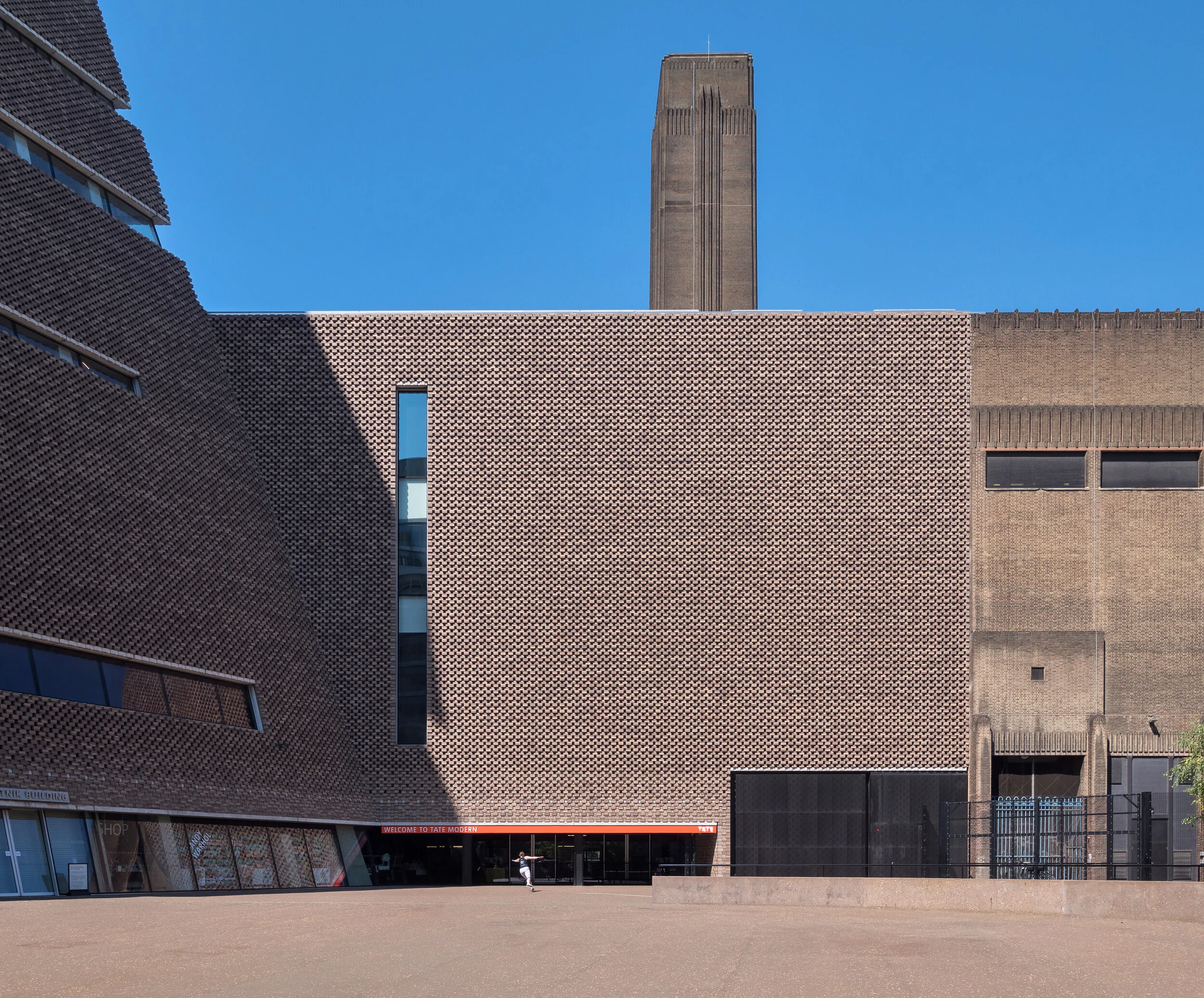
Architecture under lockdown: The Tate Modern. Images: Copyright © Alex Upton

Architecture under lockdown: The Tate Modern. Images: Copyright © Alex Upton

Inner cities under the lock-down quickly transformed into spectral voids of human activity. With the actors gone, only the stage was left, the props and backdrops to life patiently awaiting the next act. With the gradual easing of restrictions, people cautiously reemerged back into the spaces they once inhabited, only to find the buildings they frequented now existing as no more than architectural sculptures; without utility. No longer possessing a familiar function, an unconscious dérive began to take place - a re-purposing of space and changing relation to the urban environment.

architecture-photography-london-lockdown-2.jpg

As an architectural photographer often working in central London, this opened up opportunities to photograph the city as it is rarely seen. Normally, photographing buildings amidst the hustle and bustle of city life can often be a challenge; just as you have your subject perfectly aligned within the frame, a passerby in situ, the afternoon sun deploying it’s architecture enhancing rays, a large white van, or citizen, unconcerned with the evanescent nature of the decisive moment, will pass before the lens rendering what could have been a moment of eternal beauty into a fragment of memory and rising sensation of ire.

architecture-photography-london-lockdown-3.jpg

So it was with this rare opportunity, on a trip through London to photograph several projects for a client, that i decided to direct my camera towards some of London’s iconic architecture. Working just a short walk from the Tate Modern, a building which I have photographed a number of times, I came across a roller skater skillfully traversing the vast empty space near the rear entrance. It was a similar story along its western elevation, where crowds usually descend into the Turbine Hall, that on this occasion, only a lone cyclist, replete with wicker basket and red helmet passed by. Admittedly the tranquillity of these images belie the true nature of events, as the riverside entrance was teaming with life; kids dangling from the steel cables of Foster’s Millennium Bridge, skateboarders leaping down staircases and sunbathers huddled in socially distanced groups, soaking up the summer heat.

3 Broadgate by Orms Architects by Alex Upton

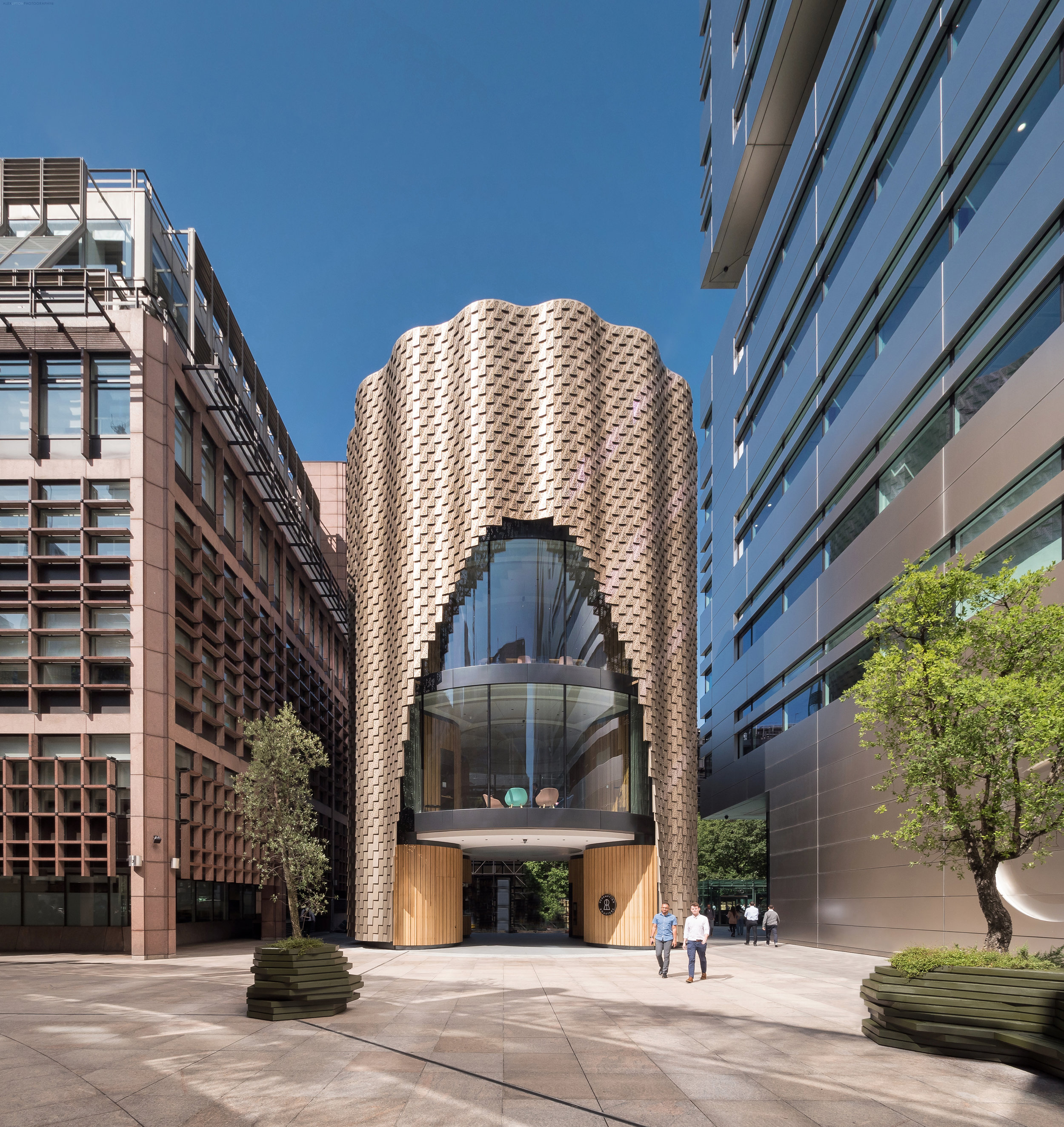
3 Broadgate, London by Orms Architects 2019. Photography: Copyright © Alex Upton

3 Broadgate, London by Orms Architects 2019. Photography: Copyright © Alex Upton

Hidden beneath the shimmering skin of Orms Architects new 3 Broadgate building is a structure descending from the 1980’s which once served as a marketing suite for the Broadgate estate. While retaining the cylindrical form of its predecessor Orms have hollowed out an archway at ground level opening the space to the public. As you are channelled through this new space a coffee shop greets you at one side while entry to the 3 floors above can be gained from the other.

Architectural photography of 3 Broadgate’s striking facade.

Architectural photography of 3 Broadgate’s striking facade.

One of the most visually arresting aspects to the building is it’s rippling facade, formed from thousands of bronze coloured aluminium panels, which I’m sure architectural photographers will be flocking to visit as it makes for some amazing images. These decorative panels trace an arch on either side of the building revealing two of the interior spaces through the glazing. In its new incarnation 3 Broadgate will continue to serve as a marketing suite for the Broadgate estate.

Thousands of perforated aluminium panels cover the facade.

Thousands of perforated aluminium panels cover the facade.

Since the building was first revealed from behind the scaffold I have paid repeated visits in anticipation that it would be ready to photograph, and while there are still some ongoing ground works - every architectural photographers nightmare - limiting certain angles, the building is mostly complete. At the time of its conception there were dissenting voices deriding the supposedly contentious plans, but seeing it complete it is hard to imagine what provoked such ire, the building is far superior to its predecessor and feels more welcoming, opening up space and creating a visual curiosity to those inclined to look in its direction.

Project Team:

Architect: Orms
Client: British Land
Main Contractor: Sir Robert McAlpine
Structural engineer: Arup
Architectural Photographer: Alex Upton

Fruit & Wool Exchange Pavilion by Sheppard Robson by Alex Upton

Sheppard Robson new Fruit & Wool Exchange Pavilion in Spitalfields , London. Photography: Copyright © Alex Upton

Sheppard Robson new Fruit & Wool Exchange Pavilion in Spitalfields , London. Photography: Copyright © Alex Upton

In late 2018 i was commissioned to photograph this small, but unique building located in Spitalfields, London by Sheppard Robson architects. The small angular pavilion their team designed is located on the perimeter of the new Fruit & Wool Exchange development and has become home to a day and night Crispin Café. The main part of the development, located behind the pavilion, opposite Old Spitalfields Market was designed by another architectural practice, Bennetts Associates.

Rear entrance to the pavilion detailing the extended angular roof

Rear entrance to the pavilion detailing the extended angular roof

From an architectural photographers perspective this was a particularly tricky building to shoot at that time of year. Its low, extended profile in context to the higher surrounding buildings meant that when the sun did meet with it’s exterior, the shadows of those buildings intermittently draped themselves over it surface obscuring from view the pavilions finer details. It was with these limitations to the architectural photography that I obtained most of the images at dusk.

Architectural Photography of the Fruit & Wool Exchange Pavilion

Architectural Photography of the Fruit & Wool Exchange Pavilion

Surrounding the cafe is a new public space with landscaping undertaken by Robert Myers Associates. The most striking external feature of the metal-clad pavilion is it’s dynamic roof design, which sweeps up from the sides of the building an meets to form a sharp, piercing point at it’s apex. The juxtaposition to the brick facade of Bennetts Associates Fruit & Wool Exchange is quite sticking, but downplayed by its low profile. While I only obtained a few photographs of the pavilion due to the size of the project and ongoing works surrounding it you can take a look at the rest by visiting the projects page above.

Project Team:

Developer: Exemplar Properties
Architect: Sheppard Robson
Photography Client: Sheppard Robson
Architectural Photographer: Alex Upton

Barts Square Residential by Sheppard Robson by Alex Upton

Barts Square Residential Buildings by Sheppard Robson Architects. All images Copyright © Alex Upton

Barts Square Residential Buildings by Sheppard Robson Architects. All images Copyright © Alex Upton

Here is another London architectural photography project I recently undertook for my client Sheppard Robson Architects. This article provides a selection of preliminary images I took of the Barts Square residential development, a scheme currently taking shape in the City of London, just north of St Paul’s Cathedral. I say preliminary since it is a rather large 3.2 acre phased development, comprising offices, retail and the aforementioned residential units, 236 to be precise. The project is being master planned under the direction of lead architects Sheppard Robson who have brought in architectural practices Maccreannor Lavington and Piercy & Company to act as sub-consultants on the scheme.

Contrasting the old and new architectural details that form the facade of the Barts Square residencies.

Contrasting the old and new architectural details that form the facade of the Barts Square residencies.

The residential aspect of Barts Square comprises an assortment of architecture where historically significant buildings have been retained and woven into the fabric of the contemporary structures surrounding them. In keeping with the strict guidelines for developments in sensitive areas of the City of London the materials and designs of the new builds are high quality and reference both the historic and environmental context in which they find themselves situated. The new buildings snugly fit into the existing narrow street patterns creating enclaves of privacy for the residents and a labyrinth like structure intrinsic to Victorian-era urban planning, causing all but the savviest Flâneur to retrace their steps as they wonder how on earth they entered the complex and if they will ever make their exit.

Architectural Photography of the Piercy & Company designed building at Barts Square.

Architectural Photography of the Piercy & Company designed building at Barts Square.

The apparent tranquility seen in the architectural photographs presented here belie the hustle and bustle of what is still a partially active construction site. Once again my already depleted reserves of patience were put to the test as each time I positioned my camera and tripod to take a shot, a fluorescent clad worker or delivery truck would, as if by magic, manifest within my field of vision. During such testing circumstances it is often only a split second, where the perfect conditions align and sun, pedestrians, architecture all fall into an evanescent, harmonious synchronicity, before instantaneously collapsing before the lens back into the cacophonous muddle of urban life.

The architectural details on the Barts Square Apartments reference surrounding historic buildings.

The architectural details on the Barts Square Apartments reference surrounding historic buildings.

These photographs of Barts Square were commissioned by my client Sheppard Robson to capture the completed buildings from the first phase of the development. While limited in the scope of what could be captured on that day, hopefully they offer a glimpse into what will be a high quality development when all eventually comes together in the final stages of construction. When time permits I will add a more comprehensive set of images showcasing some of the luxurious interiors designed by Johnson Naylor in the residential buildings, which are now partially occupied.

Project Team:

Architects: Sheppard Robson (Piercy & Company, Maccreannor Lavington)
Client: Helical PLC
Main Contractor: McLaren
Structural Engineer: Waterman Group
Landscape Architect: Gross Max
Interior Architect:
Johnson Naylor
Architectural Photographer: Alex Upton

Royal Mint Court Redevelopment by Sheppard Robson by Alex Upton

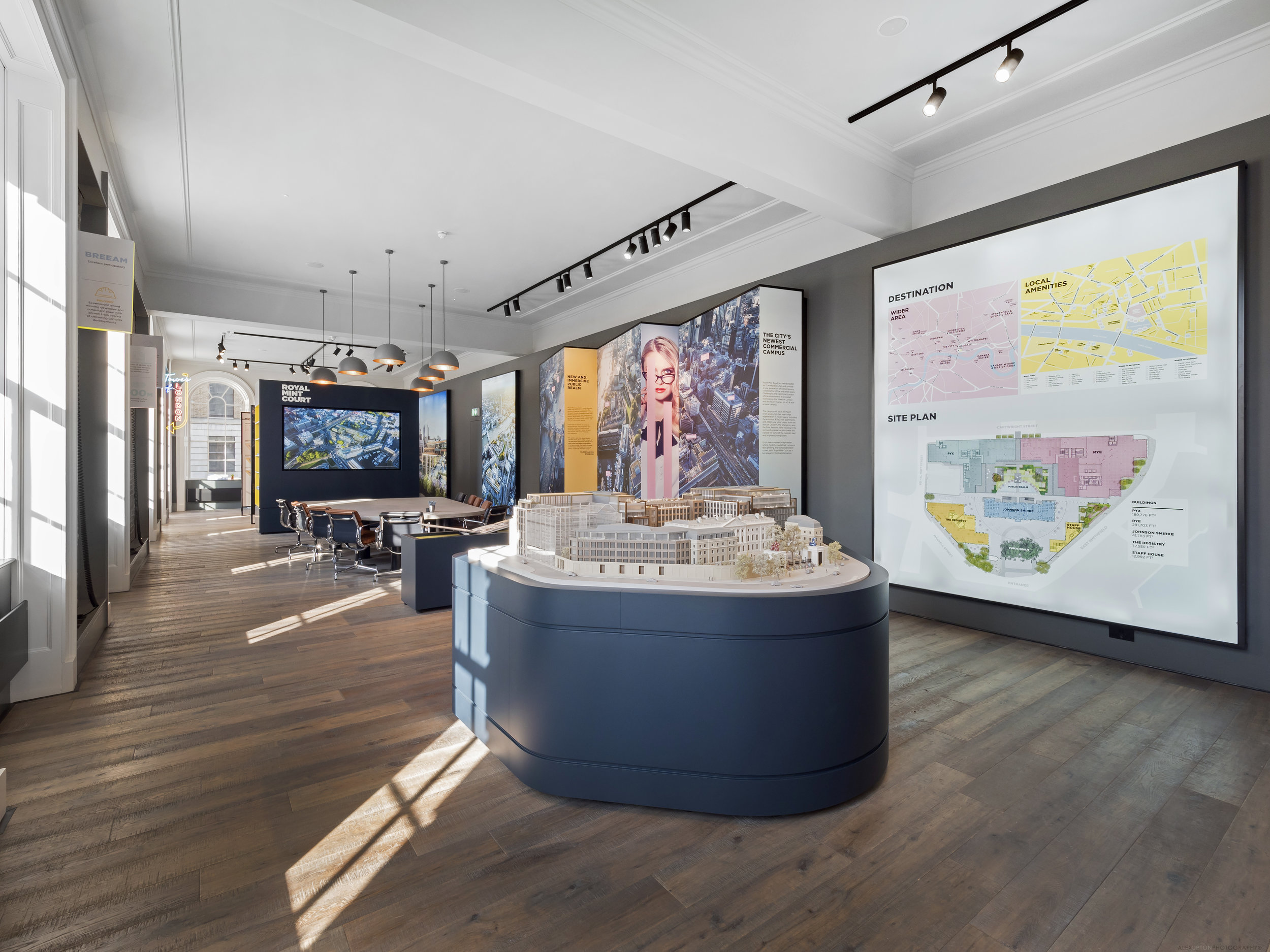
Royal Mint Court London Showroom by Sheppard Robson 2017. Photography Copyright © Alex Upton

Royal Mint Court London Showroom by Sheppard Robson 2017. Photography Copyright © Alex Upton

The Royal Mint Court building and its generous, fortified grounds occupy a rather large 5.23 acre site in central London. The historic building which served as the Royal Mint between 1809 and 1967 is surrounded by prestigious landmarks such as The Tower of London and Tower Bridge. In late 2017 I was commissioned by London-based architectural practice Sheppard Robson to photograph the onsite showroom they had designed in collaboration with their interiors department ID:SR Interiors. 

Showroom model of the proposed redevelopment of Royal Mint Court.

Showroom model of the proposed redevelopment of Royal Mint Court.

The architectural photography of Royal Mint Court which I undertook for the client captures the showroom displays; including 3D models of the proposed development, detailed information on the proposals along with interactive displays and writing on the sites historic context. There is also a pool room equipped with a bar and jukebox upon entering the building. The new development proposed by British property developers Delancey would be an office led scheme with the inclusion of new public spaces. While incorporating historic elements of the site it would also include the addition of several distinctively modern buildings.

Visualisations of the proposed Royal Mint Court development.

Visualisations of the proposed Royal Mint Court development.

Before further exciting any readers over the details of the proposed development it should be noted that the scheme will now almost certainly be revised as the People’s Republic of China recently acquired the site from Delancey and the LRC Group with the intention of converting it into their new Embassy. The buildings fortified grounds, heritage and central location all no doubt being driving factors in their decision to relocate there.

Conference area for potential clients and visitors.

Conference area for potential clients and visitors.

While it's disappointing to discover Sheppard Robson Architects' Royal Mint Court scheme will never likely see the light of day - especially after photographing its wonderful interior, which hints at what could have been - it is highly likely another grand scheme will follow in its wake as the rush to build landmark Embassies in the capital intensifies.

The Sammy Ofer Centre by Sheppard Robson by Alex Upton

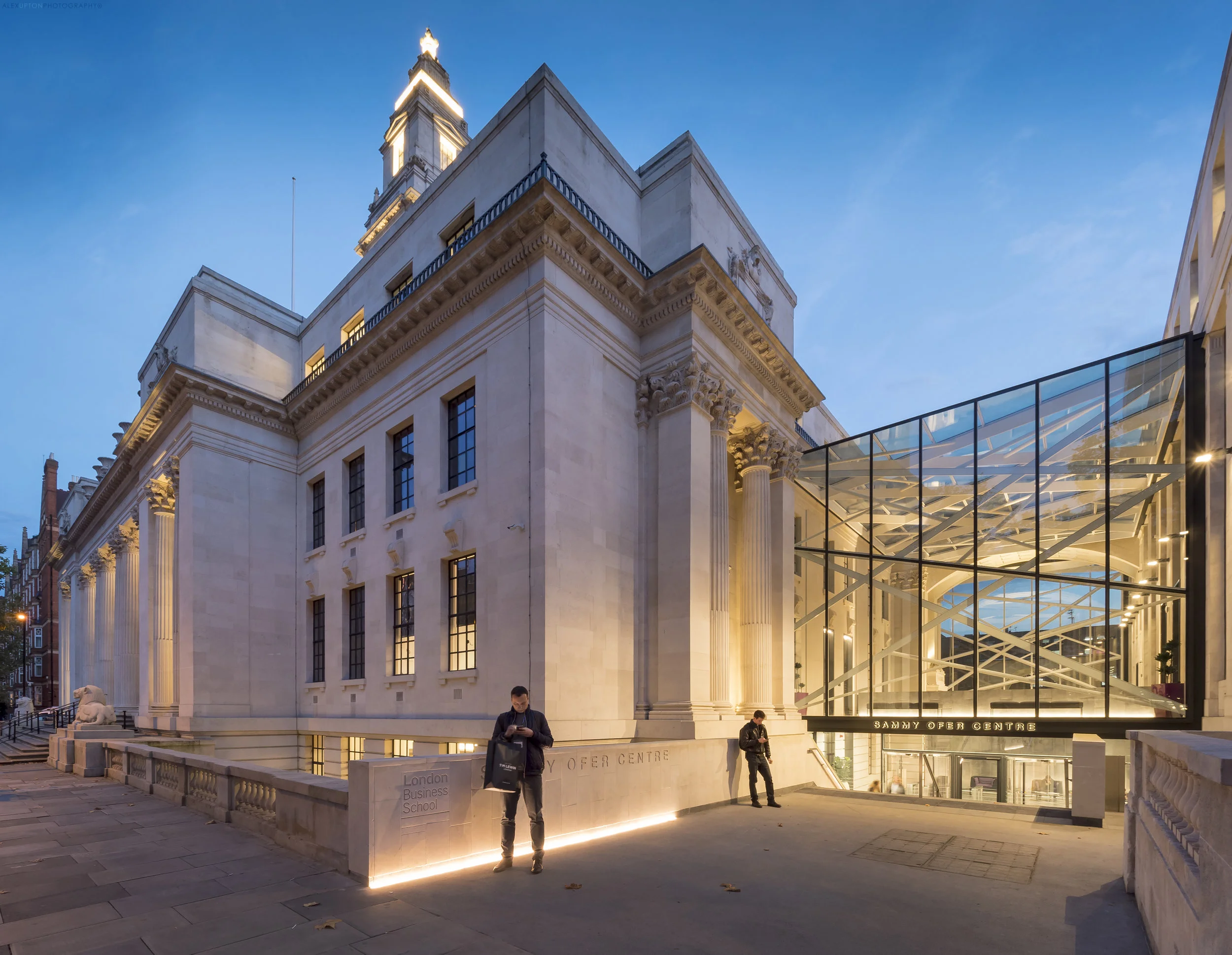
The Sammy Ofer Centre, London Business School by Sheppard Robson 2017. Photography: Copyright © Alex Upton

The Sammy Ofer Centre, London Business School by Sheppard Robson 2017. Photography: Copyright © Alex Upton

London based architectural practice Sheppard Robson recently completed a major renovation of the Old Marylebone Town Hall transforming it into a new, expaned faculty for the London Business School. The Sammy Ofer Centre - named in honour of the late Sammy Ofer, the celebrated Israeli entrepreneur and philanthropist - contains many new facilities including six lecture theatres, 32 seminar spaces, a library, offices and student lounge. The projects most distinctive external feature is the new glass and steel entrance which links the Old Town Hall to the Annex buildings.

The Sammy Ofer Centre - Main Entrance.

The Sammy Ofer Centre - Main Entrance.

I was commissioned by Sheppard Robson architects to photograph several specific views externally, along with some interior shots that matched up identically in composition and framing to a series of black and white originals taken many years previously and held in the RIBA's photographic archive. Unfortunately I don't have access to these images presently so am unable provide side by side comparisons.

The Sammy Ofer Centre - Rear Elevation.

The Sammy Ofer Centre - Rear Elevation.

At the buildings rear are further contrasts between the old and new elements; in front of the new atrium is a lone retained arch and further down, an new angular limestone and glass curtain wall which nudges up to the original more ornate stonework. Housed within this new structure are the six lecture theaters, the largest two of which conjoin to create a space with the capacity to seat 200 students.

The Sammy Ofer Centre - Private and comunal study area.

The Sammy Ofer Centre - Private and comunal study area.

Sheppard Robsons' interior design team ID:SR worked on the buildings internal fit out which comprises new modern spaces alongside retained, renovated elements of the original Old Marylebone Town Hall. There is a level opulence befitting of the schools prestigious reputation and the new furnishings work in harmony with the more classical elements of the original structure.

The Sammy Ofer Centre - ID:SR's new furnishings.

The Sammy Ofer Centre - ID:SR's new furnishings.

The irregular floor plan of the original building, with its alcoves and long narrow corridors has been utilised by ID:SR to great affect; creating areas for private discussion and study alongside other more open, less defined spaces which are more likely to promote encounters among students and hence being conducive to the exchange of ideas and discussion - an integral function of a business school.

The Sammy Ofer Centre - One of the two main lecture theaters.

The Sammy Ofer Centre - One of the two main lecture theaters.

The new lecture theaters, of which there are six, are strikingly modern with wooden panels and strip-lighting traversing the walls and ceiling, ebbing out jagged contours which follow the dynamic alignment of seating below. All of this is reminiscent of some of the grand architectural designs found in modern philharmonic halls and theater spaces.

The buildings scale is hard to comprehend externally, compounded by the many divisions of its internal space to incorporate a variety of uses throughout. The fact that there is a harmony of contrasts within, and on the outside, is testament to  Sheppard Robson Architects careful and considered approach to the renovation. More images of this building can be found in under my projects.

Location: Marylebone Road, Paddington, London.
Developer: London Business School
Contractor: Wates Construction
Photography Client / Architect: Sheppard Robson

Benenden Hospital Redevelopment by Alex Upton

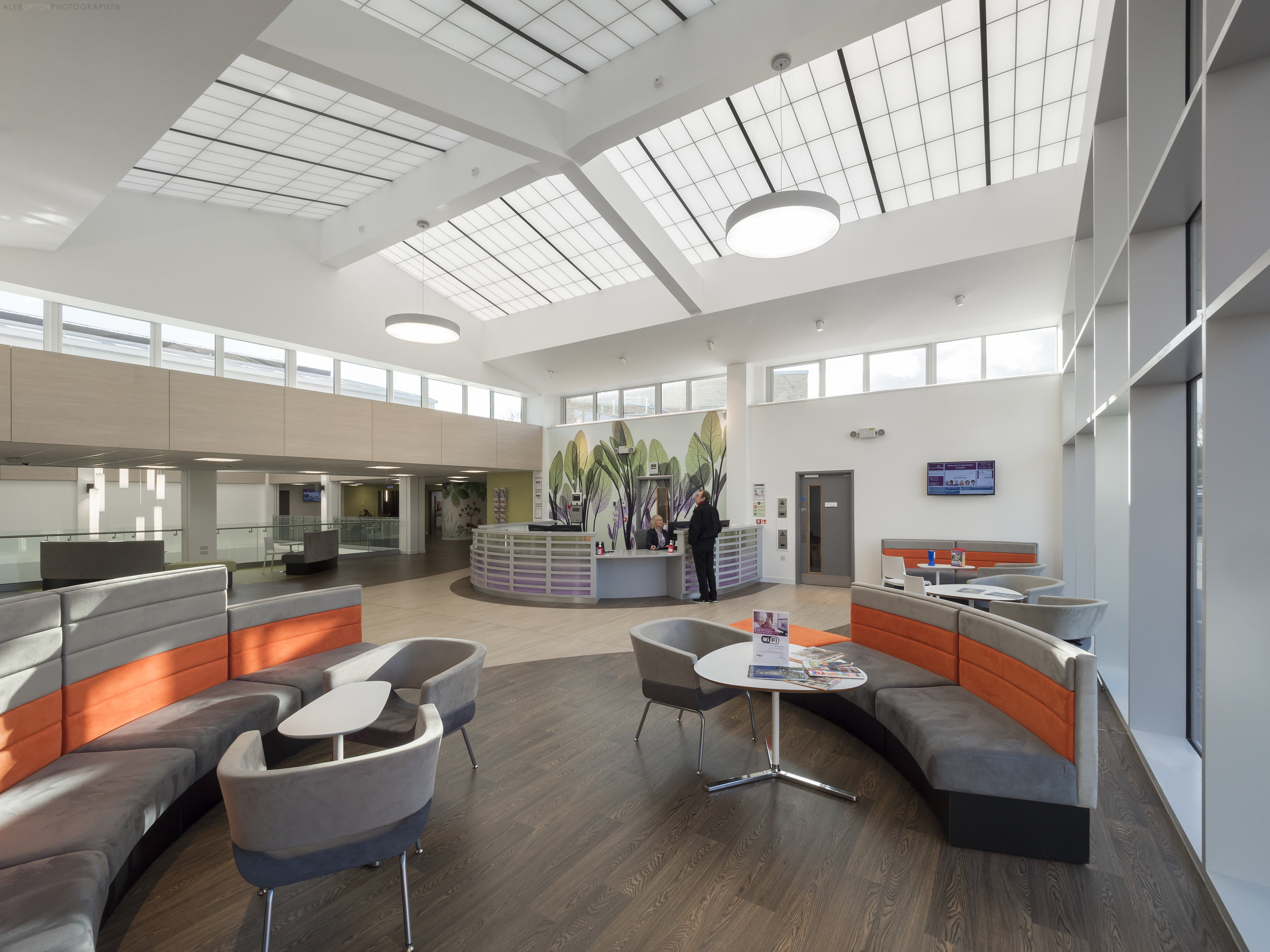
Benenden Hospital Reception Area 2017. Photography: Copyright © Alex Upton

Benenden Hospital Reception Area 2017. Photography: Copyright © Alex Upton

Location: Benenden, Cranbrook, Kent, UK
Contractor: Willmott Dixon
Photography Client: Structura / Kalwall
Architects: CA Vaughan Blundell QS, Moreton Hayward M&E and Richard Stephens Partnership

Located in the south east county of Kent, Benenden Hospital, an Independent flagship facility for Benenden Hospital Trust, recently underwent a major £45 million redevelopment. The new facilities include operating theatres, single en-suite rooms, an ophthalmic suite,  a new outpatient department, procedure rooms and recovery areas.

Benenden Hospital Waiting Room

Benenden Hospital Waiting Room

I was commissioned in late 2017 to photograph the interior of the facility, which features a large new atrium roof glazed in the client Kalwall's unique panels - the same material featured in my photography of the RIBA award winning West Croydon Bus Station. The translucent Kalwall panels allow daylight to permeate the waiting rooms creating a bright, welcoming environment for the patients. These two projects show the potential diversity of the products application and how its specific placement and incorporation into the architecture can contribute both aesthetically and functionally in a variety of ways.

Benenden Hospital Waiting Room

Benenden Hospital Waiting Room

The Interior design services were carried out by the West Midland's based practice Design Buro. Through the layout of the furniture and the application of colour to various features the interior spaces have been simplified aiding the users experience and making it easy to navigate the building. The materials themselves while not all natural reference nature through texture and colour masking the often utilitarian design of hospitals.

Benenden Hospital Reception Area

Benenden Hospital Reception Area

The parts of the scheme I had access to photograph work really well, they are both spacious and open whilst also accommodating for privacy, with the furniture creating partially secluded zones. The use of two tones of flooring, which are employed to delineate the various pathways through the hospital, help guide the patients to their destination - breaking with the notoriously labyrinth like layouts of older hospitals.

Benenden Hospital Atrium Roof

Benenden Hospital Atrium Roof

If you are interested in seeing more architectural photographs of Benenden Hospital's redevelopment and the interior design work carried out there by Design Beru please visit my portfolio in the navigation bar above.