Sheppard Robson

City of London Office Interiors by ID:SR by Alex Upton

100 Bishopsgate, Interior office design by ID:SR. Images: Copyright © Alex Upton

100 Bishopsgate, Interior office design by ID:SR. Images: Copyright © Alex Upton

In the early autumn of 2020, when normality, accompanied by a faithful companion complacency, appeared to have tentatively returned to our daily lives. A time when workers were finally jettisoning their ‘work from home’ attire - lower-body: pyjamas, upper-body: vaguely presentable shirt - and relinquishing the prospect of conducting any further business meetings through a pixelated portal from the comfort of their beds, I was commissioned by Sheppard Robson architects to photograph the new office spaces their interior design team, ID:SR, had created for a prestigious international client. The offices were located across several floors of the recently completed 100 Bishopsgate tower in the City of London financial district, where the workers were set to return.

100-bishopsgate-interior.jpg

The tower itself, a mixed use development rising over 172 meters, with 40-storeys of office space, was designed by Allies and Morrison architects. With each occupant having different requirements for their work spaces, the interior design work was to be taken up by a design team chosen at the tenants discretion. As regular visitors to my blog will know - or visitor - I have worked with Sheppard Robson on a number of architectural photography projects. With previous commercial commissions, such as the offices at One Creechurch Place, the individual floors plates are usually austere shells awaiting the clients before they are fitted out, so in this case it was nice to be able to focus my camera on the interior design work and not solely the structural details.

100-bishopsgate-interior.jpg

Before elaborating any further on the particulars of the building and extolling the qualities of the interior design, I feel obligated to draw your attention to one, not so inconspicuous fact. It might soon, if not already, have come to the perceptive viewers attention, that several of the people in the photographs reappear throughout the various settings. This was neither a coincidence nor the result of several office workers clamouring for stardom before the lens by following me from one location to the next. No, this was the result of an entirely different set of circumstances, ones which necessitate the artifice behind much architectural photography. While I favour capturing a space in an uncontrived as possible manner sometimes it is just not practical to do so.

100-bishopsgate-interior.jpg

The office was still several days from being fully occupied and with interior photography it is often optimal to begin the work before such an occasion occurs, for in a matter of minuets a neat and orderly office can descend into a cacophony of hurried bodies and out of place furniture. Once clear shelves become a cascade of spilled pages, desktops submerge beneath mounds of spreadsheets, all precariously crowned with a slightly broken, but faithful office mug. So in some cases it is therefore preferable to enlist the help of models - in this case several of the interior architects whom worked on the project.

100-bishopsgate-interior.jpg

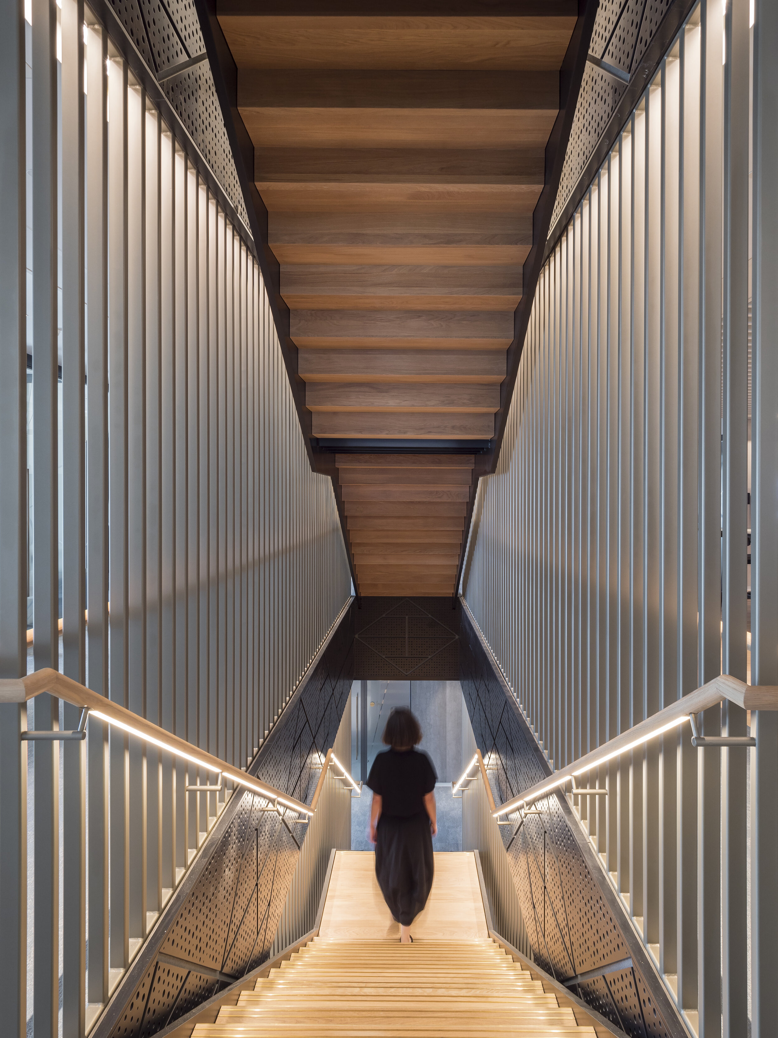
The first significant change ID:SR made to the original floor plates was the installation of staircases connecting the company offices at each level, saving employees from having to make repeated trips in the lift. Personal offices with glazed fronts surround the perimeter of the space, each with amazing views looking out onto the emerging cluster of skyscrapers. Moving inward towards the buildings core are a variety of private consultation rooms, collaborative work spaces and meeting rooms. Amongst these are kitchen and dining areas and less-specified seating areas where work or relaxation can take place individually or collaboratively. Notable is how the architects have made each space feel both distinct but also part of a cohesive whole and the variety of work spaces offer flexibility of use eschewing the conformity of old.

100-bishopsgate-interior.jpg

Colours, materials and furniture vary throughout, but each distinct area of use often replicates similar design features distinguishing their intended purpose, even if size and layout differ slightly. Having spent a considerable amount of time exploring the building and photographing each space I came to the conclusion that I could happily take up residence in one of the private offices overlooking the City, whether I could get much work done while gazing out upon the urban vista is another matter entirely. With the current situation still ongoing it sadly may be some time before these sophisticated, well designed offices are fully occupied. So for now they remain a fragment of hope in the minds of workers relegated to their kitchen table desks and daily zoom briefings. For readers wishing to see the complete set of interior photographs of 100 Bishopsgate, they can be found in the projects section of my portfolio.

100-bishopsgate-interior.jpg

Fruit & Wool Exchange Pavilion by Sheppard Robson by Alex Upton

Sheppard Robson new Fruit & Wool Exchange Pavilion in Spitalfields , London. Photography: Copyright © Alex Upton

Sheppard Robson new Fruit & Wool Exchange Pavilion in Spitalfields , London. Photography: Copyright © Alex Upton

In late 2018 i was commissioned to photograph this small, but unique building located in Spitalfields, London by Sheppard Robson architects. The small angular pavilion their team designed is located on the perimeter of the new Fruit & Wool Exchange development and has become home to a day and night Crispin Café. The main part of the development, located behind the pavilion, opposite Old Spitalfields Market was designed by another architectural practice, Bennetts Associates.

Rear entrance to the pavilion detailing the extended angular roof

Rear entrance to the pavilion detailing the extended angular roof

From an architectural photographers perspective this was a particularly tricky building to shoot at that time of year. Its low, extended profile in context to the higher surrounding buildings meant that when the sun did meet with it’s exterior, the shadows of those buildings intermittently draped themselves over it surface obscuring from view the pavilions finer details. It was with these limitations to the architectural photography that I obtained most of the images at dusk.

Architectural Photography of the Fruit & Wool Exchange Pavilion

Architectural Photography of the Fruit & Wool Exchange Pavilion

Surrounding the cafe is a new public space with landscaping undertaken by Robert Myers Associates. The most striking external feature of the metal-clad pavilion is it’s dynamic roof design, which sweeps up from the sides of the building an meets to form a sharp, piercing point at it’s apex. The juxtaposition to the brick facade of Bennetts Associates Fruit & Wool Exchange is quite sticking, but downplayed by its low profile. While I only obtained a few photographs of the pavilion due to the size of the project and ongoing works surrounding it you can take a look at the rest by visiting the projects page above.

Project Team:

Developer: Exemplar Properties
Architect: Sheppard Robson
Photography Client: Sheppard Robson
Architectural Photographer: Alex Upton

Barts Square Residential by Sheppard Robson by Alex Upton

Barts Square Residential Buildings by Sheppard Robson Architects. All images Copyright © Alex Upton

Barts Square Residential Buildings by Sheppard Robson Architects. All images Copyright © Alex Upton

Here is another London architectural photography project I recently undertook for my client Sheppard Robson Architects. This article provides a selection of preliminary images I took of the Barts Square residential development, a scheme currently taking shape in the City of London, just north of St Paul’s Cathedral. I say preliminary since it is a rather large 3.2 acre phased development, comprising offices, retail and the aforementioned residential units, 236 to be precise. The project is being master planned under the direction of lead architects Sheppard Robson who have brought in architectural practices Maccreannor Lavington and Piercy & Company to act as sub-consultants on the scheme.

Contrasting the old and new architectural details that form the facade of the Barts Square residencies.

Contrasting the old and new architectural details that form the facade of the Barts Square residencies.

The residential aspect of Barts Square comprises an assortment of architecture where historically significant buildings have been retained and woven into the fabric of the contemporary structures surrounding them. In keeping with the strict guidelines for developments in sensitive areas of the City of London the materials and designs of the new builds are high quality and reference both the historic and environmental context in which they find themselves situated. The new buildings snugly fit into the existing narrow street patterns creating enclaves of privacy for the residents and a labyrinth like structure intrinsic to Victorian-era urban planning, causing all but the savviest Flâneur to retrace their steps as they wonder how on earth they entered the complex and if they will ever make their exit.

Architectural Photography of the Piercy & Company designed building at Barts Square.

Architectural Photography of the Piercy & Company designed building at Barts Square.

The apparent tranquility seen in the architectural photographs presented here belie the hustle and bustle of what is still a partially active construction site. Once again my already depleted reserves of patience were put to the test as each time I positioned my camera and tripod to take a shot, a fluorescent clad worker or delivery truck would, as if by magic, manifest within my field of vision. During such testing circumstances it is often only a split second, where the perfect conditions align and sun, pedestrians, architecture all fall into an evanescent, harmonious synchronicity, before instantaneously collapsing before the lens back into the cacophonous muddle of urban life.

The architectural details on the Barts Square Apartments reference surrounding historic buildings.

The architectural details on the Barts Square Apartments reference surrounding historic buildings.

These photographs of Barts Square were commissioned by my client Sheppard Robson to capture the completed buildings from the first phase of the development. While limited in the scope of what could be captured on that day, hopefully they offer a glimpse into what will be a high quality development when all eventually comes together in the final stages of construction. When time permits I will add a more comprehensive set of images showcasing some of the luxurious interiors designed by Johnson Naylor in the residential buildings, which are now partially occupied.

Project Team:

Architects: Sheppard Robson (Piercy & Company, Maccreannor Lavington)
Client: Helical PLC
Main Contractor: McLaren
Structural Engineer: Waterman Group
Landscape Architect: Gross Max
Interior Architect:
Johnson Naylor
Architectural Photographer: Alex Upton

Brunel University Wilfred Brown Building by Sheppard Robson by Alex Upton

Brunel University Wilfred Brown Building.jpg

Delving once again into the architectural photographers archive here is yet another project I have unearthed; Brunel University’s refurbished Wilfred Brown Building by the London-based Sheppard Robson architectural practice. Almost immediately after completing the photography of One Creechurch Place in late 2017 for the same client another completed project awaited me, this time in the form of the Wilfred Brown Building which houses the College of Engineering, Design and Physical Sciences for Brunel University. The project can be found situated amongst the University’s large campus located on the fringe of West London in the town of Uxbridge.

brunel-university-wilfred-brown-building.jpg

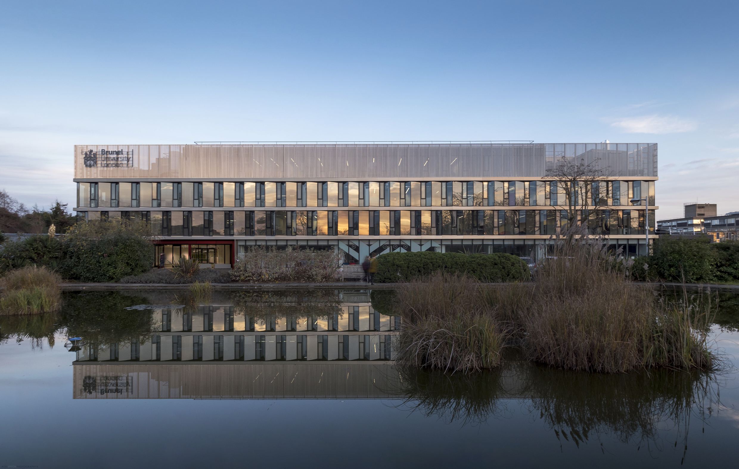
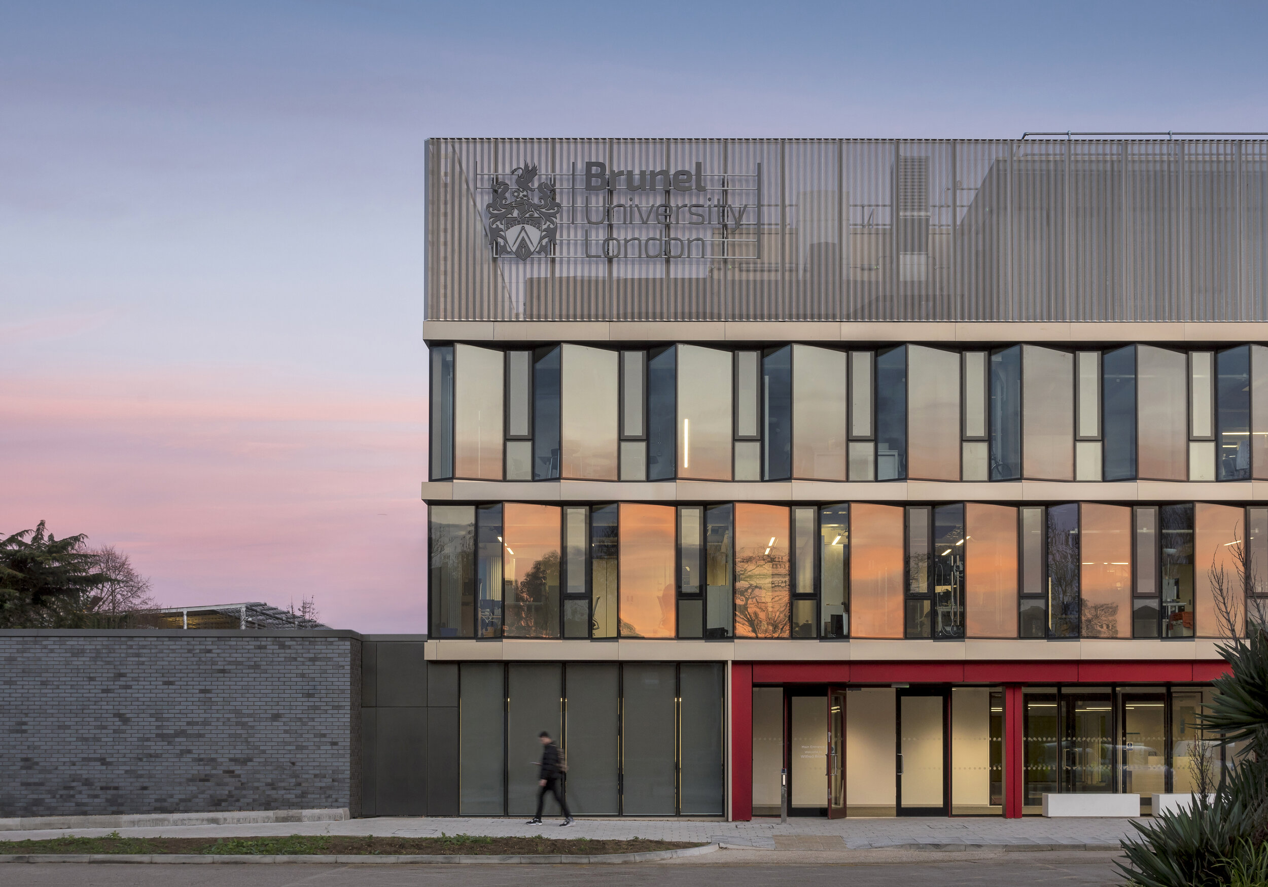
The Wilfred Brown Building was originally delivered by Sheppard Robson in 1968 followed by a rooftop extension in 1990. Like many Universities, findings itself amidst a flux of expansion in student numbers and a need to accommodate cutting edge learning facilities Brunel commissioned a modernisation of the building. Relieved of its aging skin the structure was stripped back to its concrete frame and re-clad with a ‘saw tooth’ facade, which according to Sheppard Robson is comprised of a ‘north-west facing clear glazing and west, south-west facing glazing with interstitial architectural mesh to provide solar shading’. Situated above this is a crown of perforated profiled metal which compliments the glazing below.

Brunel University Wilfred Brown Building 3.jpg

The building, situated on the universities western boundary is accompanied by a quaint pond - home to several ducks and a scattering of Water Lilies - creating an idyllic microcosm amidst the hustle and bustle of campus activity. For any trivia buffs, an episode of the BBC comedy Cuckoo was filmed outside the building when the families son attended an unnamed University. When photographing the building it came to my attention that one of the aesthetic qualities the jagged facade expertly accentuates is a reflected sunset, as seen in the Miami-esque shades of pink and orange intermittently captured along the glazed panels.

Brunel University Wilfred Brown Building 4.jpg

Internally the building is fitted out by Sheppard Robson’s interior design department ID:SR. Due to its multiple uses, a variation in the design elements and application of colour make an intuitive and easily navigable space. Corridors and open spaces are punctuated by both private and public study areas, formed from colourful sofas and chairs which offer both comfort and a level of concealment. Other rooms are home to more specialised equipment, assessment, interview and meeting rooms, as well as several large spaces for lectures and faculty meetings. As when having photographed other University buildings in the past, a brief exposure to campus life is enough to draw on a sense of nostalgia for a simpler, more fun, albeit debt driven way of life, compelling one to abandoned the strictures and ennui of working life and take up a lengthy degree course.

Location: Uxbridge, London, UK.
Developer: Brunel University
Contractor: ARJ Construction
Architect / Photography Client: Sheppard Robson

One Creechurch Place by Sheppard Robson by Alex Upton

One Creechurch Place Sheppard Robson.jpg

Location: 1 Creechurch Lane, City of London.
Developer: Helical
Contractor: Skanska
Architect / Photography Client: Sheppard Robson

Still playing catch up with the long list of projects I have photographed over the past year, here is another from the neglected archives - which really should have received attention much earlier, alas a hectic work schedule prohibited my bringing it to your attention. One Creechurch Place is a rather large - 25,315 sqm to be precise - modern, office development located on the eastern edge of the City of London. While not yet obtaining a fancy epithet of its own, unlike those imaginatively designated to the company it sits in; The Scalpel, Gherkin, Cheese-grater et al. the building is just about large enough at 18-stories to make its presence known. Designed by London based architectural practice Sheppard Robson the building was completed in late 2017, which is around the time when I was commissioned to photograph the project.

One Creechurch Place Sheppard Robson 2.jpg

To disperse the buildings bulk it takes on the form of a cluster of towers varying in height, each adorned with horizontal and vertical fins which deviate in their rhythms of appearance. This external matrix tracing the facade lends the building a modernist aesthetic reminiscent of GMW Architects 1969 building, St Helen’s Tower, also know as 1 Undershaft, which is located just a short walk away. As can be seen in the above photograph a canopy is created over the main entrance where just beyond a public space exists, this area hosts temporary installations and sculptures as part of the City of London’s cultural programme.

One Creechurch Place Sheppard Robson 4.jpg

According to the architects Sheppard Robson the building’s ‘principal cladding system is a unitised, interactive double skin – a double-glazed inner layer, single-glazed outer layer and an operable blind in the cavity between.’ Which ‘allows control of solar gain and optimises natural daylight within the offices.’ It is environmentally friendly considerations like this that enabled the development to achieve a BREEAM ‘Excellent’ rating, keeping it in line with the innovative requirements needed of new buildings in the City. Moving Internally the building features a number of perks for the tenants, with the lobby area accommodating a cafe and the basement floors housing high-quality changing rooms, shower facilities and a generous parking facility for bikes.

One Creechurch Place Sheppard Robson 5.jpg

The buildings refined external austerity makes it a somewhat humble addition to the City of London’s ever evolving skyline, which to date has been a breeding ground for a cacophony of architectural peculiarities each trying to out compete each other to gain the crown bestowed on the most irregular form. One Creechurch Place has been designed within the boundaries of height restrictions that need to be adhered to for its location, making use of subtle shifts in form to accommodate this, while still maximising floor-space for the developer Helical. It maybe be that more reserved additions like this to the City will help balance out the skyline, making it more coherent and less flamboyant.

Royal Mint Court Redevelopment by Sheppard Robson by Alex Upton

Royal Mint Court London Showroom by Sheppard Robson 2017. Photography Copyright © Alex Upton

Royal Mint Court London Showroom by Sheppard Robson 2017. Photography Copyright © Alex Upton

The Royal Mint Court building and its generous, fortified grounds occupy a rather large 5.23 acre site in central London. The historic building which served as the Royal Mint between 1809 and 1967 is surrounded by prestigious landmarks such as The Tower of London and Tower Bridge. In late 2017 I was commissioned by London-based architectural practice Sheppard Robson to photograph the onsite showroom they had designed in collaboration with their interiors department ID:SR Interiors. 

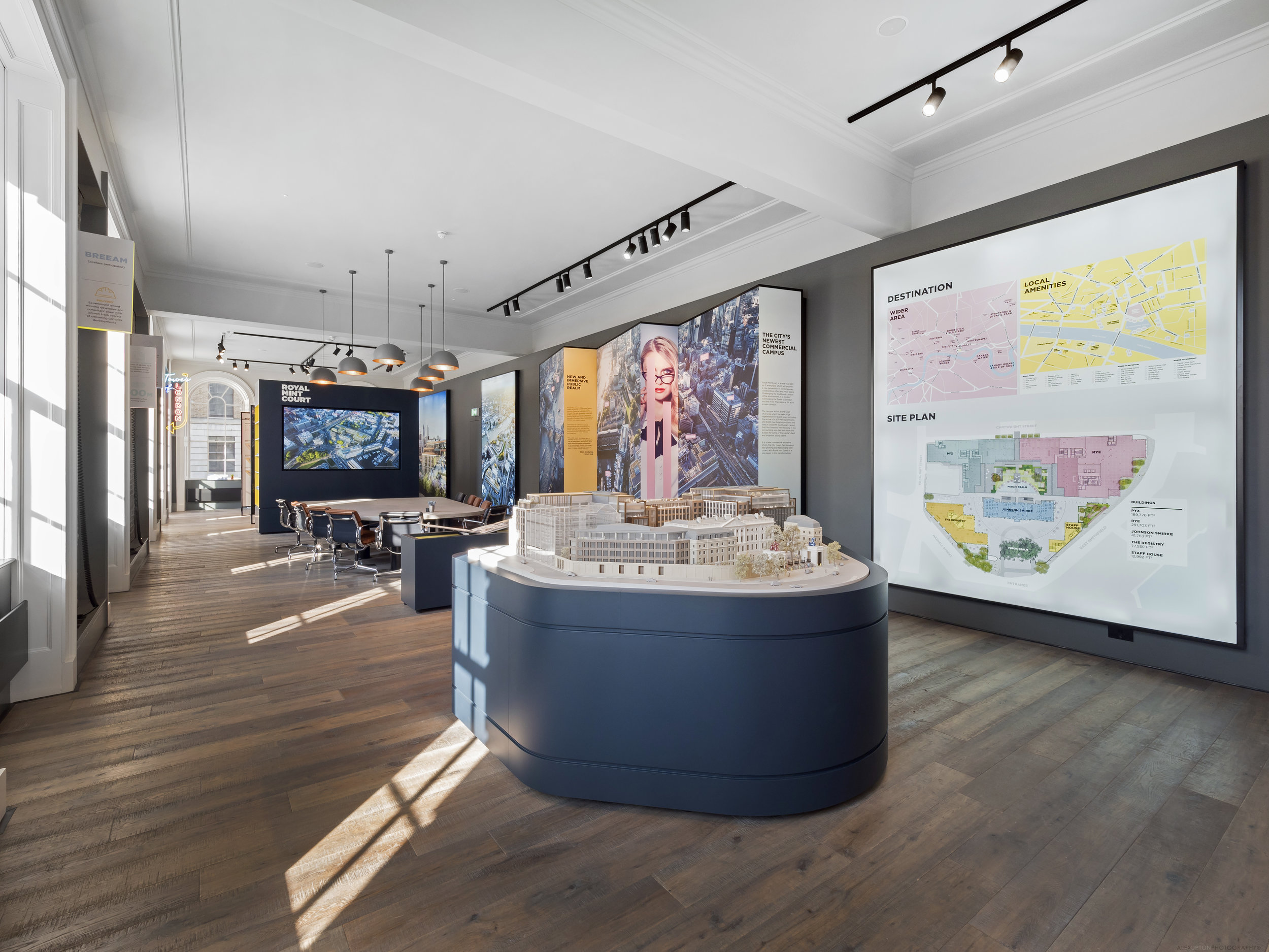
Showroom model of the proposed redevelopment of Royal Mint Court.

Showroom model of the proposed redevelopment of Royal Mint Court.

The architectural photography of Royal Mint Court which I undertook for the client captures the showroom displays; including 3D models of the proposed development, detailed information on the proposals along with interactive displays and writing on the sites historic context. There is also a pool room equipped with a bar and jukebox upon entering the building. The new development proposed by British property developers Delancey would be an office led scheme with the inclusion of new public spaces. While incorporating historic elements of the site it would also include the addition of several distinctively modern buildings.

Visualisations of the proposed Royal Mint Court development.

Visualisations of the proposed Royal Mint Court development.

Before further exciting any readers over the details of the proposed development it should be noted that the scheme will now almost certainly be revised as the People’s Republic of China recently acquired the site from Delancey and the LRC Group with the intention of converting it into their new Embassy. The buildings fortified grounds, heritage and central location all no doubt being driving factors in their decision to relocate there.

Conference area for potential clients and visitors.

Conference area for potential clients and visitors.

While it's disappointing to discover Sheppard Robson Architects' Royal Mint Court scheme will never likely see the light of day - especially after photographing its wonderful interior, which hints at what could have been - it is highly likely another grand scheme will follow in its wake as the rush to build landmark Embassies in the capital intensifies.

The Sammy Ofer Centre by Sheppard Robson by Alex Upton

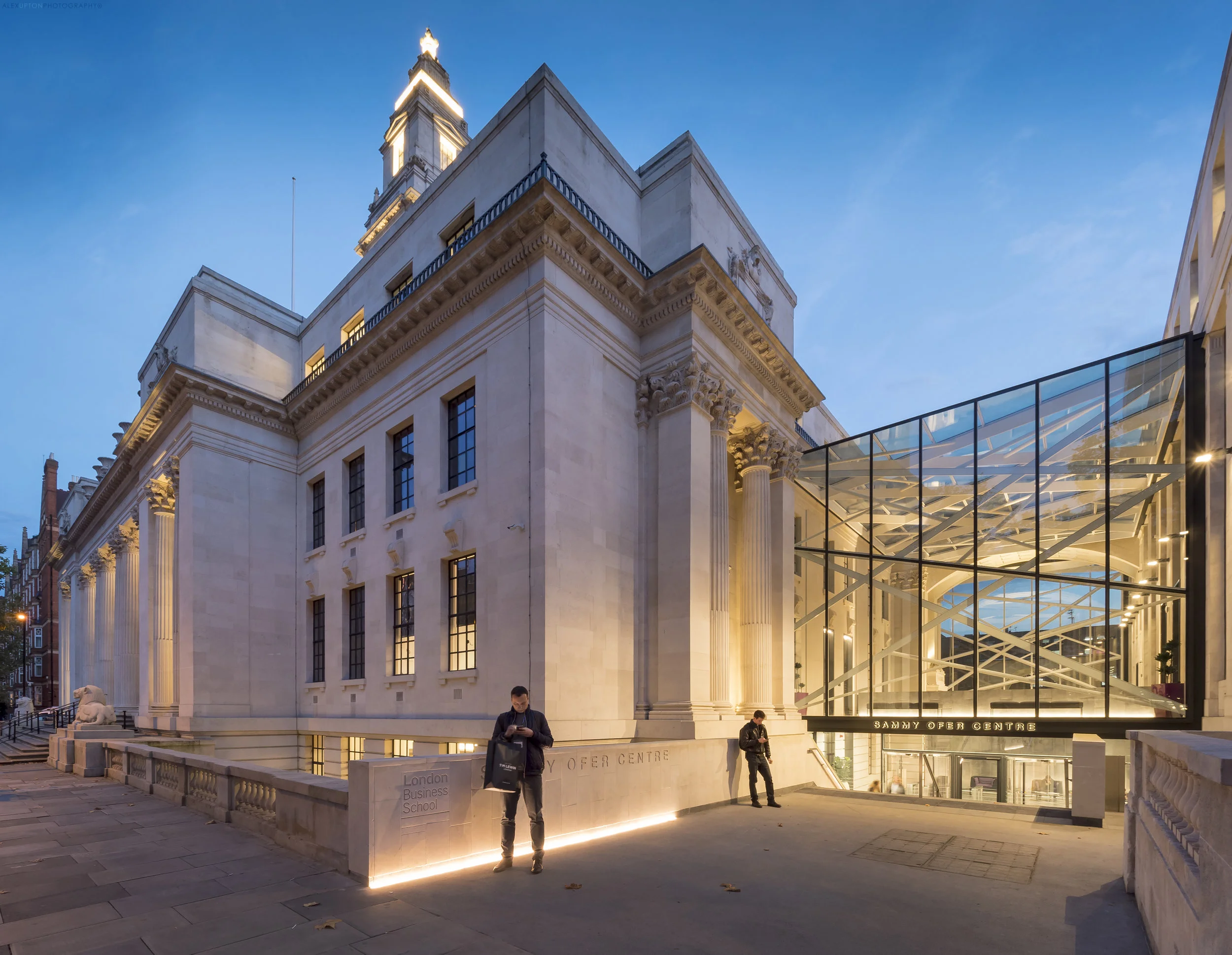
The Sammy Ofer Centre, London Business School by Sheppard Robson 2017. Photography: Copyright © Alex Upton

The Sammy Ofer Centre, London Business School by Sheppard Robson 2017. Photography: Copyright © Alex Upton

London based architectural practice Sheppard Robson recently completed a major renovation of the Old Marylebone Town Hall transforming it into a new, expaned faculty for the London Business School. The Sammy Ofer Centre - named in honour of the late Sammy Ofer, the celebrated Israeli entrepreneur and philanthropist - contains many new facilities including six lecture theatres, 32 seminar spaces, a library, offices and student lounge. The projects most distinctive external feature is the new glass and steel entrance which links the Old Town Hall to the Annex buildings.

The Sammy Ofer Centre - Main Entrance.

The Sammy Ofer Centre - Main Entrance.

I was commissioned by Sheppard Robson architects to photograph several specific views externally, along with some interior shots that matched up identically in composition and framing to a series of black and white originals taken many years previously and held in the RIBA's photographic archive. Unfortunately I don't have access to these images presently so am unable provide side by side comparisons.

The Sammy Ofer Centre - Rear Elevation.

The Sammy Ofer Centre - Rear Elevation.

At the buildings rear are further contrasts between the old and new elements; in front of the new atrium is a lone retained arch and further down, an new angular limestone and glass curtain wall which nudges up to the original more ornate stonework. Housed within this new structure are the six lecture theaters, the largest two of which conjoin to create a space with the capacity to seat 200 students.

The Sammy Ofer Centre - Private and comunal study area.

The Sammy Ofer Centre - Private and comunal study area.

Sheppard Robsons' interior design team ID:SR worked on the buildings internal fit out which comprises new modern spaces alongside retained, renovated elements of the original Old Marylebone Town Hall. There is a level opulence befitting of the schools prestigious reputation and the new furnishings work in harmony with the more classical elements of the original structure.

The Sammy Ofer Centre - ID:SR's new furnishings.

The Sammy Ofer Centre - ID:SR's new furnishings.

The irregular floor plan of the original building, with its alcoves and long narrow corridors has been utilised by ID:SR to great affect; creating areas for private discussion and study alongside other more open, less defined spaces which are more likely to promote encounters among students and hence being conducive to the exchange of ideas and discussion - an integral function of a business school.

The Sammy Ofer Centre - One of the two main lecture theaters.

The Sammy Ofer Centre - One of the two main lecture theaters.

The new lecture theaters, of which there are six, are strikingly modern with wooden panels and strip-lighting traversing the walls and ceiling, ebbing out jagged contours which follow the dynamic alignment of seating below. All of this is reminiscent of some of the grand architectural designs found in modern philharmonic halls and theater spaces.

The buildings scale is hard to comprehend externally, compounded by the many divisions of its internal space to incorporate a variety of uses throughout. The fact that there is a harmony of contrasts within, and on the outside, is testament to  Sheppard Robson Architects careful and considered approach to the renovation. More images of this building can be found in under my projects.

Location: Marylebone Road, Paddington, London.
Developer: London Business School
Contractor: Wates Construction
Photography Client / Architect: Sheppard Robson

Photographers Diary: Architecture 02 by Alex Upton

Here's another quick update of some recent architectural photography projects I have been working on over the past few weeks, months, years - keeping this page up to date demands a surplus of time which I currently don't possess. More images of the individual projects will become available when I am permited to release them, for now please enjoy these teasers.

Creechurch Place by Sheppard Robson Architects. Photography: Copyright © Alex Upton

Creechurch Place by Sheppard Robson Architects. Photography: Copyright © Alex Upton

Creechurch Place, City of London, London, UK.

Joining the ever increasing cluster of high-rise office developments in the City of London's preeminent finance district is Creechurch Place designed by Sheppard Robson Architects for developers Helical. Providing 17 storeys of high-grade, modern, felxible office space the building also features two basement levels with changing rooms, bike storage and more. This is a project I have photographed both externally and internally for the client Sheppard Robson. A more comprehensive set of images covering the development will be added to my portfolio soon so please keep checking back for updates.

Sammy Ofer Centre by Sheppard Robson Architects. Photography: Copyright © Alex Upton

Sammy Ofer Centre by Sheppard Robson Architects. Photography: Copyright © Alex Upton

London Business School, The Sammy Ofer Centre, London, UK.

Again working for the client Sheppard Robson Architects I was commissioned to photograph several exterior shots of their recently completed Sammy Ofer Centre at London Business School. The design, with its distinguished glass and steel entrance connecting two sections of the building is part of a larger transformation of the iconic Old Marylebone Town Hall. The project includes the refurbishment of the Hall’s Council House and Annexe buildings and transforms them into a major new faculty for the London Business School.

BH2 Bournemouth Leisure Centre. Photography: Copyright © Alex Upton

BH2 Bournemouth Leisure Centre. Photography: Copyright © Alex Upton

BH2 Bournemouth, Uk.

BH2 Bournemouth is a major new leisure development in Bournemouth's town centre. The project includes an Odeon cinema, restaurants and retails facilities. I was commissioned to photograph the site by Kalwall UK providers of the translucent cladding system which allows light to permeate from the buildings interior out through its facade illuminating the building. Some interesting events accompanied the photography of this building, all shall be revealed in a future update on the project.

Muswell Hill by PH Plus Architects. Photography: Copyright © Alex Upton

Muswell Hill by PH Plus Architects. Photography: Copyright © Alex Upton

Muswell Hill, London, UK.

Easily going unobserved due to its slightly concealed location, Muswell Hill, designed by PHplus Architects is a beautiful little development comprising a community centre, commercial space and several residential units. I was commissioned by facade specialists Taylor Maxwell to photograph the site which utilises the distinctive brick work the supplied for the project. The distinctive design of the residential units follows the contours of the sloping site and I can't help wishing i was a resident of one of the lovely apartments. More images coming soon.

Wilfred Brownby Sheppard Robson Architects. Photography: Copyright © Alex Upton

Wilfred Brownby Sheppard Robson Architects. Photography: Copyright © Alex Upton

Brunel University, Wilfred Brown Building, Uxbridge, London, UK

Recently opened at the start of the new 2017 academic term is another building designed by Sheppard Robson Architects. The Wilfred Brown Building at Brunel University in West London is a major redevelopment of the firms original building that occupied the site since 1968. The building has been transformed into a modern space to accommodate new technologies and provide dynamic spaces for academic collaboration and research. The project is now occupied by the recently formed College of Engineering, Design and Physical Sciences. More images on their way soon.