architecture

BBC DIY SOS: Dale Youth Boxing Club by Featherstone Young by Alex Upton

Architectural Photography of Dale Youth Boxing Club

Architectural Photography of Dale Youth Boxing Club

Location: North Kensington, London, UK.
Developer: BBC and Westway Trust
Architect Featherstone Young
Photography Client: Kalwall UK

Located in the shadow of the elevated A40 road in North Kensington is Bay 20, a plot of land owned and operated by the Westway Trust. The contentious history of the site and the multifarious visions that came and went with the years that it intermittently lay in a state alternating between occupation and dormancy, are well documented in an article by Isabelle Priest in the RIBA Journal. In the wake of the tragedy that was the Grenfell Tower fire in 2018, these unused spaces were utilised by the local communities as places to convene, although the Bay 20 plot remained inaccessible; a dark, desolate space that prompted avoidance.

Rear Entrance to Bay 20 and Dale Youth Boxing Club

Rear Entrance to Bay 20 and Dale Youth Boxing Club

Fortunately this state of impasse was to come to an end when, after the fire, directors at the BBC’s show DIY SOS decided to create something for the community in the area. Working within a two to three week build time the project sought to involve the local residents in the project as much as possible, consulting their opinions at various stages throughout the design process. The suppliers of materials and building contractors, all charitably offered their services free of charge and the architectural practice Featherstone Young were approached to create designs for the two buildings that were to occupy the site.

Reception area for Dale Youth Boxing Club

Reception area for Dale Youth Boxing Club

One of the buildings, it was decided, was to be the new home to the Dale Youth Boxing Club, which had formerly been based in the first floor of Grenfell Tower. This was the particular building for which I was commissioned to photograph both the interior and exterior spaces, by the client Kalwall UK, whom I had previously worked on a number of interesting projects with, such as West Croydon Bus Station and the Benenden Hospital Redevelopment. For the client this was an unique project as it saw their Kalwall curtain walling integrated seamlessly with intermittent panels of glazing, the product making up nearly the entirety of the external structure. As with the previous projects I had photographed by day these semi-opaque panels allowed natural light to gently permeate the buildings interior, while at night inverting this effect.

Dale Youth Boxing Club Exterior

Dale Youth Boxing Club Exterior

Dictated by the contours of the site the new Dale Youth Boxing Club fits snugly underneath the flyover and features, over its two floors, a fully equipped training area, boxing ring and changing rooms. On my final visit to photograph the project in the early evening it was great to see the local residents, especially the children, making use of both the new walkway that the site has opened up and the facilities it offers -uninhibited by the anxiety that the site once projected. In the evening the space really comes to life with the gym’s internal light illuminating the building and the colourful panels of the community centre opposite creating a welcoming environment.

Training facilities inside Dale Youth Boxing Club

Training facilities inside Dale Youth Boxing Club

For those interested in seeing the project come to life, it’s conception, design and construction was featured over two episodes of the BBC’s DIY SOS programme. Like all new developments, their is often an air of apprehension and distrust in the local community as to how much they will benefit from them, but it is safe to say from my own visits to the site that these fears have been allayed and the locals, especially the children have really embraced the project and are already making great use of it.

BBC DIY SOS Dayle Youth Centre 7.jpg

In terms of both architecture and materials Bay 20 and The Dale Youth Boxing Club exemplify the transformative power of architecture and what can be done with limited resources, space, and a potentially oppressive location. The hard work of all those involved and their charitable donations have created a wonderful space where the local community can come together and experience a place that they helped to shape. It is sometimes these smaller, community based projects that make architectural photography such a rewarding profession; witnessing the local children and parents utilising and having fun in the space is surely sign of a successful endeavour.

Brunel University Wilfred Brown Building by Sheppard Robson by Alex Upton

Brunel University Wilfred Brown Building.jpg

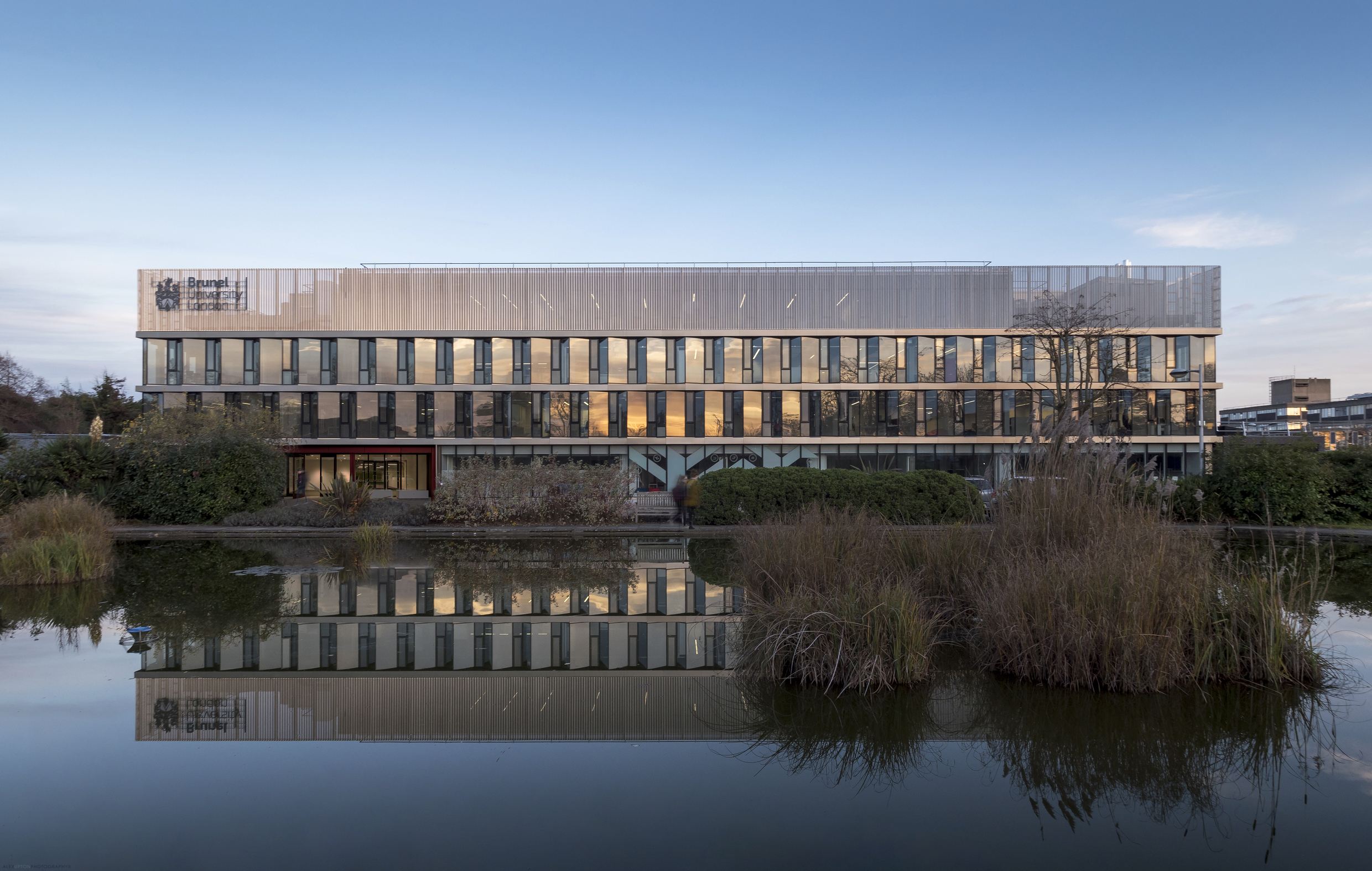
Delving once again into the architectural photographers archive here is yet another project I have unearthed; Brunel University’s refurbished Wilfred Brown Building by the London-based Sheppard Robson architectural practice. Almost immediately after completing the photography of One Creechurch Place in late 2017 for the same client another completed project awaited me, this time in the form of the Wilfred Brown Building which houses the College of Engineering, Design and Physical Sciences for Brunel University. The project can be found situated amongst the University’s large campus located on the fringe of West London in the town of Uxbridge.

brunel-university-wilfred-brown-building.jpg

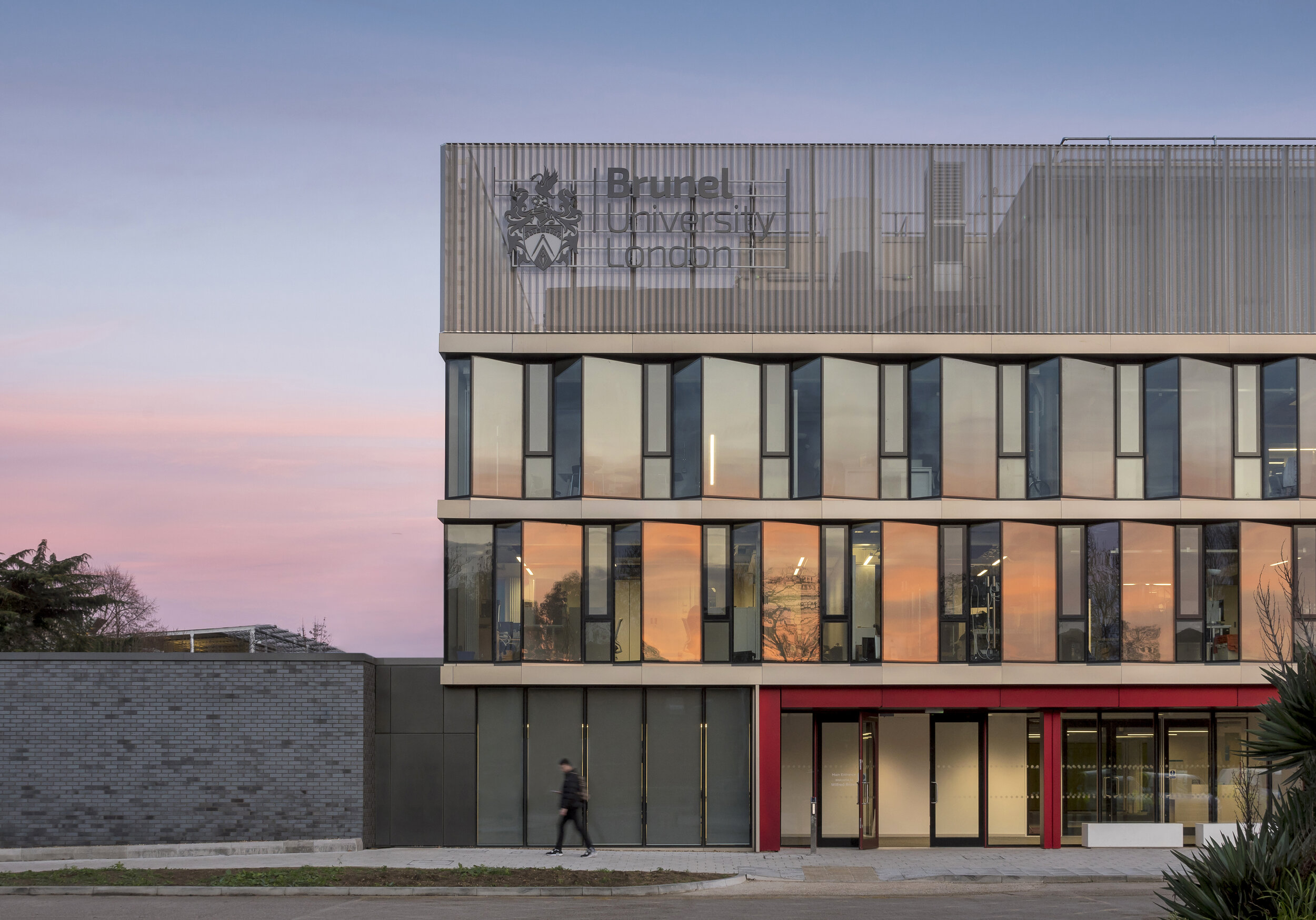
The Wilfred Brown Building was originally delivered by Sheppard Robson in 1968 followed by a rooftop extension in 1990. Like many Universities, findings itself amidst a flux of expansion in student numbers and a need to accommodate cutting edge learning facilities Brunel commissioned a modernisation of the building. Relieved of its aging skin the structure was stripped back to its concrete frame and re-clad with a ‘saw tooth’ facade, which according to Sheppard Robson is comprised of a ‘north-west facing clear glazing and west, south-west facing glazing with interstitial architectural mesh to provide solar shading’. Situated above this is a crown of perforated profiled metal which compliments the glazing below.

Brunel University Wilfred Brown Building 3.jpg

The building, situated on the universities western boundary is accompanied by a quaint pond - home to several ducks and a scattering of Water Lilies - creating an idyllic microcosm amidst the hustle and bustle of campus activity. For any trivia buffs, an episode of the BBC comedy Cuckoo was filmed outside the building when the families son attended an unnamed University. When photographing the building it came to my attention that one of the aesthetic qualities the jagged facade expertly accentuates is a reflected sunset, as seen in the Miami-esque shades of pink and orange intermittently captured along the glazed panels.

Brunel University Wilfred Brown Building 4.jpg

Internally the building is fitted out by Sheppard Robson’s interior design department ID:SR. Due to its multiple uses, a variation in the design elements and application of colour make an intuitive and easily navigable space. Corridors and open spaces are punctuated by both private and public study areas, formed from colourful sofas and chairs which offer both comfort and a level of concealment. Other rooms are home to more specialised equipment, assessment, interview and meeting rooms, as well as several large spaces for lectures and faculty meetings. As when having photographed other University buildings in the past, a brief exposure to campus life is enough to draw on a sense of nostalgia for a simpler, more fun, albeit debt driven way of life, compelling one to abandoned the strictures and ennui of working life and take up a lengthy degree course.

Location: Uxbridge, London, UK.
Developer: Brunel University
Contractor: ARJ Construction
Architect / Photography Client: Sheppard Robson

One Creechurch Place by Sheppard Robson by Alex Upton

One Creechurch Place Sheppard Robson.jpg

Location: 1 Creechurch Lane, City of London.
Developer: Helical
Contractor: Skanska
Architect / Photography Client: Sheppard Robson

Still playing catch up with the long list of projects I have photographed over the past year, here is another from the neglected archives - which really should have received attention much earlier, alas a hectic work schedule prohibited my bringing it to your attention. One Creechurch Place is a rather large - 25,315 sqm to be precise - modern, office development located on the eastern edge of the City of London. While not yet obtaining a fancy epithet of its own, unlike those imaginatively designated to the company it sits in; The Scalpel, Gherkin, Cheese-grater et al. the building is just about large enough at 18-stories to make its presence known. Designed by London based architectural practice Sheppard Robson the building was completed in late 2017, which is around the time when I was commissioned to photograph the project.

One Creechurch Place Sheppard Robson 2.jpg

To disperse the buildings bulk it takes on the form of a cluster of towers varying in height, each adorned with horizontal and vertical fins which deviate in their rhythms of appearance. This external matrix tracing the facade lends the building a modernist aesthetic reminiscent of GMW Architects 1969 building, St Helen’s Tower, also know as 1 Undershaft, which is located just a short walk away. As can be seen in the above photograph a canopy is created over the main entrance where just beyond a public space exists, this area hosts temporary installations and sculptures as part of the City of London’s cultural programme.

One Creechurch Place Sheppard Robson 4.jpg

According to the architects Sheppard Robson the building’s ‘principal cladding system is a unitised, interactive double skin – a double-glazed inner layer, single-glazed outer layer and an operable blind in the cavity between.’ Which ‘allows control of solar gain and optimises natural daylight within the offices.’ It is environmentally friendly considerations like this that enabled the development to achieve a BREEAM ‘Excellent’ rating, keeping it in line with the innovative requirements needed of new buildings in the City. Moving Internally the building features a number of perks for the tenants, with the lobby area accommodating a cafe and the basement floors housing high-quality changing rooms, shower facilities and a generous parking facility for bikes.

One Creechurch Place Sheppard Robson 5.jpg

The buildings refined external austerity makes it a somewhat humble addition to the City of London’s ever evolving skyline, which to date has been a breeding ground for a cacophony of architectural peculiarities each trying to out compete each other to gain the crown bestowed on the most irregular form. One Creechurch Place has been designed within the boundaries of height restrictions that need to be adhered to for its location, making use of subtle shifts in form to accommodate this, while still maximising floor-space for the developer Helical. It maybe be that more reserved additions like this to the City will help balance out the skyline, making it more coherent and less flamboyant.

Photographers Diary: Architecture 03 by Alex Upton

Architecture and a Sense of Scale

Below are a selection of photographs I shot over the past few months which aim convey a sense of architectural scale between building and individual. In some instances there is a genuine attempt to express the relationship between the two, while in others i have endeavoured to exaggerated the scale through various approaches to framing the subject and building, hinting at a different interpretation entirely. The individuals depicted are mostly isolated from the default hustle and bustle of their busy locations, with the intention to permit the viewer to interpret their thoughts and imagine their journeys against these architectural backdrops.

Royal National Theatre - South Bank, London Photography: Copyright © Alex Upton

Royal National Theatre - South Bank, London Photography: Copyright © Alex Upton

Royal National Theatre

Architect Denys Lasdun's National theater on South Bank is an impressive Brutalist mass of concrete. It is wonderful to photograph on a sunny day when its sharp, angular form casts deep, dynamic shadows over its surface. Trying to isolate a subject in this busy area is no easy feat. Fortunately, after a protracted, impatient wait I was rewarded by this lone passerby, who can be seen dragging his reluctant, outstretched shadow along with him as he goes about is business. The additional shadow of a bird in flight also momentarily graces the Theaters facade.

Tate Modern, The Blavatnik Building - London. Photography: Copyright © Alex Upton

Tate Modern, The Blavatnik Building - London. Photography: Copyright © Alex Upton

The Blavatnik Building

At the point where the old and new brick of the Tate Modern meet in a distinct yet reverent embrace, a rear entrance can be found over-scored by a panel of bright orange announcing 'welcome'! Having visited the gallery a number of times I already have a fair number of photographs piled up on my hard-drive awaiting a distant day of editing. On this occasion the artist collective SUPERFLEX had installed a complex structure of grey and orange painted steel frames, bearing fruit in the form of countless swings. In this photograph i was lucky to capture an appropriately orange clad visitor entering the building just at the decisive moment.

V&A Extension, London. Photography: Copyright © Alex Upton

V&A Extension, London. Photography: Copyright © Alex Upton

V&A Museum Exhibition Road Quarter

As if the Victoria & Albert Museum didn't already have enough space to display their many wares, they commissioned British, Stirling Prize-winning, architect Amanda Levete to openup the ground beneath the existing building and insert a new gallery space to accommodate their headline exhibitions. I happened to be working on a job close by at Imperial Collage London and decided to pop into the new cafe and take a look around. The sun was almost, but not quite, in the perfect position as i came out and with no time to spare I captured the above image of an lone visitor, more engrossed in his phone display than the monumental architecture surrounding him.

Seven Pancras Square - King's Cross, London Photography: Copyright © Alex Upton

Seven Pancras Square - King's Cross, London Photography: Copyright © Alex Upton

Seven Pancras Square

Exiting the rear of St. Pancras Station you are confronted by Studio Downie Architects new build office which wraps around the existing Grade II Listed Stanley Building. In this busy vicinity it's low, tapering wall plays the presumably unintended role of a perch for those recuperating after a long and most likely delayed journey, or for workers looking for a momentary escape. Isolating the individuals and building like this adds a sense of wonder and intrigue directed at both the building, location and human subjects.

 Library of Birmingham. Photography: Copyright © Alex Upton

 Library of Birmingham. Photography: Copyright © Alex Upton

The Library of Birmingham

While photographing another project in Birmingham's Arena Central development area i felt compelled to take advantage of a rare cloudless, blue sky. Out on the decks of Mecanoo Architect's new Library of Birmingham were a number of sightseers, gazing and pointing, no doubt at the vast up-earthed portions of the city which are undergoing a massive phase of regeneration. Isolated like this the building appears to my eyes an enormous vessel in flight, the passengers in awe as they make their voyage to unknown territories. 

1 Undershaft (Aviva Tower) by OAG by Alex Upton

1 Undershaft - Photography: Copyright © Alex Upton

1 Undershaft - Photography: Copyright © Alex Upton

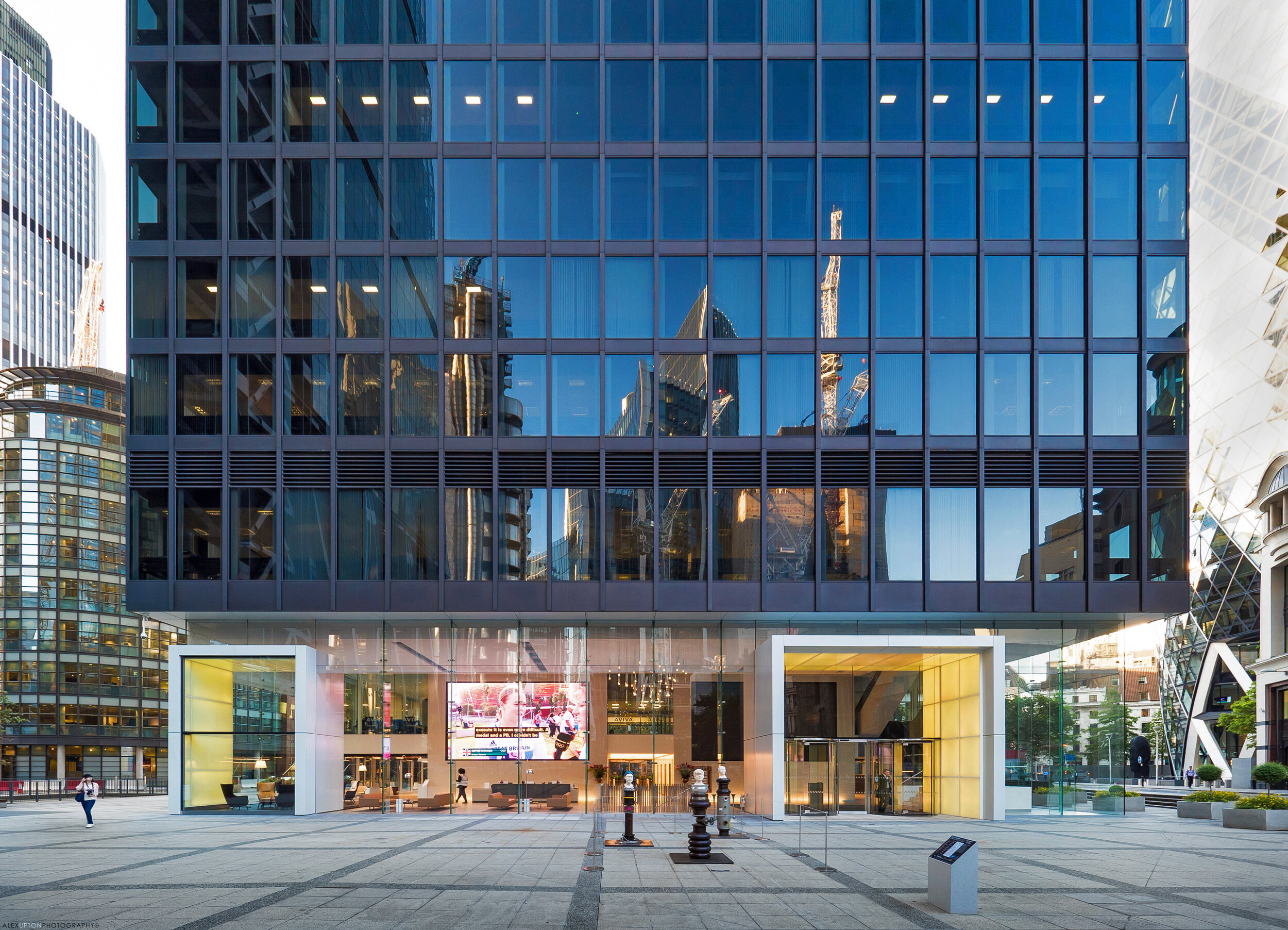
1 Undershaft, also know as both St Helen's and Aviva Tower recently underwent a internal and external renovation spanning the first and second floor lobby area. Bespoke glazing specialists OAG commissioned the following set of images to document their contribution to the site.

1-undershaft-aviva-tower

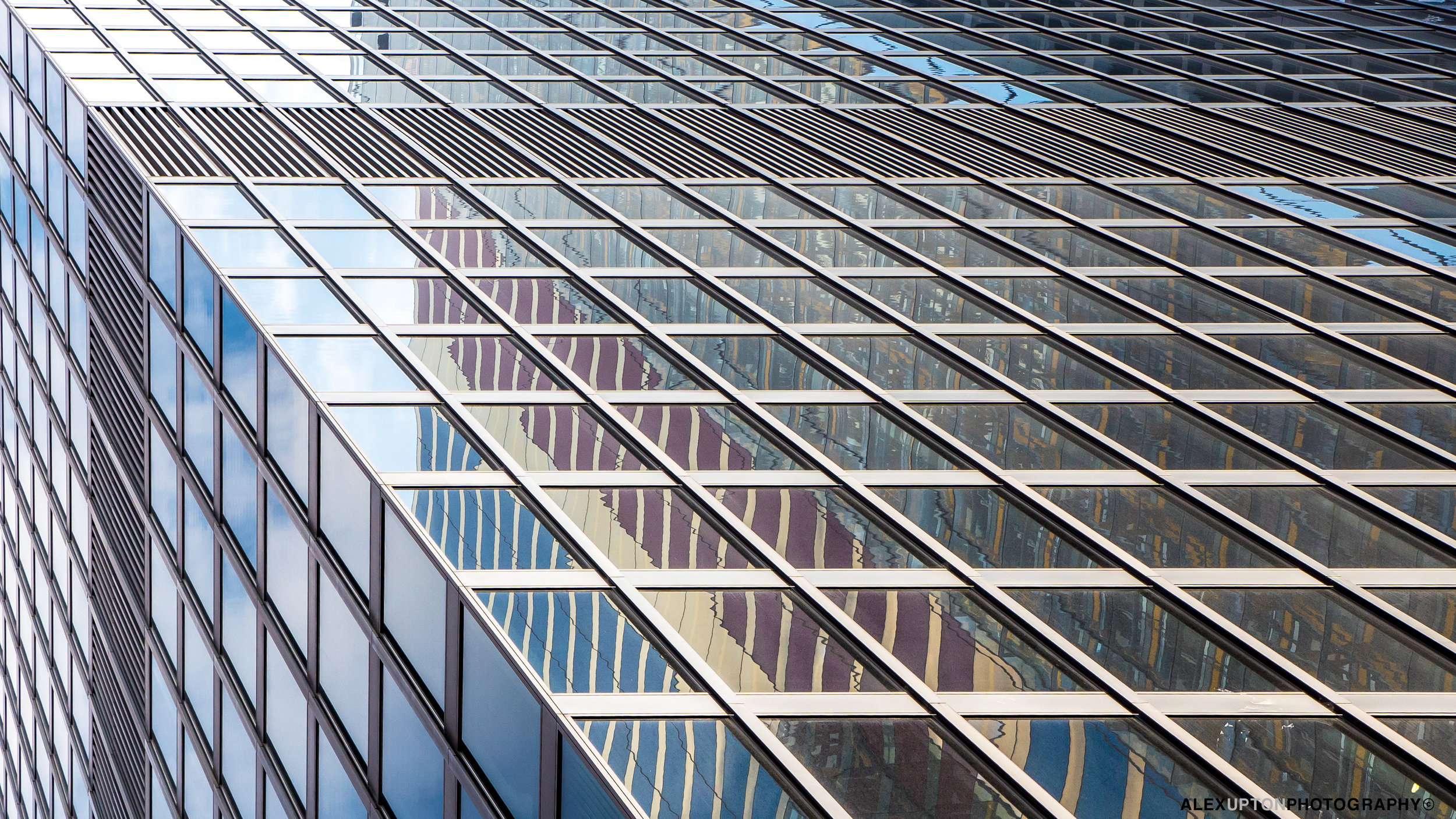
The 23 storey tower, home to insurance giant Aviva was originally completed in 1969 by architects Gollins Melvin Ward. With its restrained modernist styling 1 Undershaft can appear austere in the company of Norman Foster's 30 St Mary Axe and Richard Rogers 122 Leadenhall, yet its simplicity and rigid geometry offer a somewhat calming presence not offered by its flamboyant neighbours.

Aviva Tower Facade Detail

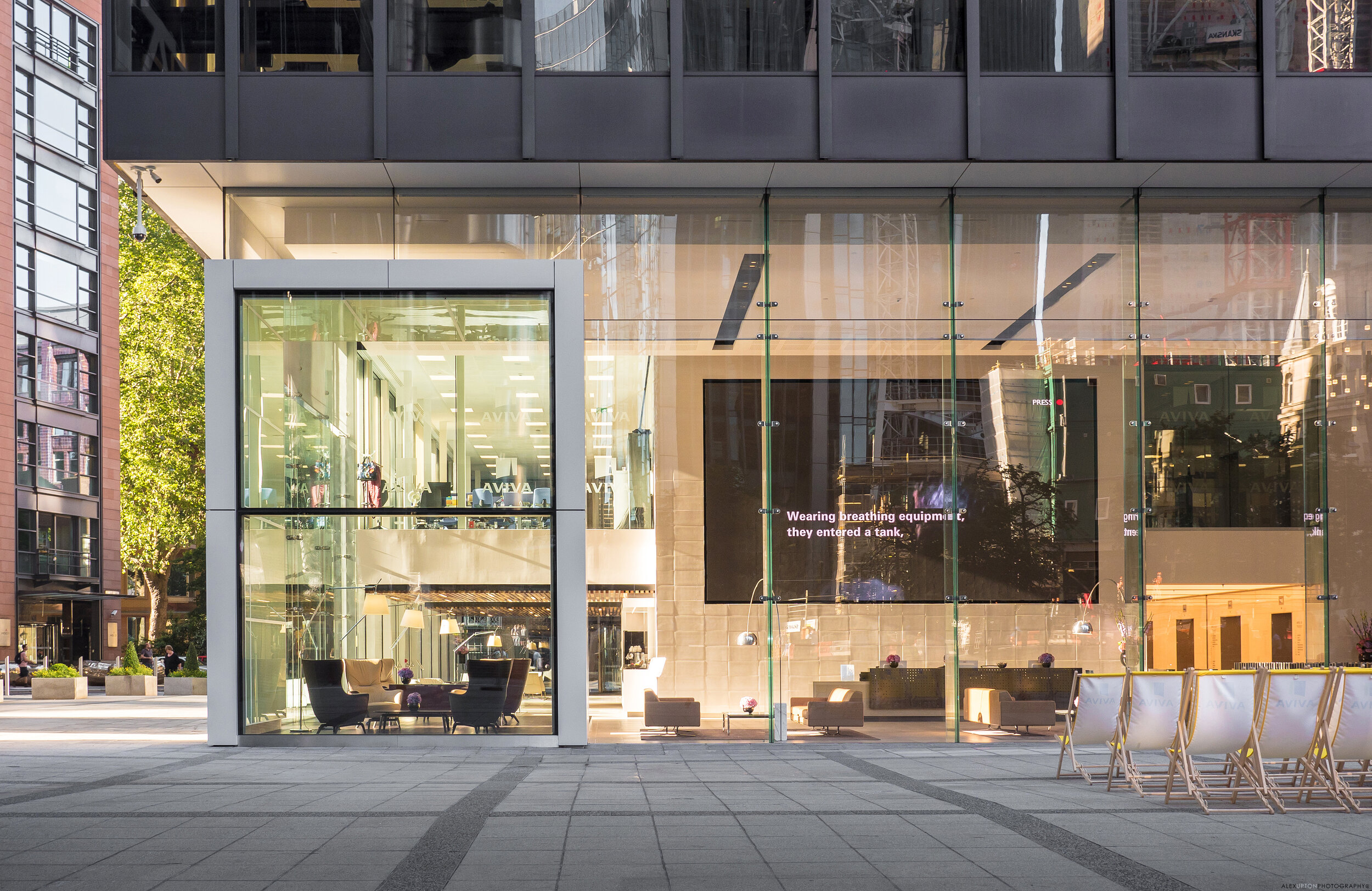
With the need to bring the buildings interior and entry level space into the 21st century OAG working with COMO have introduce 7.6 metre high glass fins, weighing in at just under a tonne each to create a impressive transparent facade. Internally with the assistance and digital expertise of Light Lab OAG have transformed the space into a technical haven with LED back lit panels surrounding the entrance and projecting feature pods which add colour and depth to the surface.

1-undershaft-architecture

Internally a giant display projects various data streams to passers by, at the time of photographing the building the Olympic Games were being televised with seating outside for the weary office workers to lay back in, relax and recuperate. Undoubtedly there are some Deleuzian theoretical gems waiting to be extracted from the notion of city workers sitting watching other city works through a screen like facade which in itself contains another screen - insights relating to levels of opacity in financial markets, multi layered screens and work / leisure time divisions abound, but I will leave such endeavours to those more qualified. 

11-undershaft.jpg

Occupied by over 3000 office workers the transformations to 1 Undeshaft were carried out with little disturbance to the buildings daily functioning. What could have simply been a functional facade has become and interactive, dynamic space, which is both impressive for its scale, quality, innovation and bold style. Inviting the public to engage with the building does away with the notion that the facade should be a barrier between those on the inside and those on the outside. For further photographs documenting the renovation head over to 1 Undershaft listed in my projects gallery.   

1 Undershaft

Afterword: The future of 1 Undershaft 

After suffering heavy damages in the 1992 Baltic exchange bombing the Towers continued existence looks under threat once again with the emergence of plans for its replacement by a 72 storey tower set to be the City of London's tallest building if completed. This eventuality is still yet to be approved and remains as of now a distant prospect, so for time being at least the towers occupants, and the passing public can enjoy its hi-tech renovation. 

Lexicon Tower by Skidmore Owings & Merrill by Alex Upton

Lexicon Tower - Photography: Copyright © Alex Upton

Development: Lexicon 261 City Road
Architects: Skidmore Owings & Merrill (SOM)
Location: City Road, Islington, London
Height: 115m (36fl)

Lexicon Tower - Photography: Copyright © Alex Upton 

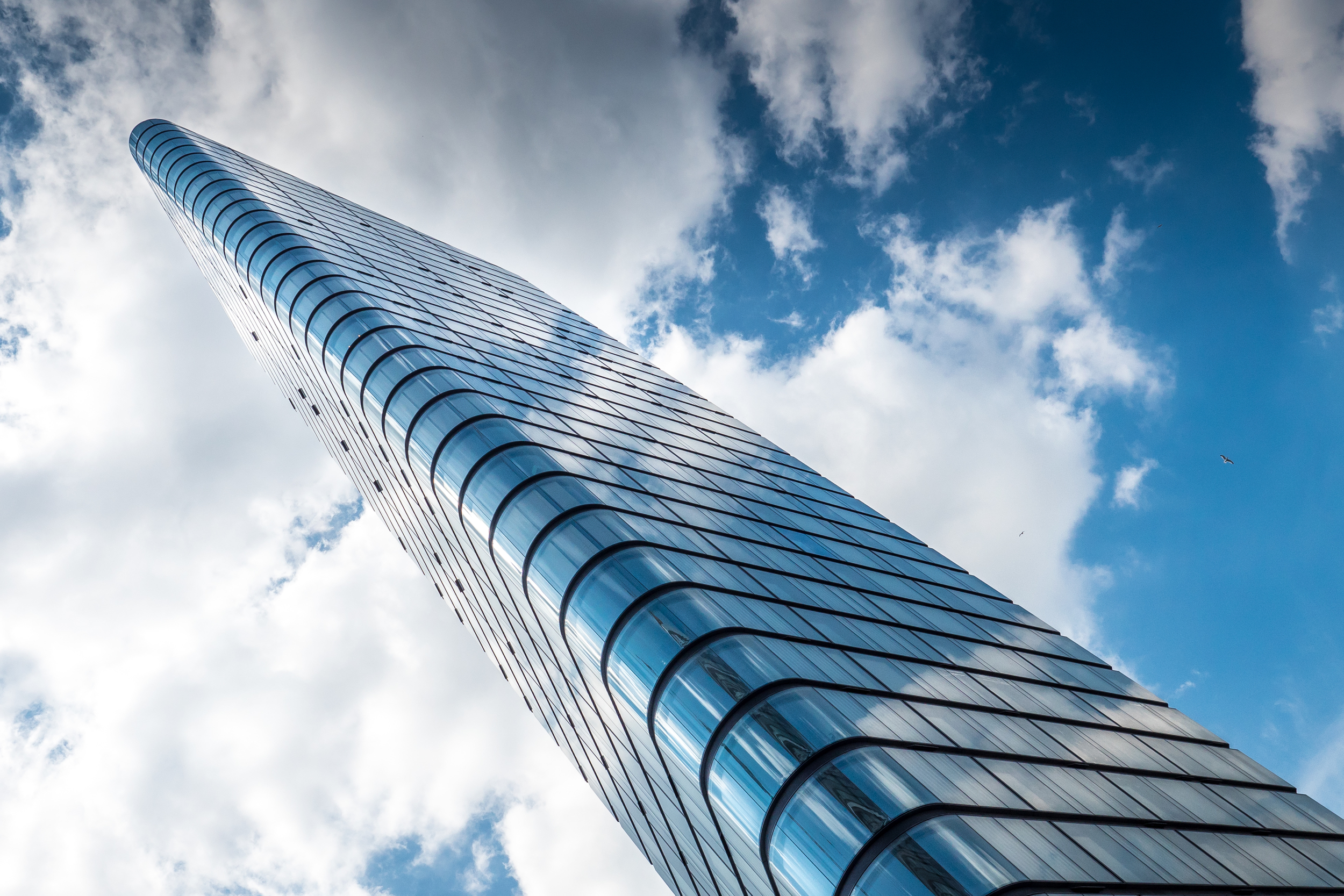
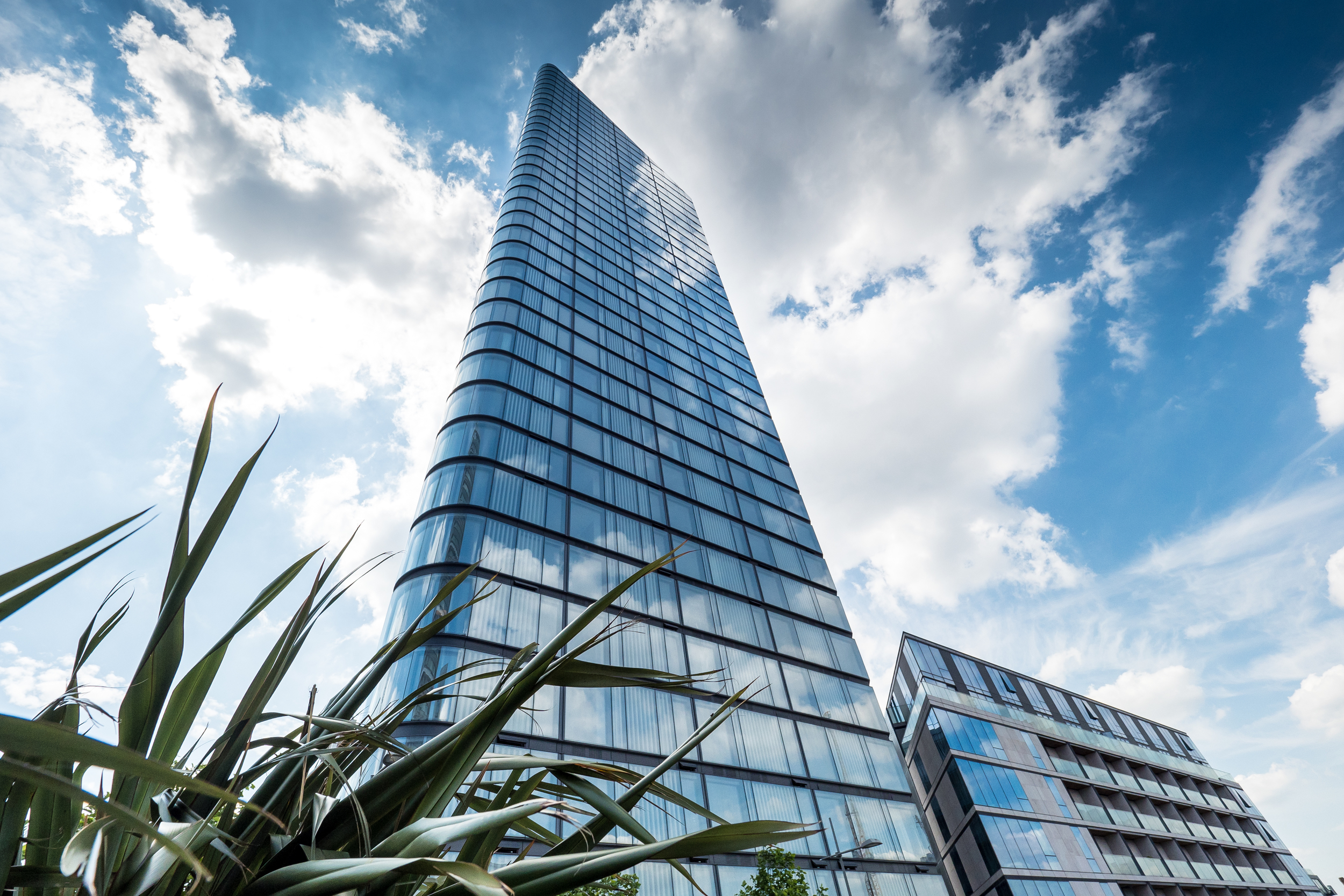
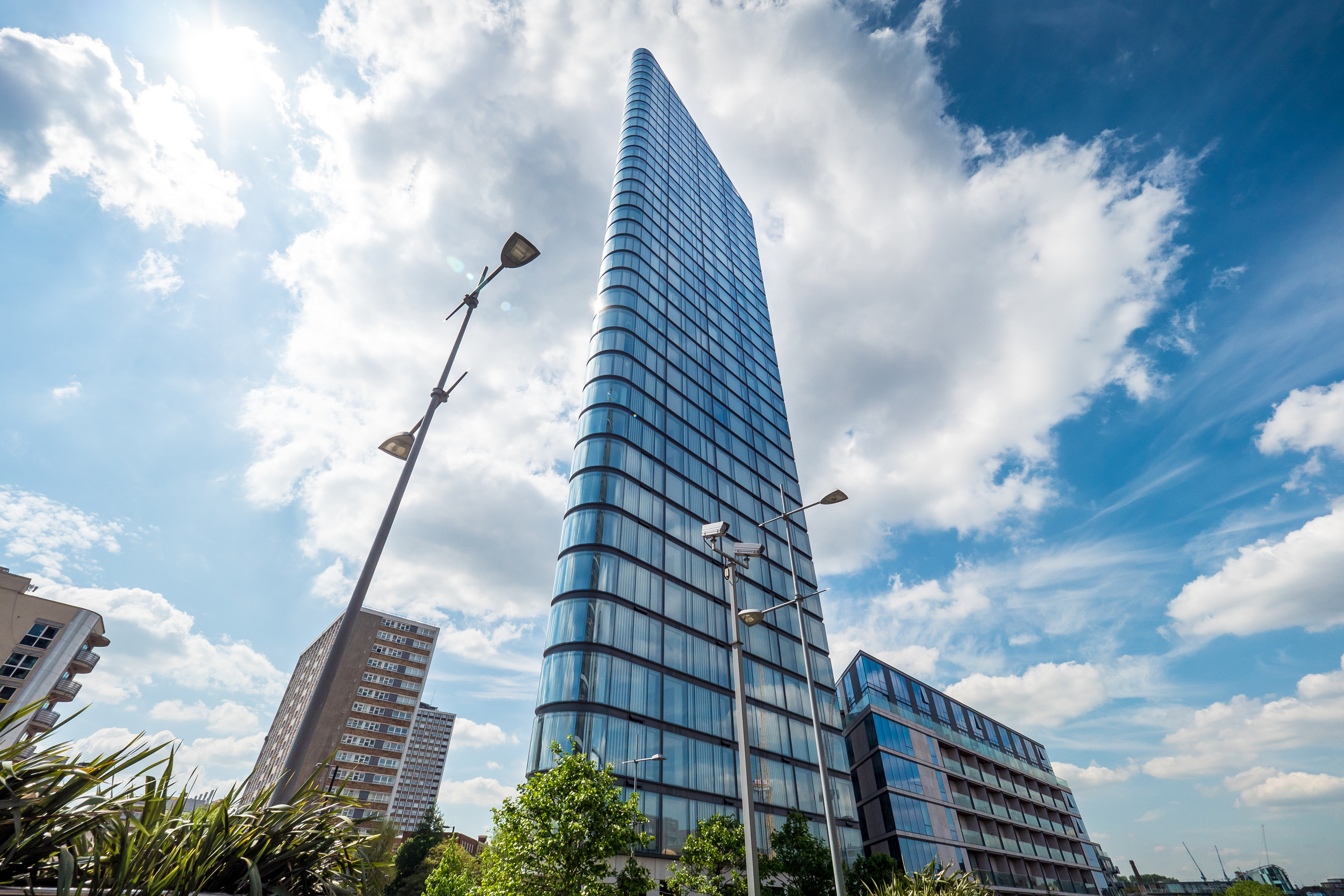
The Lexicon is a residential development by Mount Anvil which stands adjacent to Canaletto Tower on the waterfront, just beside City Road. It is one of a number of new high-rise buildings to spring up on this stretch of road, alongside Make architects Atlas Building, Foster and Partners 250 City Road and the recently completed The Eagle and Montcalm Signature Tower developments by Terry Farrell & Partners and Squire & Partners collaboration with 5plus architects respectively.

Lexicon Tower - Photography: Copyright © Alex Upton

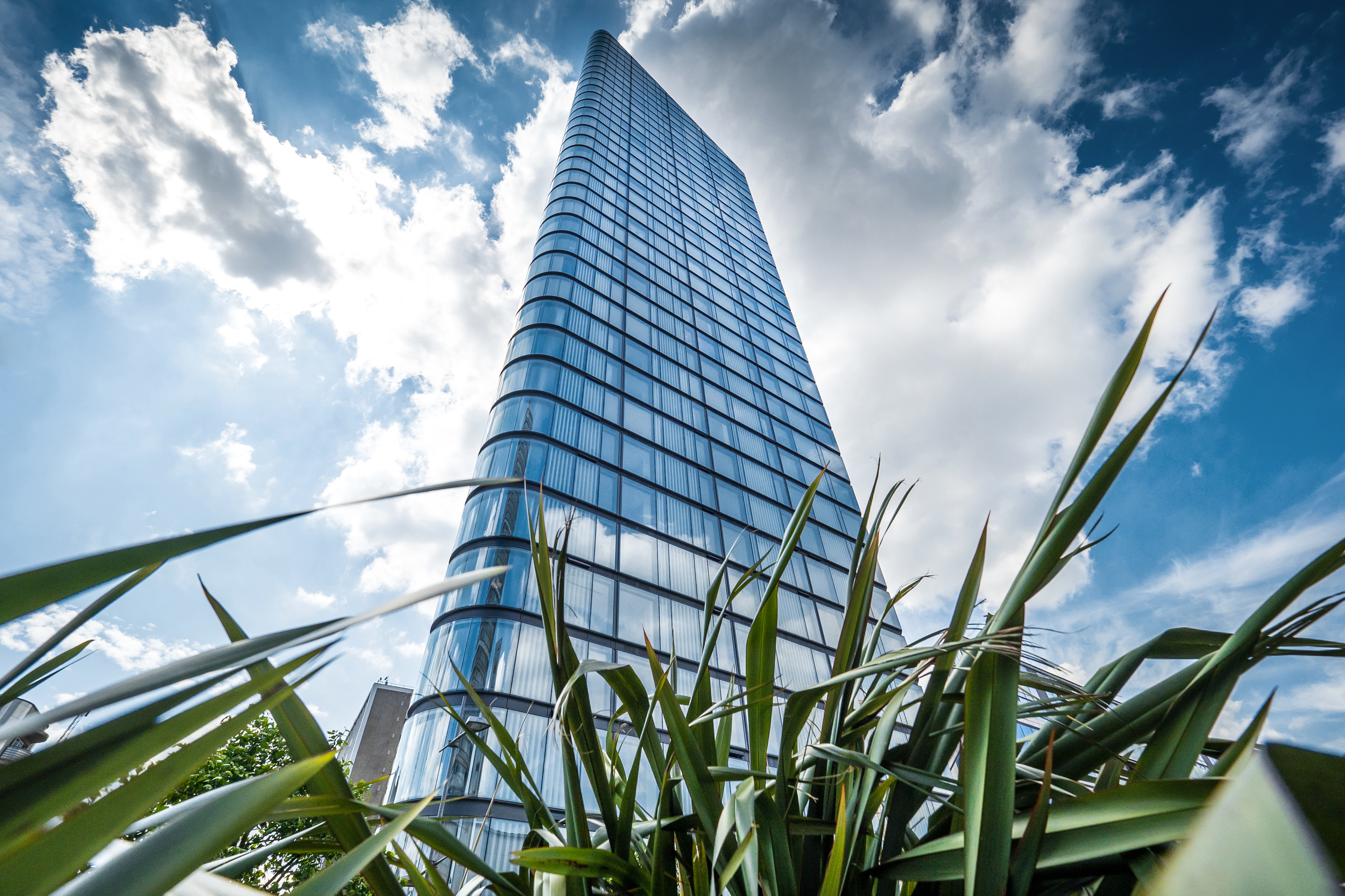
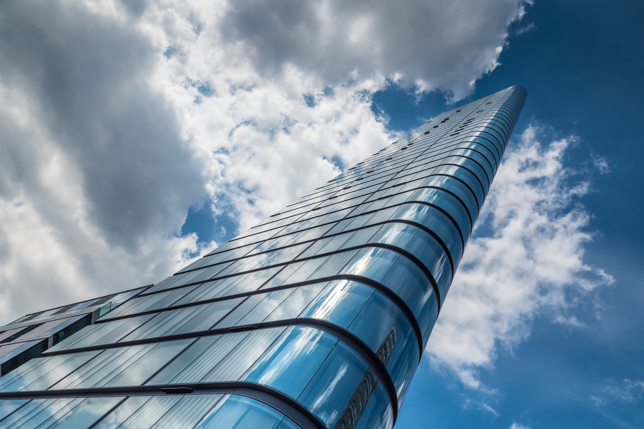
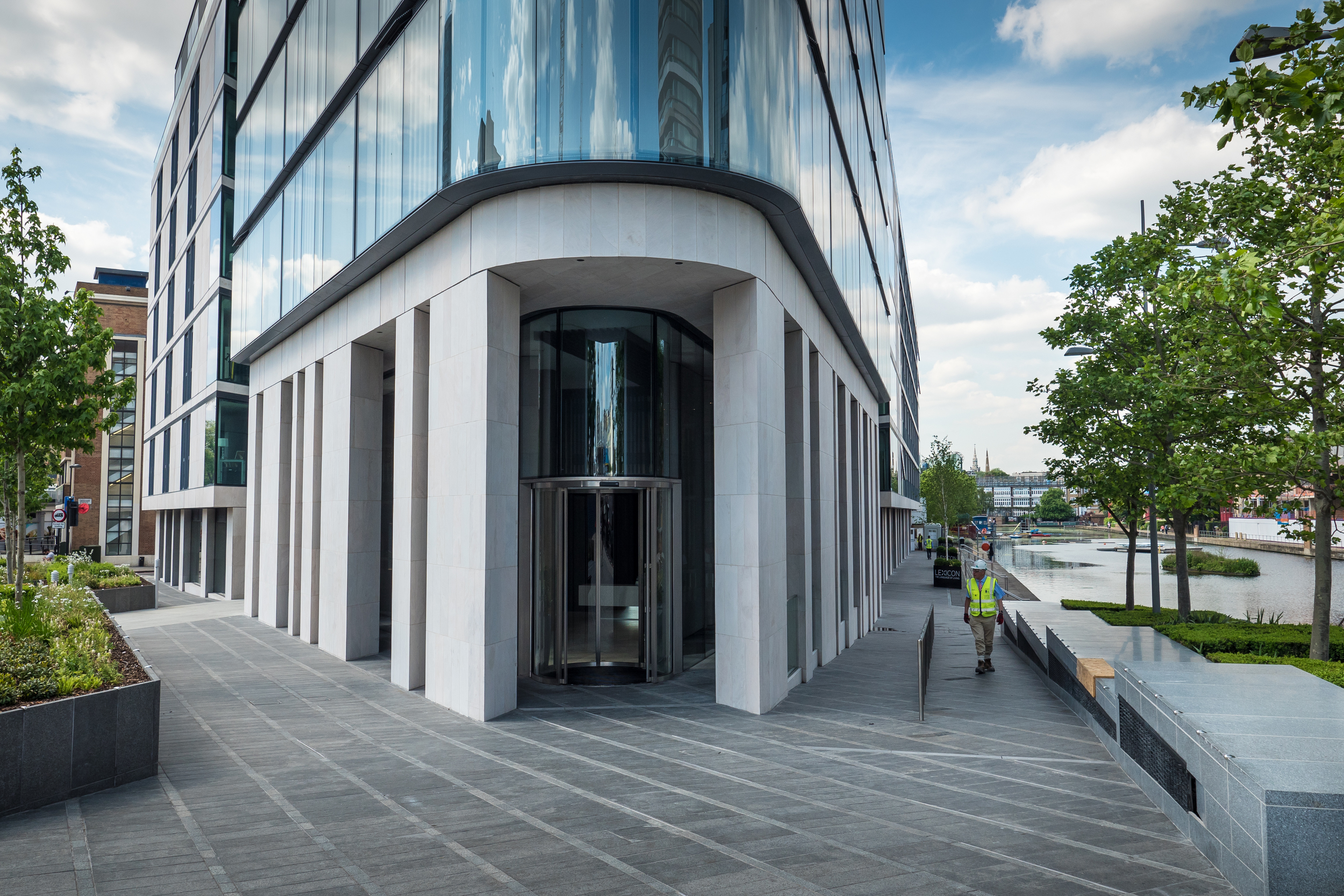
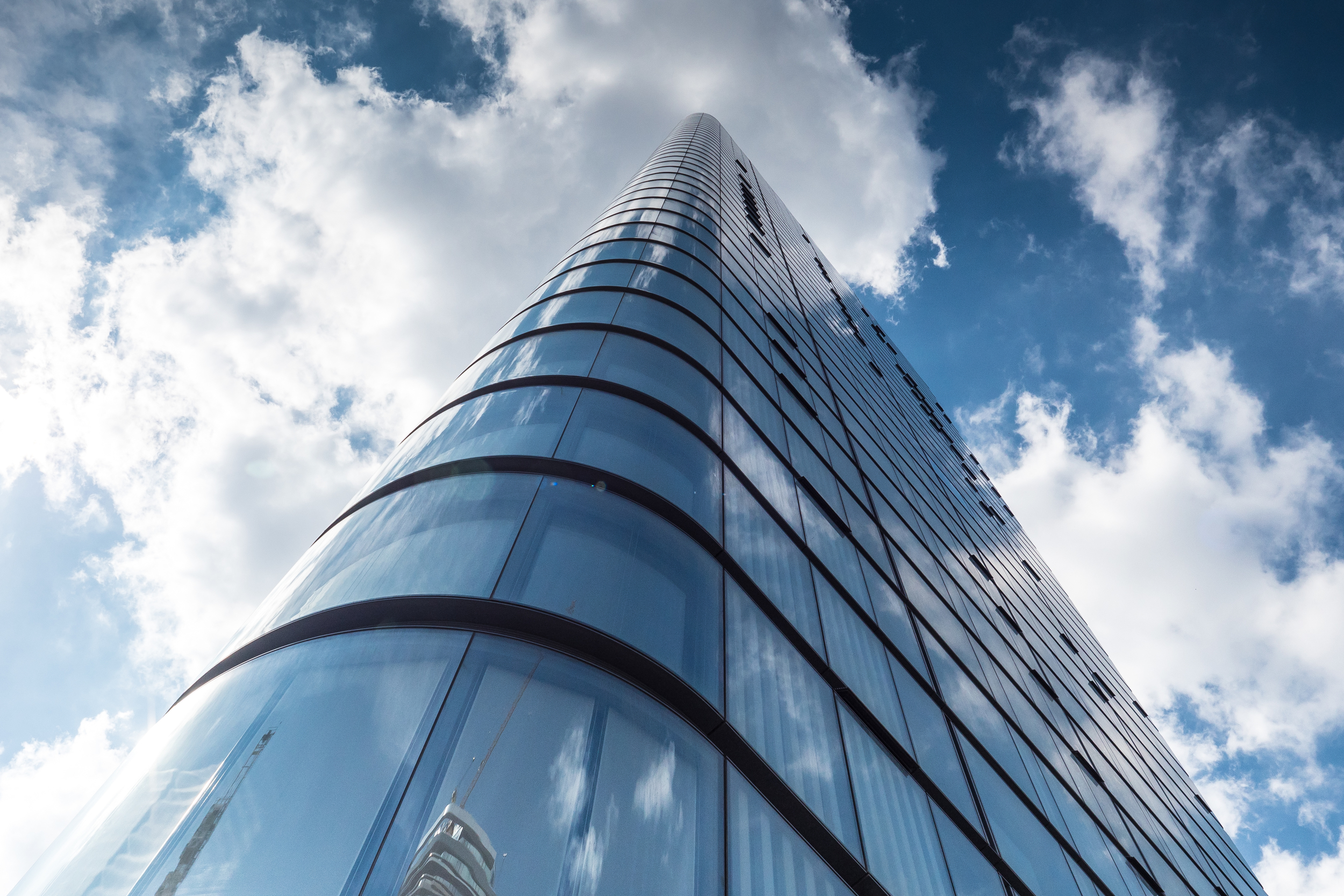
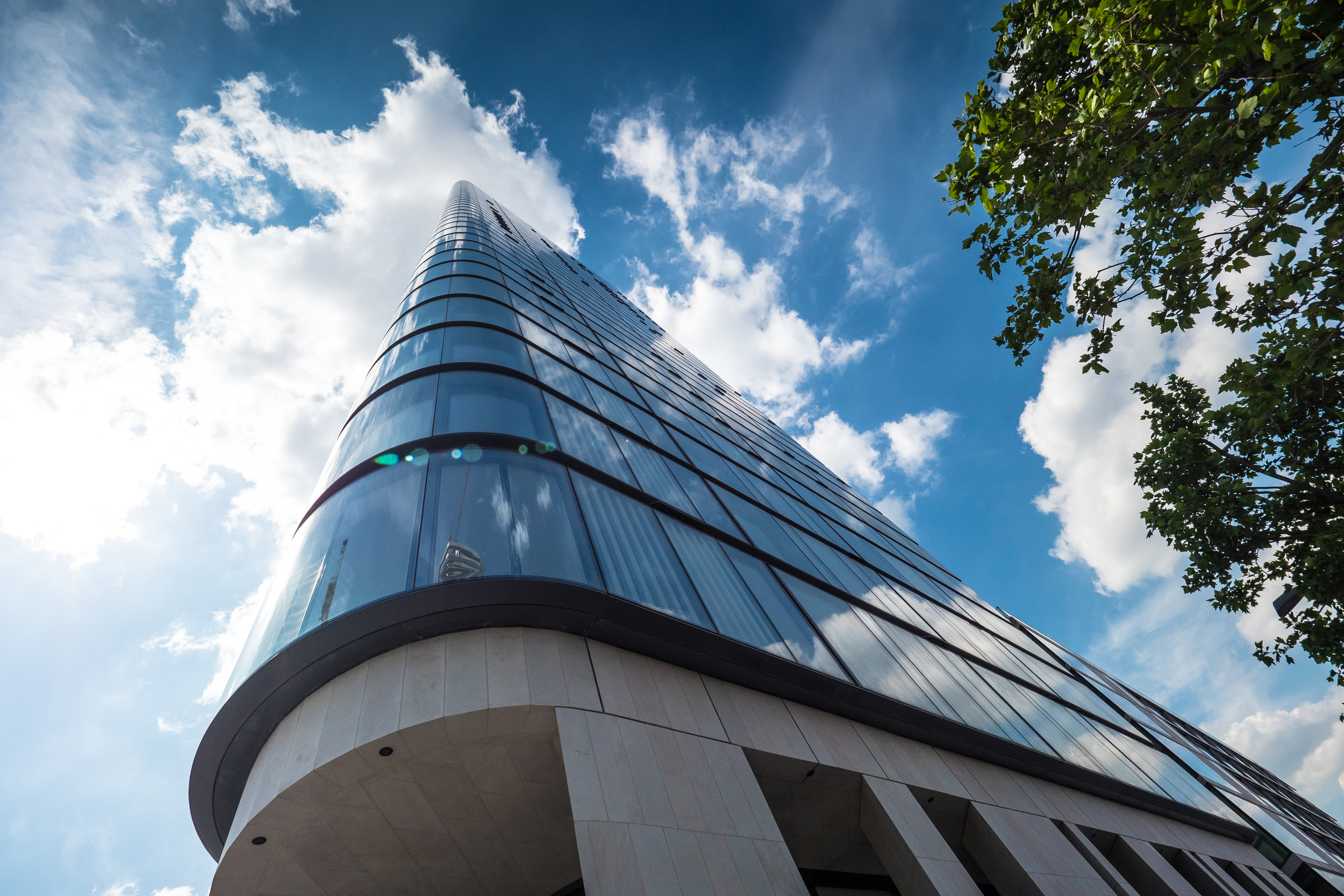
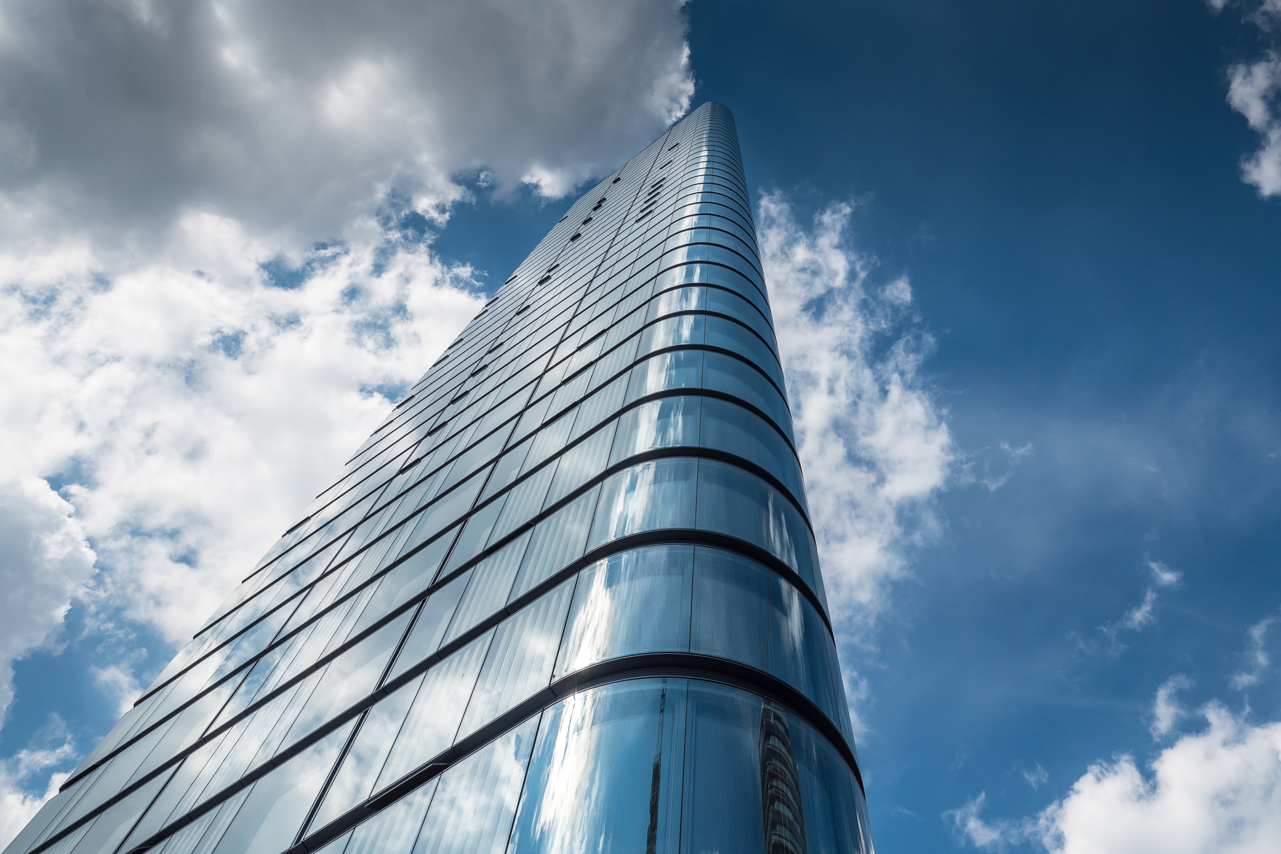
This sleek tower was designed by Skidmore Owings & Merrill (SOM) architects - the team behind the world’s current tallest building Dubai’s Burj Khalifa - and features both a high-rise and low-rise element. The Lexicon's minimal aesthetic is accented by its use of high quality materials, the façade being covered with a beautiful clear class which curves at the corner sections. There are 146, one, two and three bedroom luxury apartments within spread across the buildings 36 floors.

Lexicon Tower - Photography: Copyright © Alex Upton

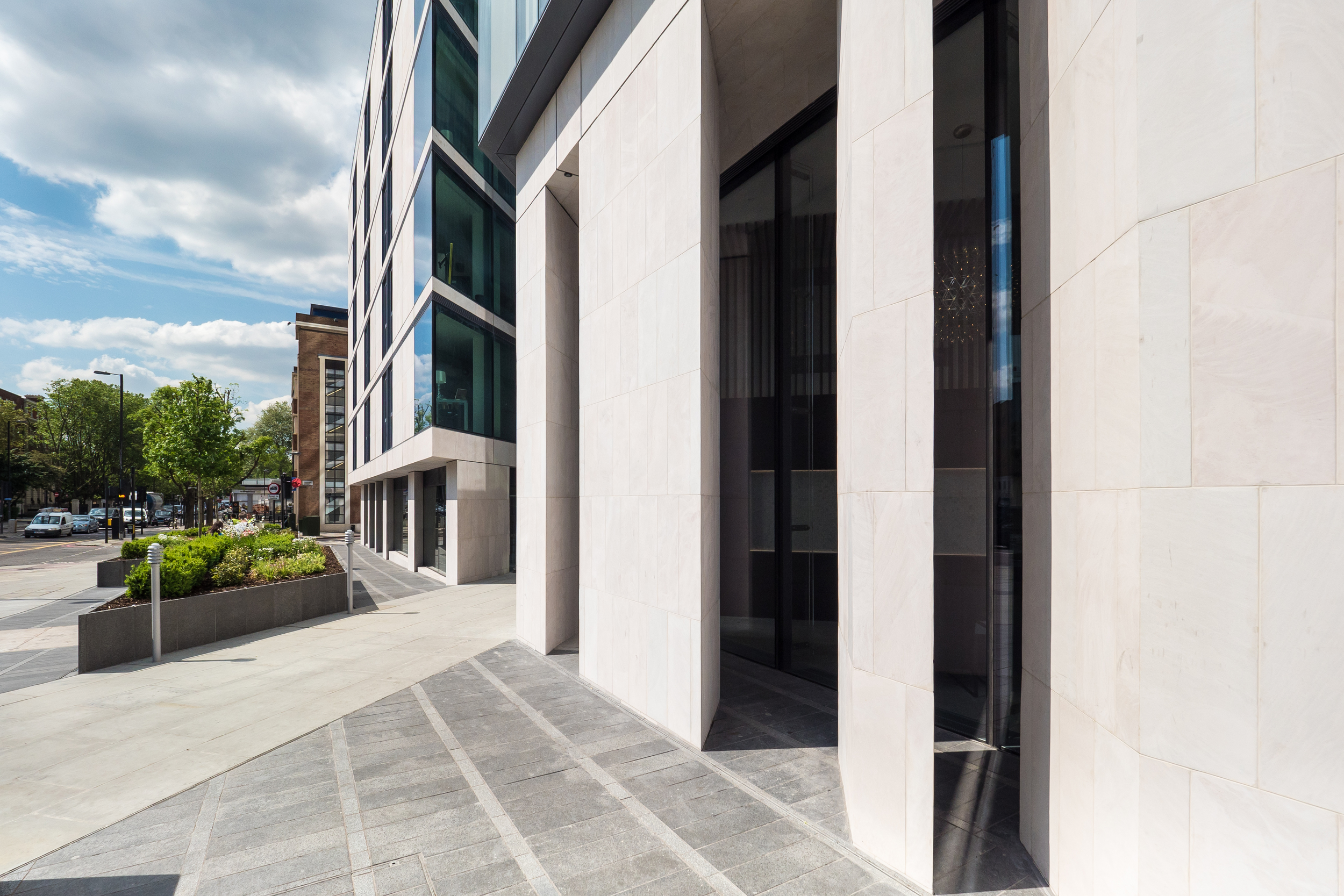
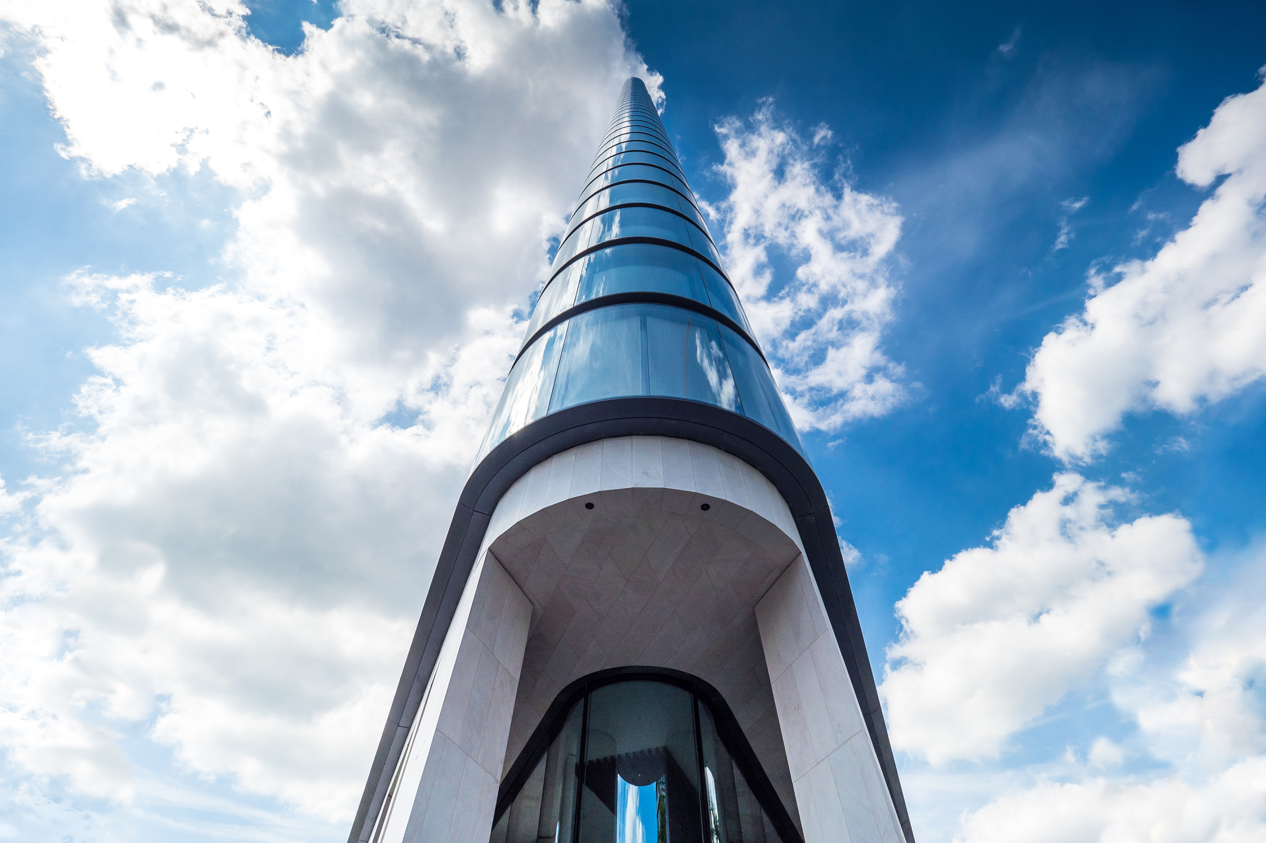
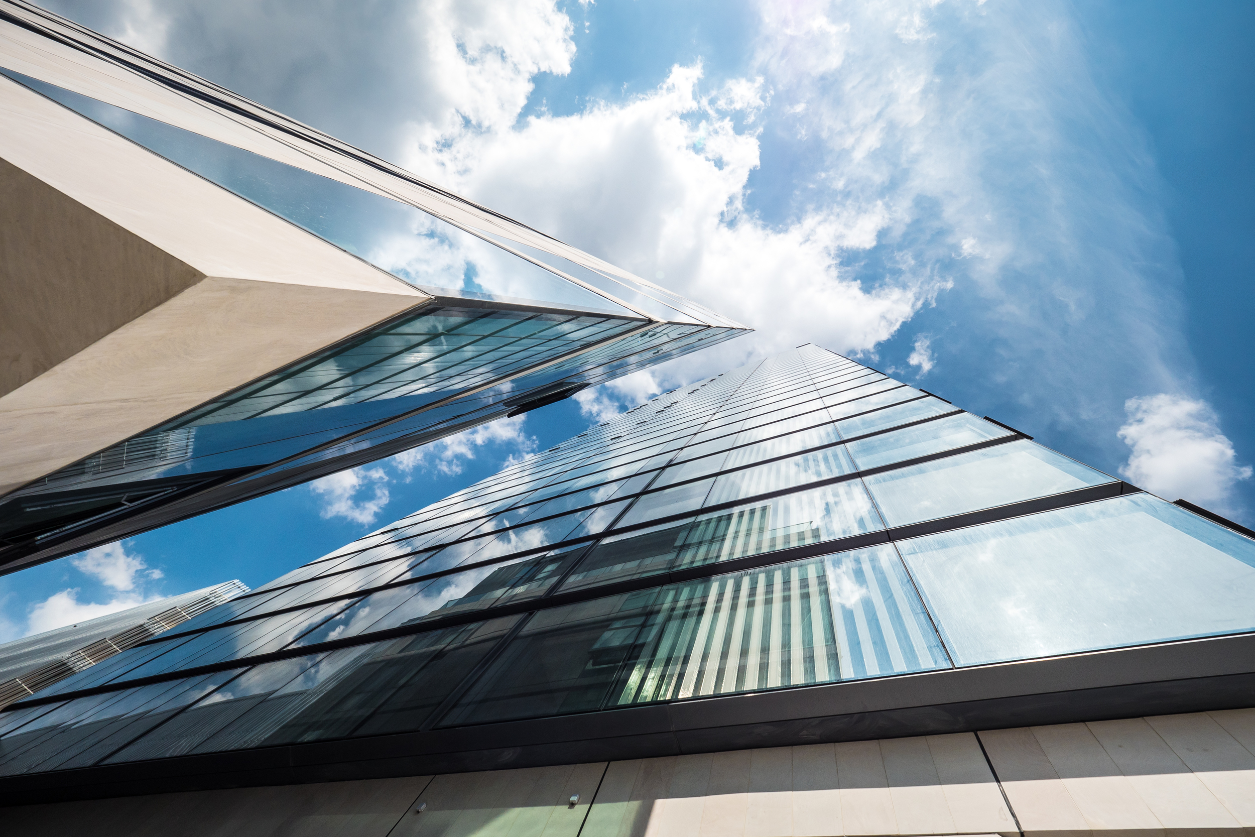
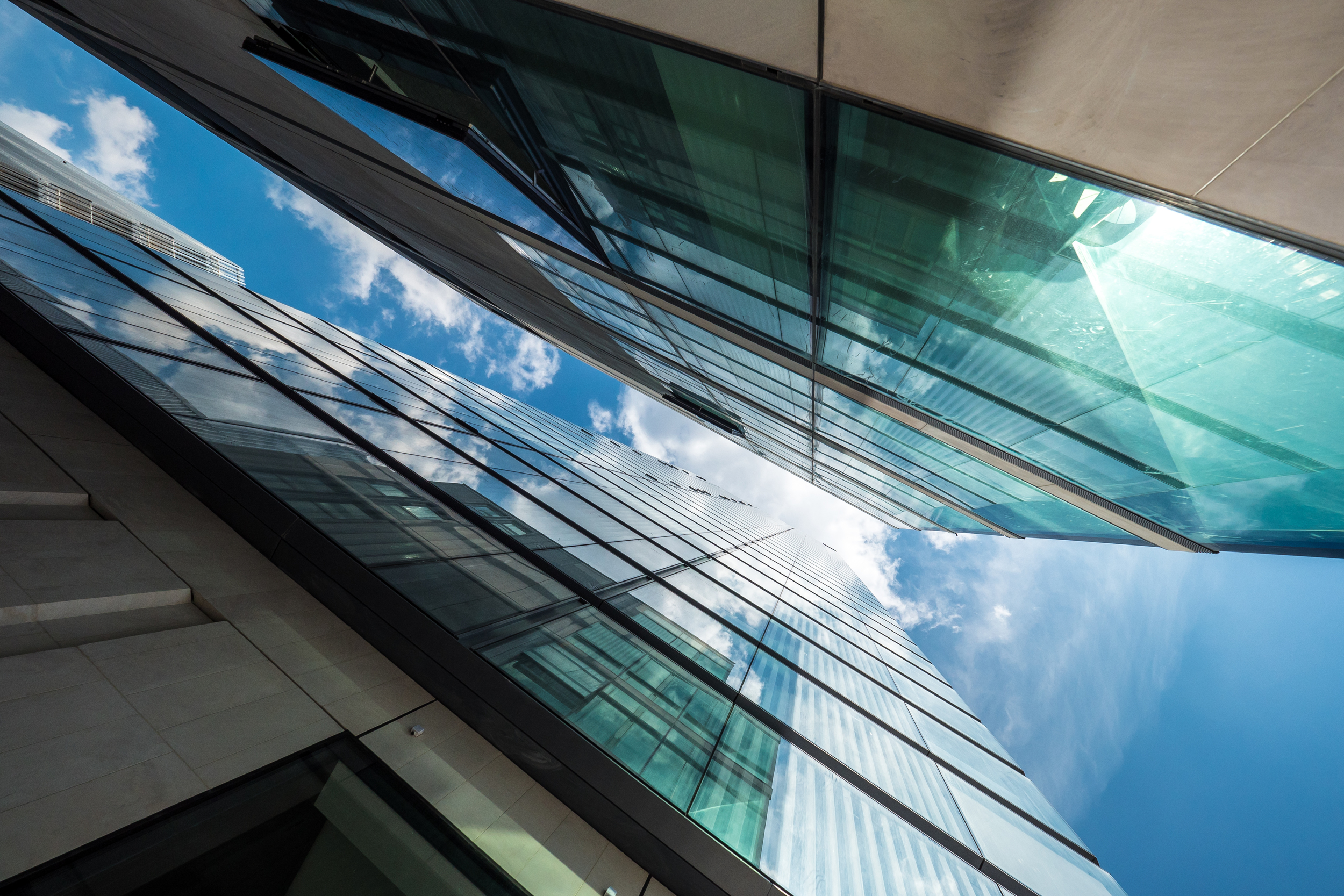
The stone clad detailing around the base of the tower becomes sharp and angular, cutting into he surrounding space projecting an interesting play between light and shadow. This lower portion of the building complements the more restrained and curvaceous upper portion by contrasting both form and materials, and in doing so breaks up the monotony of what could have been a singular design feature.

Lexicon Tower - Photography: Copyright © Alex Upton

I am looking forward to returning to this area over the coming years and photographing the new developments, most of which are still at the ground works stage. Once Lexicon and Canaletto are joined by Norman Foster's 250 City Road this small area will be home to some truly iconic architecture by three leading architectural practices.

Canaletto by UNStudio by Alex Upton

Canaletto 259 City Road - Photography: Copyright © Alex Upton

Development: Canaletto 259 City Road
Architects: UNStudio
Location: City Road, Islington, London
Height: 90m (31fl)

Canaletto 259 City Road - Photography: Copyright © Alex Upton

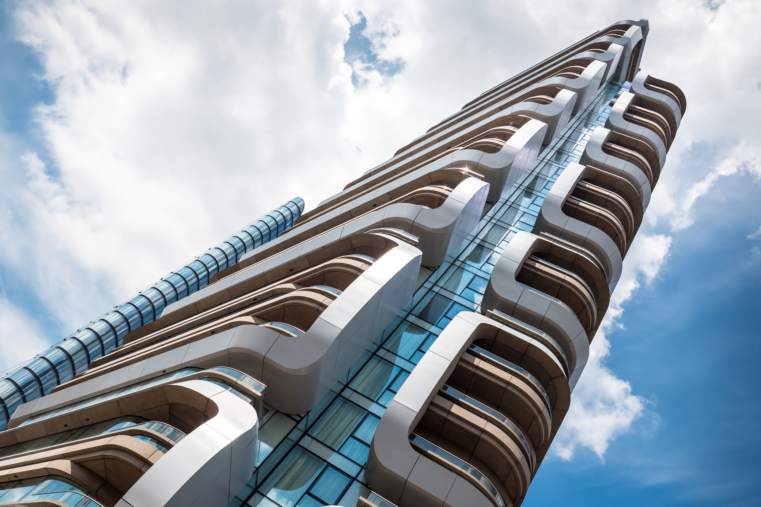
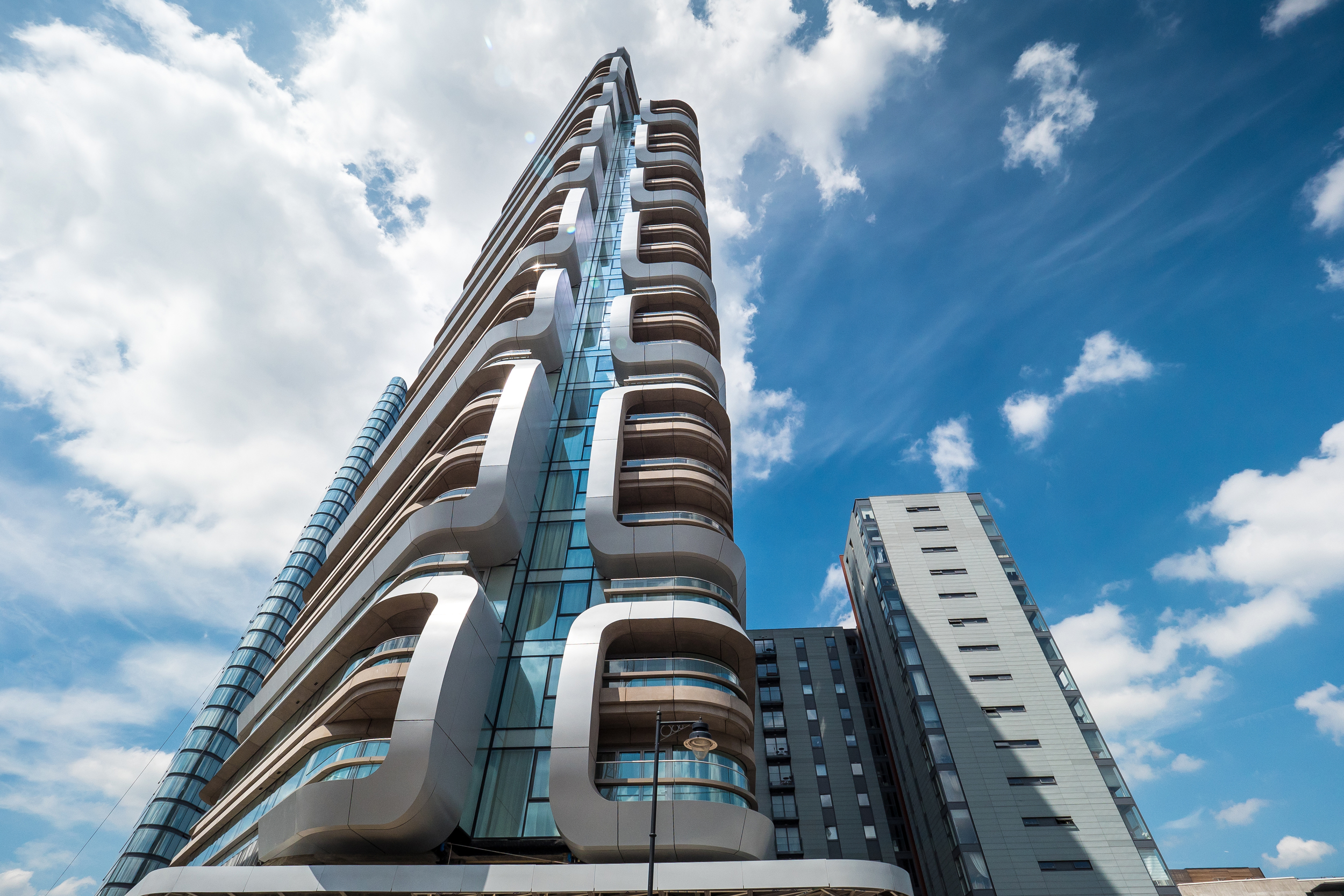
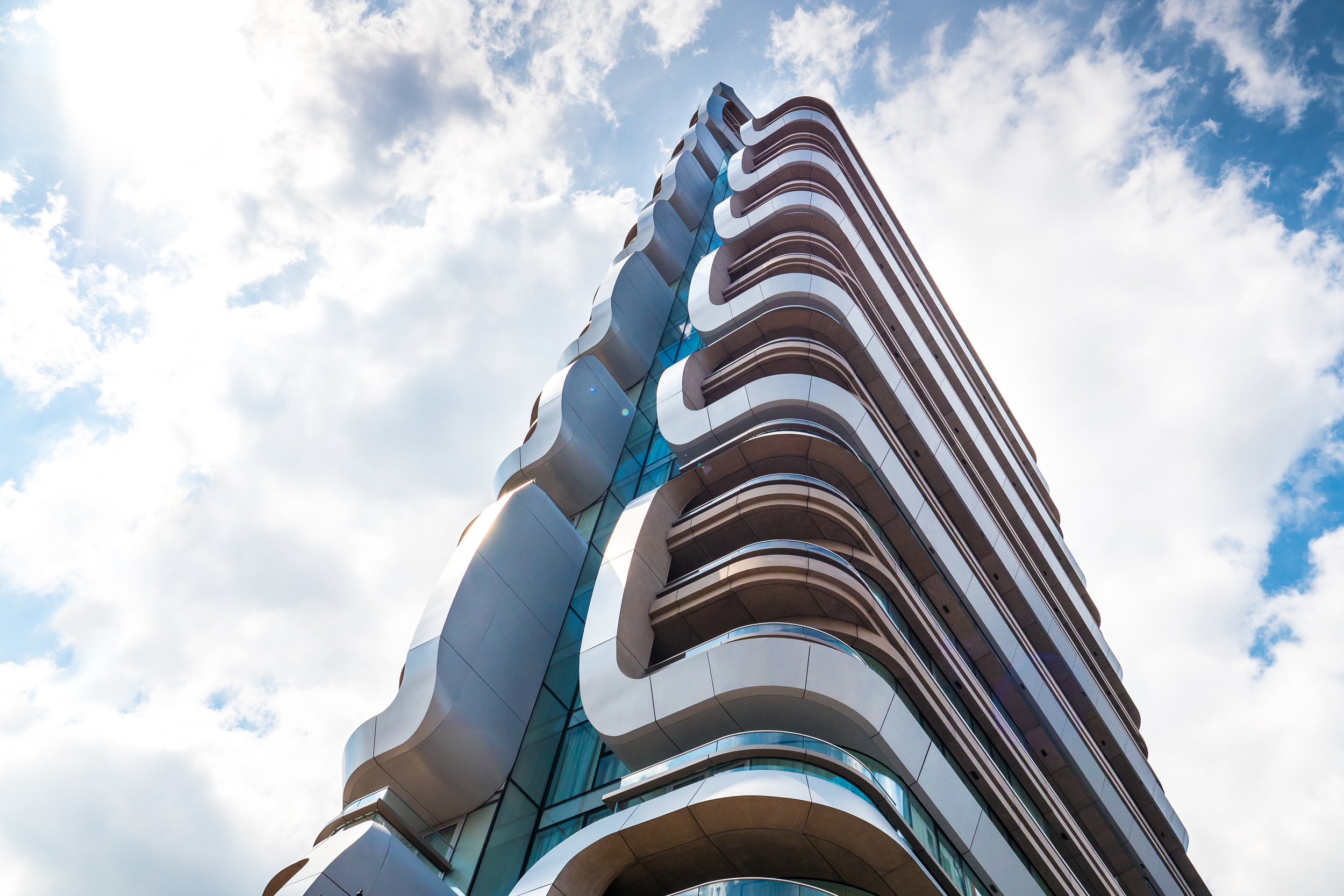
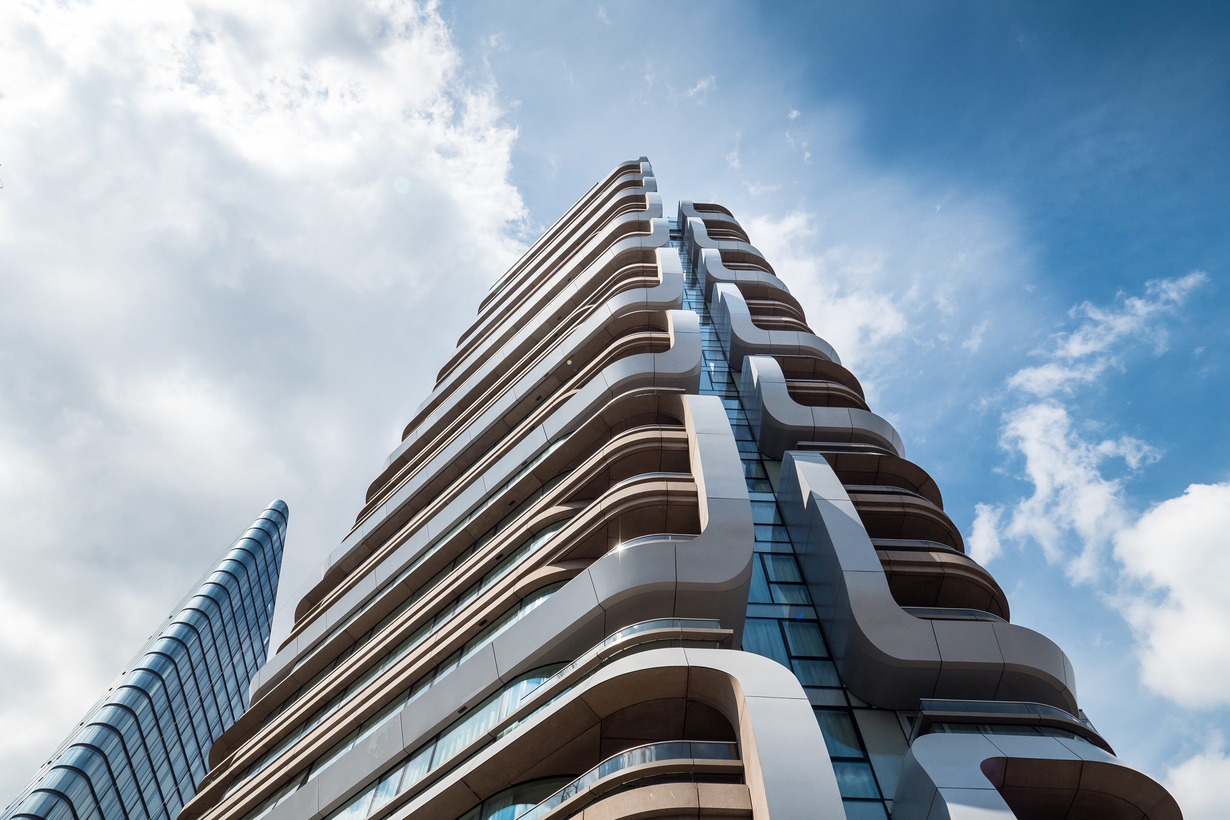
Canaletto is a residential tower designed by Dutch architect Ben van Berkel of UNStudio. The building is located at 259 City Road which borders on Islington, The City, Shoreditch and Clerkenwell. Construction is still on going with most of the work now taking place at the base of the tower where the concierge area is being fitted out, these architectural photographs capture Canaletto's current progress.

Canaletto 259 City Road - Photography: Copyright © Alex Upton

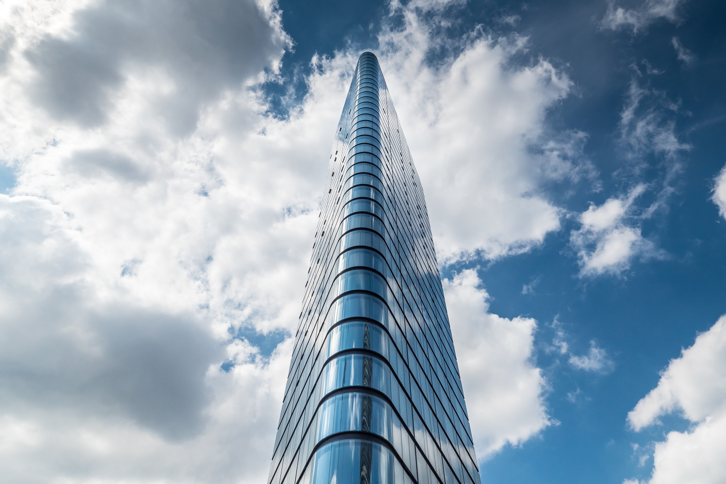
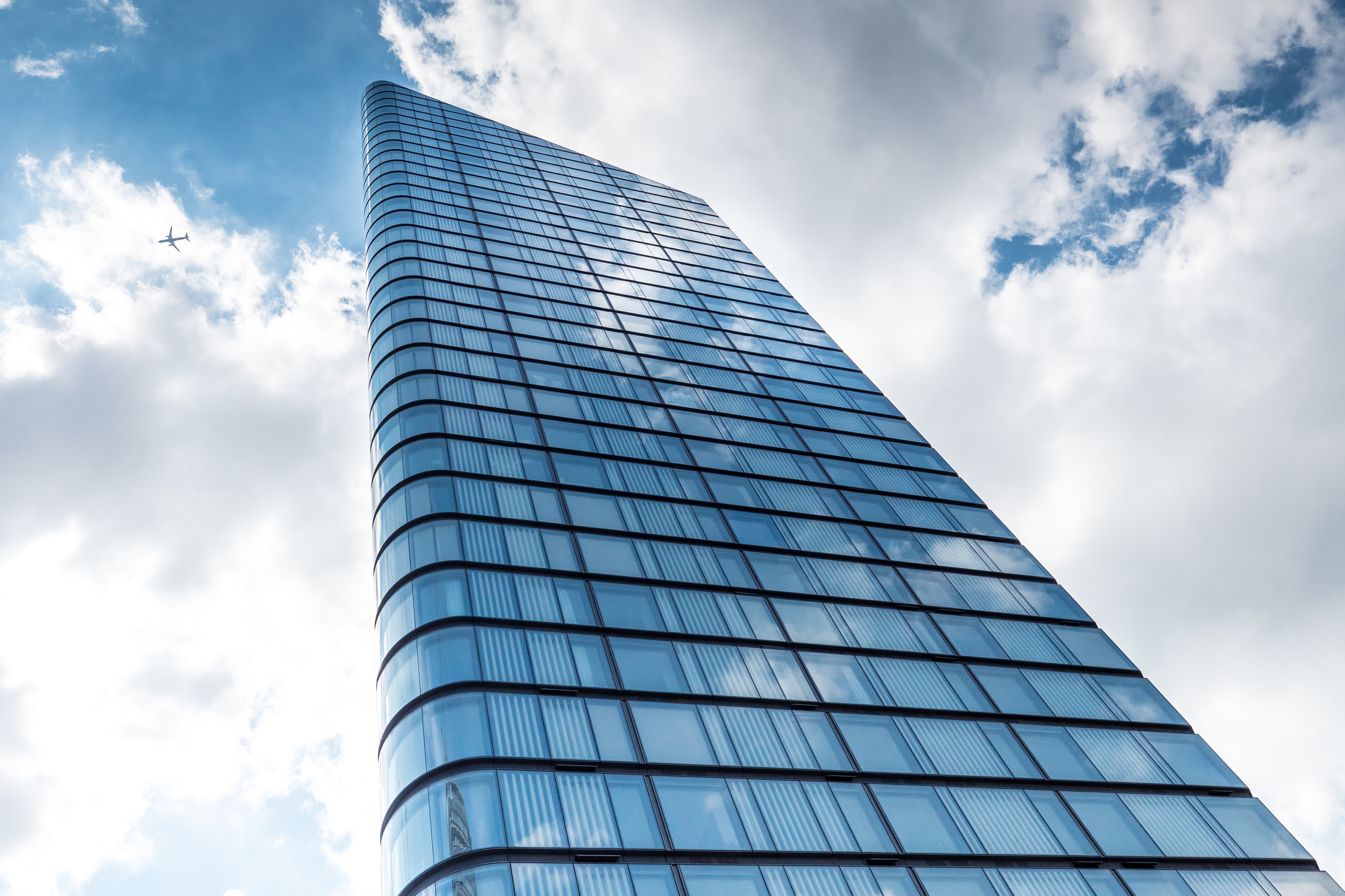
Returning from a trip to the recently opened Yayoi Kusama exhibition at the Victoria Miro Gallery - which for prospective residents is conveniently located a minuets walk from the Canaletto building along with a McDonald's Drive Thru, a real melting pot of high and low brow culture - i happened to chance upon these beautiful cloud formations passing over the tower. These photographs of Canaletto are the result of me trying to recalibrate my senses after being dazzled by Kusama's infinity mirror installations, which by the way are well worth a visit. 
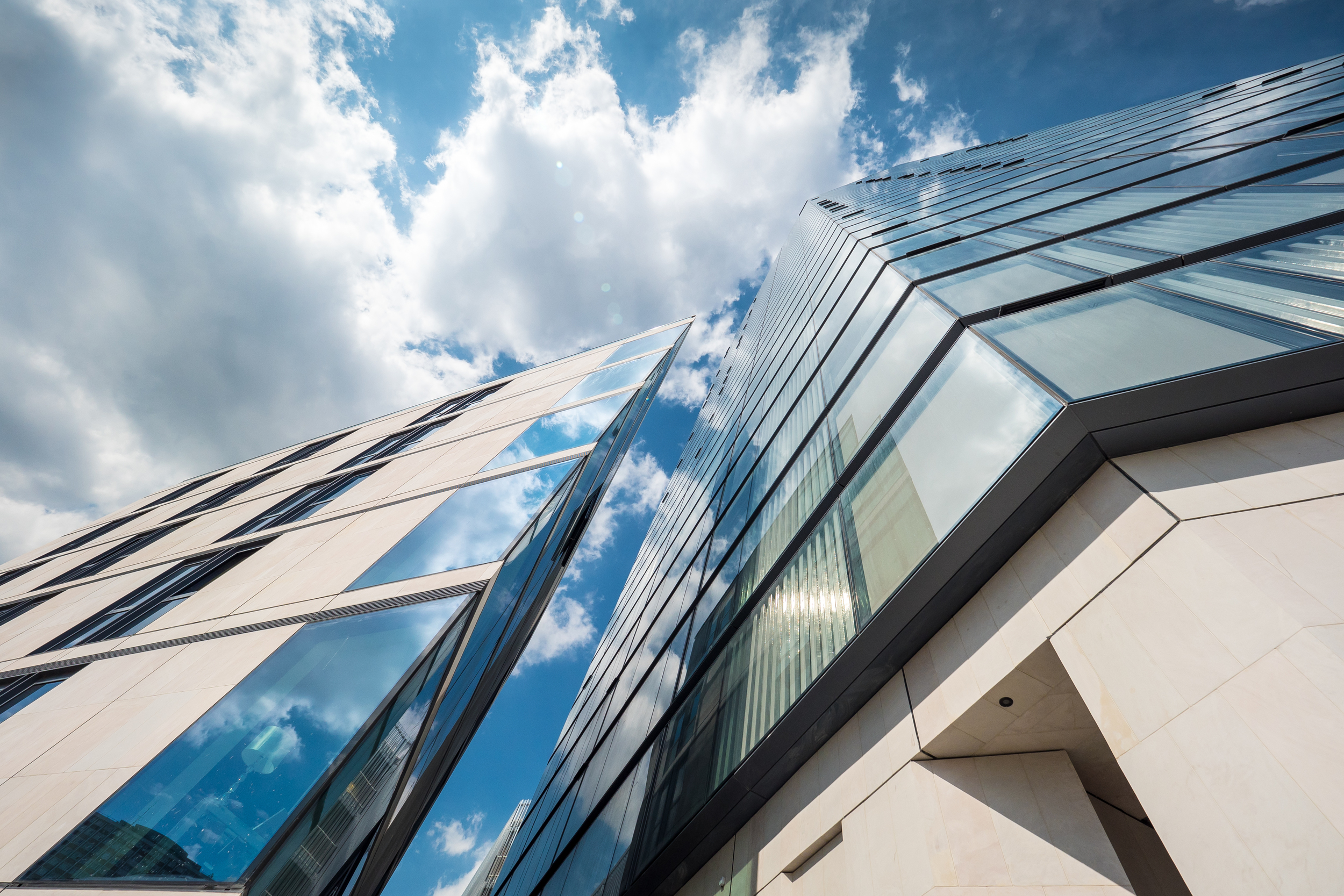
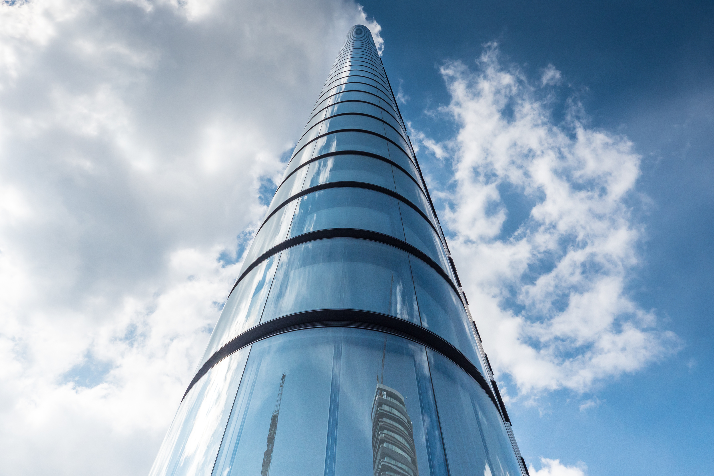
Canaletto 259 City Road - Photography: Copyright © Alex Upton

The lucky residents of this tower will have access to a wide range of facilities including what will be a stylish restaurant, private screening room, swimming pool and gymnasium and a 24th floor private club and sky terrace. The innovative design by UNStudio incorporates balconies into the linear and somewhat bulbous chrome clad panels that wrap around the buildings façade, which according to the architects create 'sustainability benefits achieved through surface modelling, with opportunities for shading, balancing good internal daylight and views with reduced heat gains'. Along with their sustainable credentials these panels produce some beautiful forms which for and architectural photographer offer endless opportunities for new and exciting compositions.

Canaletto 259 City Road - Photography: Copyright © Alex Upton

Canaletto is located in an area which is currently seeing a lot of developments start to rise, with Foster and Partners 250 City Road residential apartments just beginning to break ground over the road and the adjacent Lexicon building also nearing completion - for which a photograph update will follow shortly. 

Canaletto 259 City Road - Photography: Copyright © Alex Upton

Construction Update: Riverwalk by Alex Upton

Riverwalk - London - Photography: Copyright © Alex Upton


Development: Riverwalk Residencies
Architect: Stanton Williams
Location: Pimlico, Westminster, London
Height: (17fl)

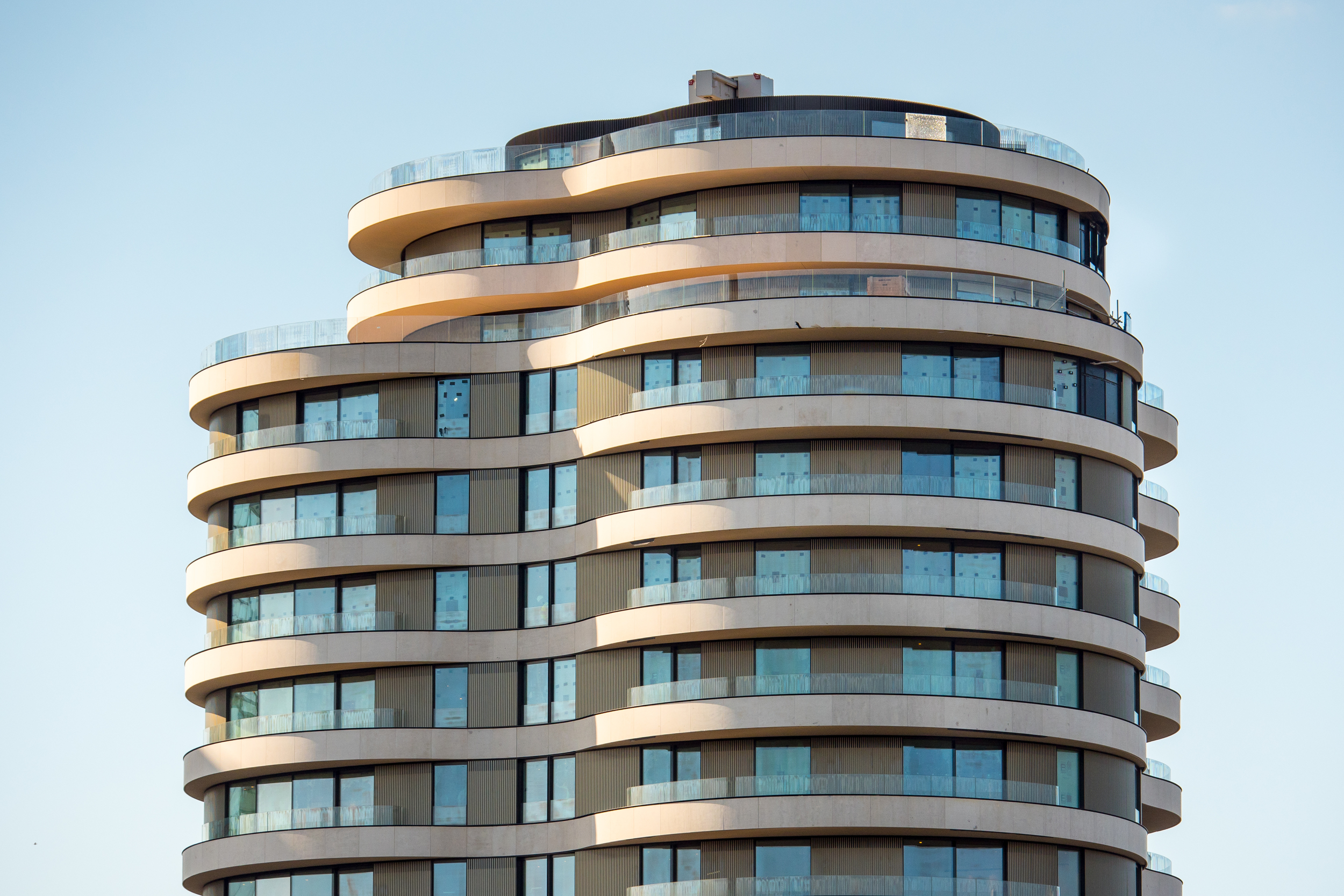
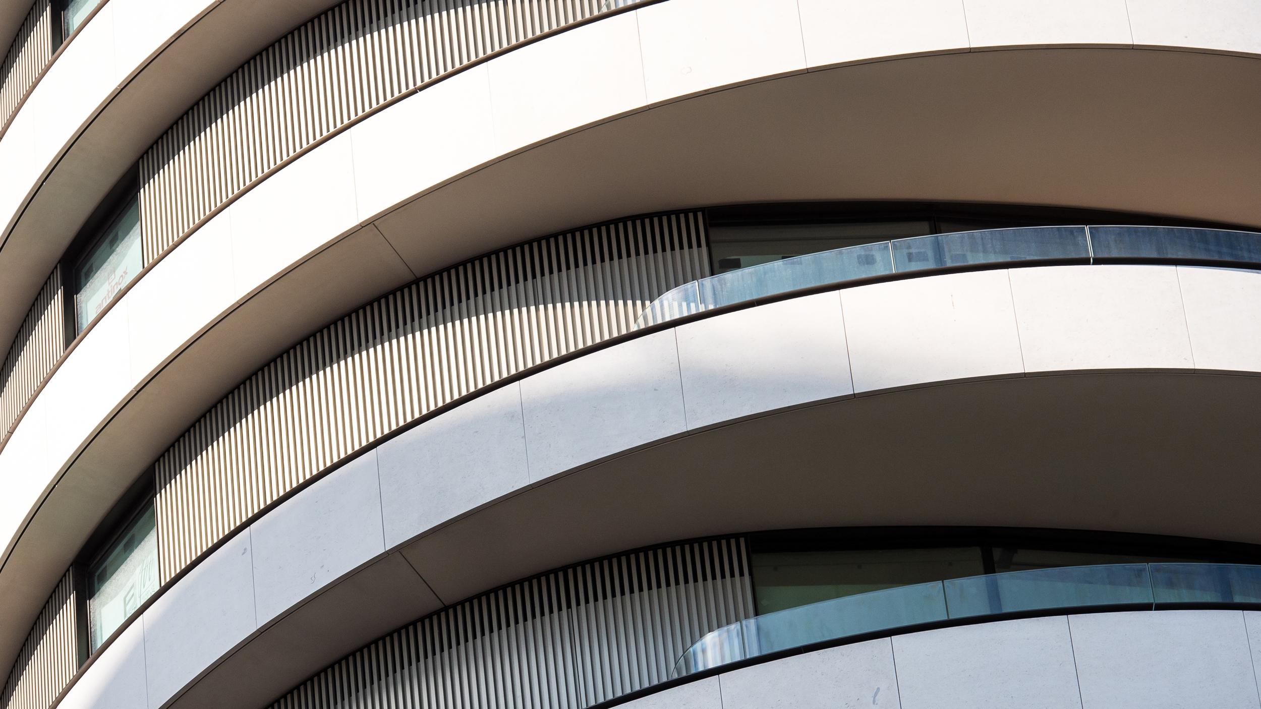
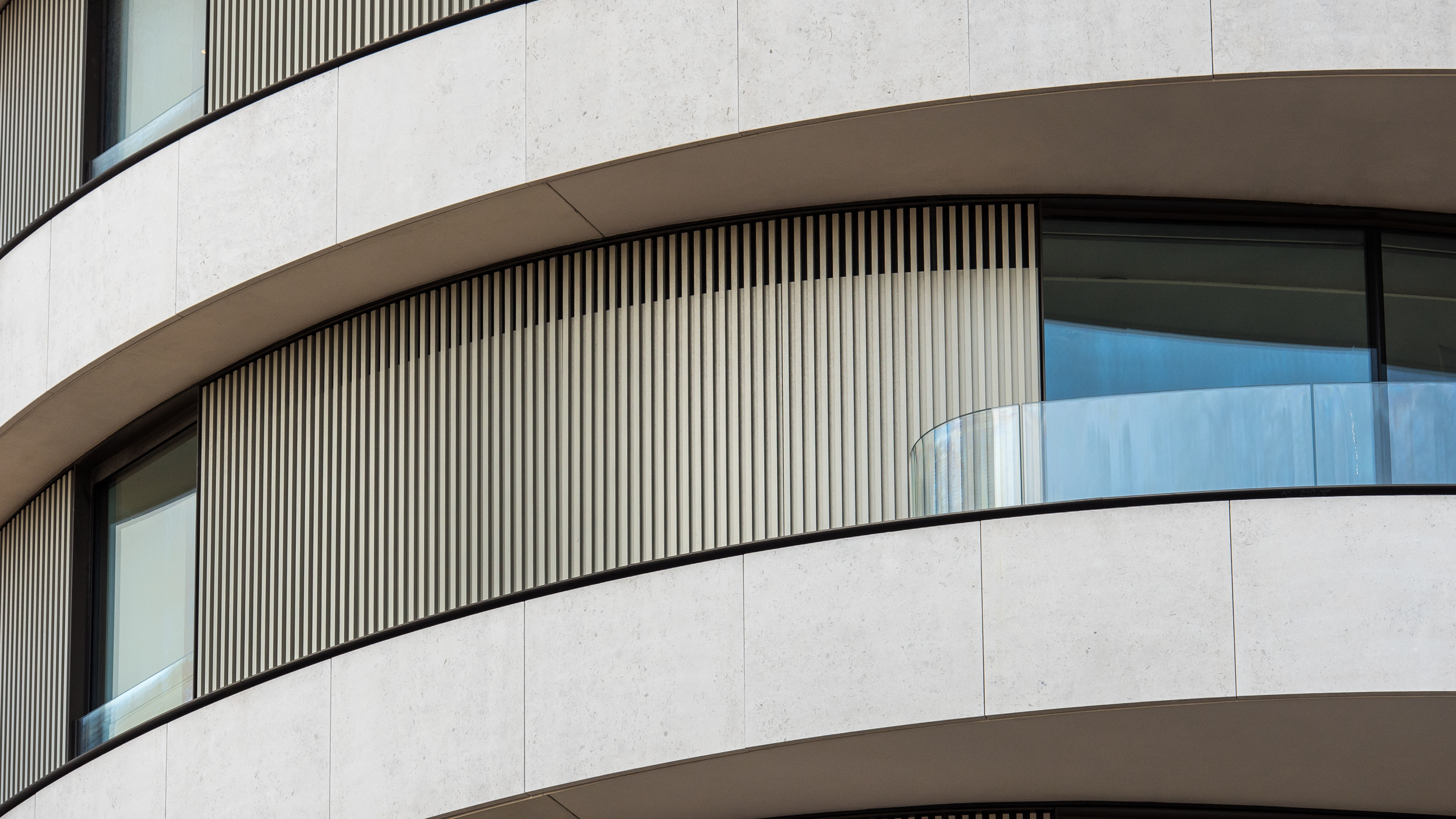
These architectural photographs show the current progress at the Riverwalk development situated on the Thames River Bank near Vauxhall Bridge. The exterior is almost complete with the stone cladding looking to be of a very high quality. There is still ongoing landscaping at the base of the tower with the extension of the river walk way being continued up to the bridge. A sculpture - obligatory to all new luxury developments - by Peter Randall-Page is still concealed in protective wrapping somewhere near the base of the building which will join Henry Moore's sculpture 'Locking Piece' later this year. Here is a description of the artwork curtsy of the developers website.

'Peter Randall-Page’s ‘Shapes in the Clouds’ will be installed in the landscaped area around Riverwalk and explores how the sensual and organic can emerge from the formal and geometric. In this version of a dodecahedron carved out of Rosso Luana marble, in which the heavy figuring is reminiscent of solidifying cloud, the Dartmoor-based artist has combined geometric order with geological chaos to produce something both visceral and sensual. Peter often describes it as breathing life into dumb matter.'