Photography

One Creechurch Place by Sheppard Robson by Alex Upton

One Creechurch Place Sheppard Robson.jpg

Location: 1 Creechurch Lane, City of London.
Developer: Helical
Contractor: Skanska
Architect / Photography Client: Sheppard Robson

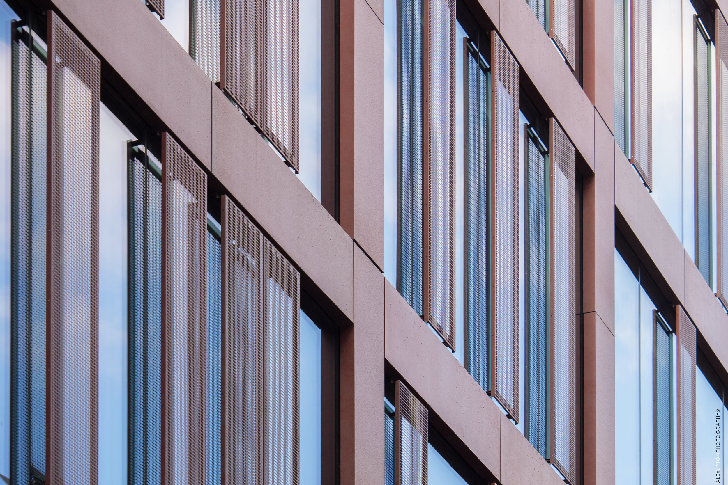
Still playing catch up with the long list of projects I have photographed over the past year, here is another from the neglected archives - which really should have received attention much earlier, alas a hectic work schedule prohibited my bringing it to your attention. One Creechurch Place is a rather large - 25,315 sqm to be precise - modern, office development located on the eastern edge of the City of London. While not yet obtaining a fancy epithet of its own, unlike those imaginatively designated to the company it sits in; The Scalpel, Gherkin, Cheese-grater et al. the building is just about large enough at 18-stories to make its presence known. Designed by London based architectural practice Sheppard Robson the building was completed in late 2017, which is around the time when I was commissioned to photograph the project.

One Creechurch Place Sheppard Robson 2.jpg

To disperse the buildings bulk it takes on the form of a cluster of towers varying in height, each adorned with horizontal and vertical fins which deviate in their rhythms of appearance. This external matrix tracing the facade lends the building a modernist aesthetic reminiscent of GMW Architects 1969 building, St Helen’s Tower, also know as 1 Undershaft, which is located just a short walk away. As can be seen in the above photograph a canopy is created over the main entrance where just beyond a public space exists, this area hosts temporary installations and sculptures as part of the City of London’s cultural programme.

One Creechurch Place Sheppard Robson 4.jpg

According to the architects Sheppard Robson the building’s ‘principal cladding system is a unitised, interactive double skin – a double-glazed inner layer, single-glazed outer layer and an operable blind in the cavity between.’ Which ‘allows control of solar gain and optimises natural daylight within the offices.’ It is environmentally friendly considerations like this that enabled the development to achieve a BREEAM ‘Excellent’ rating, keeping it in line with the innovative requirements needed of new buildings in the City. Moving Internally the building features a number of perks for the tenants, with the lobby area accommodating a cafe and the basement floors housing high-quality changing rooms, shower facilities and a generous parking facility for bikes.

One Creechurch Place Sheppard Robson 5.jpg

The buildings refined external austerity makes it a somewhat humble addition to the City of London’s ever evolving skyline, which to date has been a breeding ground for a cacophony of architectural peculiarities each trying to out compete each other to gain the crown bestowed on the most irregular form. One Creechurch Place has been designed within the boundaries of height restrictions that need to be adhered to for its location, making use of subtle shifts in form to accommodate this, while still maximising floor-space for the developer Helical. It maybe be that more reserved additions like this to the City will help balance out the skyline, making it more coherent and less flamboyant.

Royal Mint Court Redevelopment by Sheppard Robson by Alex Upton

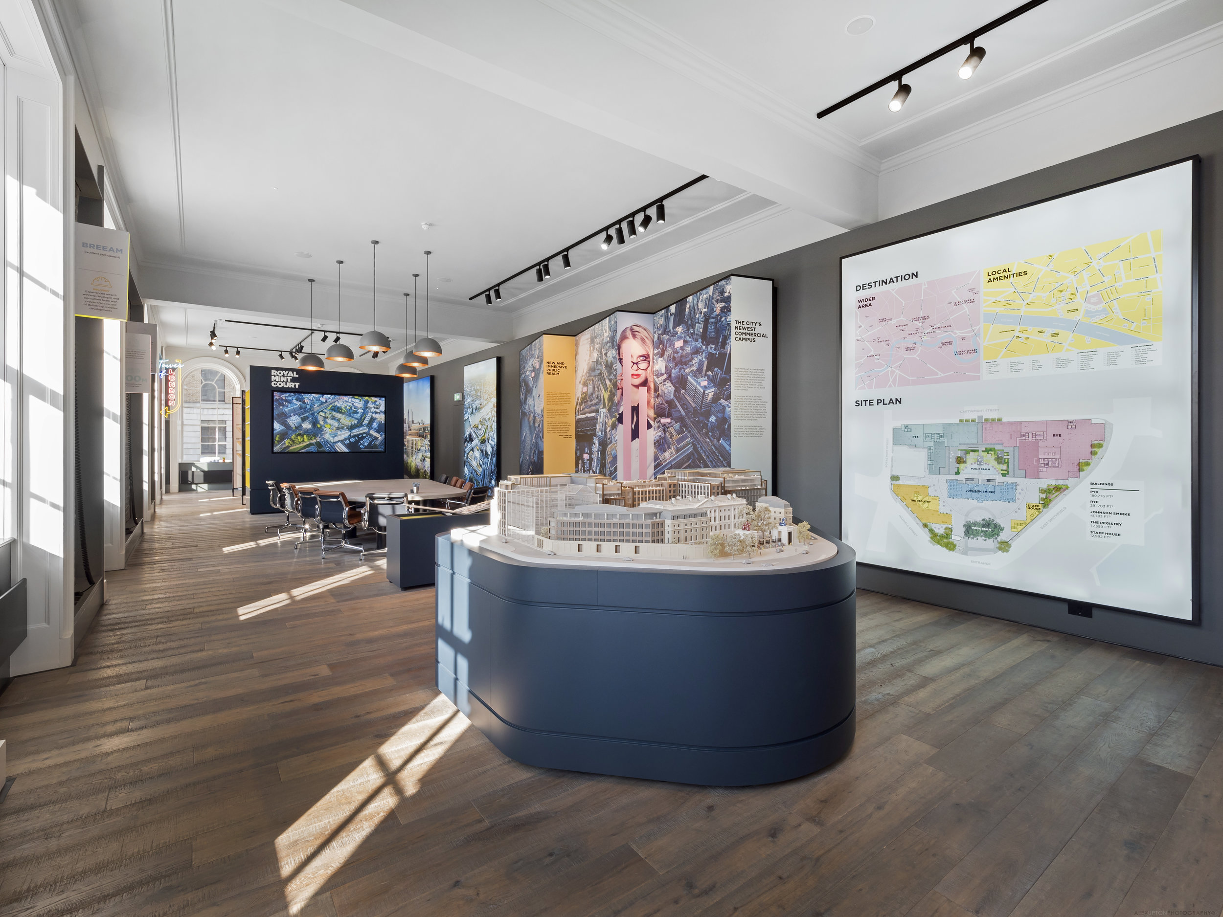
Royal Mint Court London Showroom by Sheppard Robson 2017. Photography Copyright © Alex Upton

Royal Mint Court London Showroom by Sheppard Robson 2017. Photography Copyright © Alex Upton

The Royal Mint Court building and its generous, fortified grounds occupy a rather large 5.23 acre site in central London. The historic building which served as the Royal Mint between 1809 and 1967 is surrounded by prestigious landmarks such as The Tower of London and Tower Bridge. In late 2017 I was commissioned by London-based architectural practice Sheppard Robson to photograph the onsite showroom they had designed in collaboration with their interiors department ID:SR Interiors. 

Showroom model of the proposed redevelopment of Royal Mint Court.

Showroom model of the proposed redevelopment of Royal Mint Court.

The architectural photography of Royal Mint Court which I undertook for the client captures the showroom displays; including 3D models of the proposed development, detailed information on the proposals along with interactive displays and writing on the sites historic context. There is also a pool room equipped with a bar and jukebox upon entering the building. The new development proposed by British property developers Delancey would be an office led scheme with the inclusion of new public spaces. While incorporating historic elements of the site it would also include the addition of several distinctively modern buildings.

Visualisations of the proposed Royal Mint Court development.
Visualisations of the proposed Royal Mint Court development.
Before further exciting any readers over the details of the proposed development it should be noted that the scheme will now almost certainly be revised as the People’s Republic of China recently acquired the site from Delancey and the LRC Group with the intention of converting it into their new Embassy. The buildings fortified grounds, heritage and central location all no doubt being driving factors in their decision to relocate there.

Conference area for potential clients and visitors.

Conference area for potential clients and visitors.

While it's disappointing to discover Sheppard Robson Architects' Royal Mint Court scheme will never likely see the light of day - especially after photographing its wonderful interior, which hints at what could have been - it is highly likely another grand scheme will follow in its wake as the rush to build landmark Embassies in the capital intensifies.

Photographers Diary: Architecture 03 by Alex Upton

Architecture and a Sense of Scale

Below are a selection of photographs I shot over the past few months which aim convey a sense of architectural scale between building and individual. In some instances there is a genuine attempt to express the relationship between the two, while in others i have endeavoured to exaggerated the scale through various approaches to framing the subject and building, hinting at a different interpretation entirely. The individuals depicted are mostly isolated from the default hustle and bustle of their busy locations, with the intention to permit the viewer to interpret their thoughts and imagine their journeys against these architectural backdrops.

Royal National Theatre - South Bank, London Photography: Copyright © Alex Upton

Royal National Theatre - South Bank, London Photography: Copyright © Alex Upton

Royal National Theatre

Architect Denys Lasdun's National theater on South Bank is an impressive Brutalist mass of concrete. It is wonderful to photograph on a sunny day when its sharp, angular form casts deep, dynamic shadows over its surface. Trying to isolate a subject in this busy area is no easy feat. Fortunately, after a protracted, impatient wait I was rewarded by this lone passerby, who can be seen dragging his reluctant, outstretched shadow along with him as he goes about is business. The additional shadow of a bird in flight also momentarily graces the Theaters facade.

Tate Modern, The Blavatnik Building - London. Photography: Copyright © Alex Upton

Tate Modern, The Blavatnik Building - London. Photography: Copyright © Alex Upton

The Blavatnik Building

At the point where the old and new brick of the Tate Modern meet in a distinct yet reverent embrace, a rear entrance can be found over-scored by a panel of bright orange announcing 'welcome'! Having visited the gallery a number of times I already have a fair number of photographs piled up on my hard-drive awaiting a distant day of editing. On this occasion the artist collective SUPERFLEX had installed a complex structure of grey and orange painted steel frames, bearing fruit in the form of countless swings. In this photograph i was lucky to capture an appropriately orange clad visitor entering the building just at the decisive moment.

V&A Extension, London. Photography: Copyright © Alex Upton

V&A Extension, London. Photography: Copyright © Alex Upton

V&A Museum Exhibition Road Quarter

As if the Victoria & Albert Museum didn't already have enough space to display their many wares, they commissioned British, Stirling Prize-winning, architect Amanda Levete to openup the ground beneath the existing building and insert a new gallery space to accommodate their headline exhibitions. I happened to be working on a job close by at Imperial Collage London and decided to pop into the new cafe and take a look around. The sun was almost, but not quite, in the perfect position as i came out and with no time to spare I captured the above image of an lone visitor, more engrossed in his phone display than the monumental architecture surrounding him.

Seven Pancras Square - King's Cross, London Photography: Copyright © Alex Upton

Seven Pancras Square - King's Cross, London Photography: Copyright © Alex Upton

Seven Pancras Square

Exiting the rear of St. Pancras Station you are confronted by Studio Downie Architects new build office which wraps around the existing Grade II Listed Stanley Building. In this busy vicinity it's low, tapering wall plays the presumably unintended role of a perch for those recuperating after a long and most likely delayed journey, or for workers looking for a momentary escape. Isolating the individuals and building like this adds a sense of wonder and intrigue directed at both the building, location and human subjects.

 Library of Birmingham. Photography: Copyright © Alex Upton

 Library of Birmingham. Photography: Copyright © Alex Upton

The Library of Birmingham

While photographing another project in Birmingham's Arena Central development area i felt compelled to take advantage of a rare cloudless, blue sky. Out on the decks of Mecanoo Architect's new Library of Birmingham were a number of sightseers, gazing and pointing, no doubt at the vast up-earthed portions of the city which are undergoing a massive phase of regeneration. Isolated like this the building appears to my eyes an enormous vessel in flight, the passengers in awe as they make their voyage to unknown territories. 

Benenden Hospital Redevelopment by Alex Upton

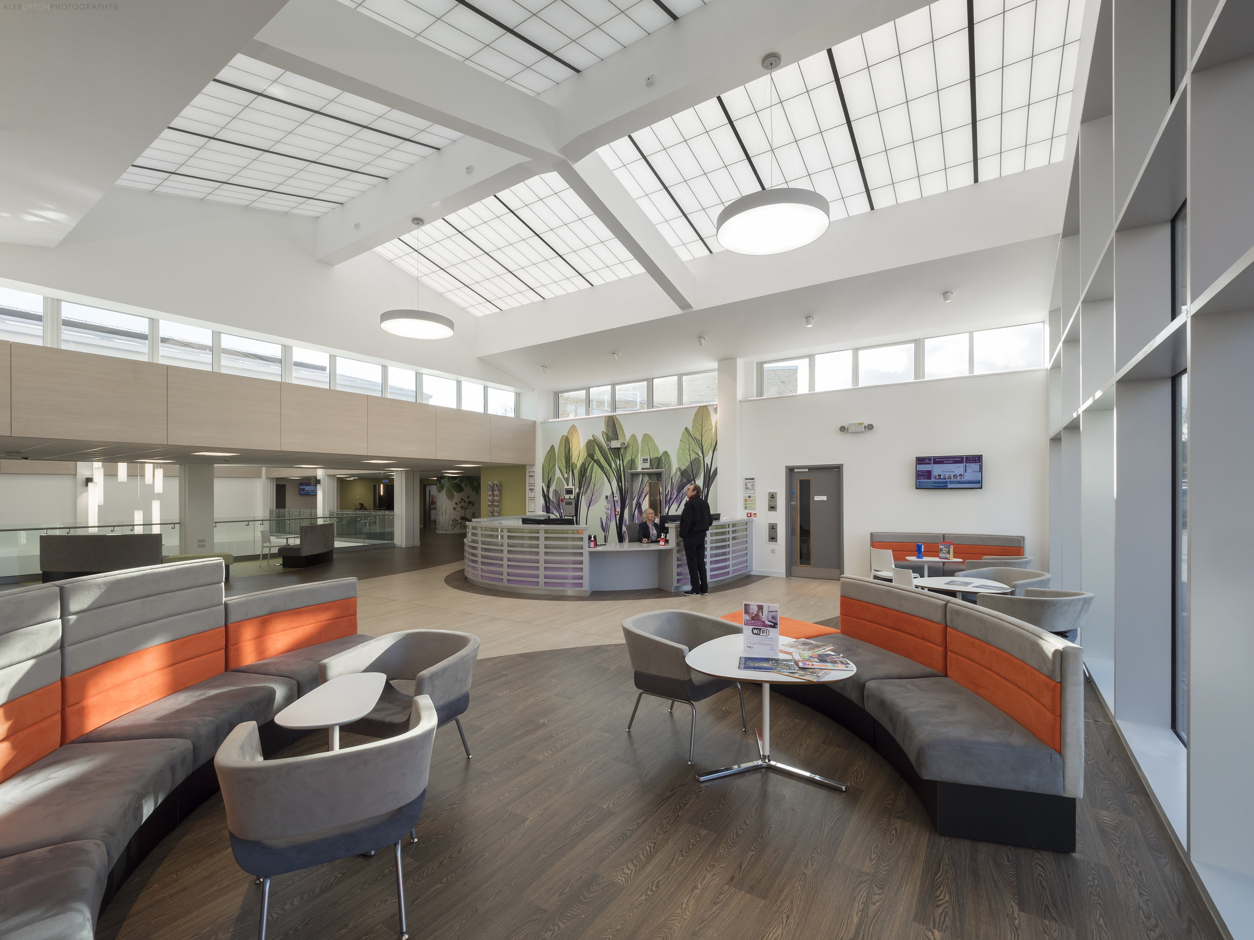
Benenden Hospital Reception Area 2017. Photography: Copyright © Alex Upton

Benenden Hospital Reception Area 2017. Photography: Copyright © Alex Upton

Location: Benenden, Cranbrook, Kent, UK
Contractor: Willmott Dixon
Photography Client: Structura / Kalwall
Architects: CA Vaughan Blundell QS, Moreton Hayward M&E and Richard Stephens Partnership

Located in the south east county of Kent, Benenden Hospital, an Independent flagship facility for Benenden Hospital Trust, recently underwent a major £45 million redevelopment. The new facilities include operating theatres, single en-suite rooms, an ophthalmic suite,  a new outpatient department, procedure rooms and recovery areas.

Benenden Hospital Waiting Room

Benenden Hospital Waiting Room

I was commissioned in late 2017 to photograph the interior of the facility, which features a large new atrium roof glazed in the client Kalwall's unique panels - the same material featured in my photography of the RIBA award winning West Croydon Bus Station. The translucent Kalwall panels allow daylight to permeate the waiting rooms creating a bright, welcoming environment for the patients. These two projects show the potential diversity of the products application and how its specific placement and incorporation into the architecture can contribute both aesthetically and functionally in a variety of ways.

Benenden Hospital Waiting Room

Benenden Hospital Waiting Room

The Interior design services were carried out by the West Midland's based practice Design Buro. Through the layout of the furniture and the application of colour to various features the interior spaces have been simplified aiding the users experience and making it easy to navigate the building. The materials themselves while not all natural reference nature through texture and colour masking the often utilitarian design of hospitals.

Benenden Hospital Reception Area

Benenden Hospital Reception Area

The parts of the scheme I had access to photograph work really well, they are both spacious and open whilst also accommodating for privacy, with the furniture creating partially secluded zones. The use of two tones of flooring, which are employed to delineate the various pathways through the hospital, help guide the patients to their destination - breaking with the notoriously labyrinth like layouts of older hospitals.

Benenden Hospital Atrium Roof

Benenden Hospital Atrium Roof

If you are interested in seeing more architectural photographs of Benenden Hospital's redevelopment and the interior design work carried out there by Design Beru please visit my portfolio in the navigation bar above.

Photographers Diary: Architecture 02 by Alex Upton

Here's another quick update of some recent architectural photography projects I have been working on over the past few weeks, months, years - keeping this page up to date demands a surplus of time which I currently don't possess. More images of the individual projects will become available when I am permited to release them, for now please enjoy these teasers.

Creechurch Place by Sheppard Robson Architects. Photography: Copyright © Alex Upton

Creechurch Place by Sheppard Robson Architects. Photography: Copyright © Alex Upton

Creechurch Place, City of London, London, UK.

Joining the ever increasing cluster of high-rise office developments in the City of London's preeminent finance district is Creechurch Place designed by Sheppard Robson Architects for developers Helical. Providing 17 storeys of high-grade, modern, felxible office space the building also features two basement levels with changing rooms, bike storage and more. This is a project I have photographed both externally and internally for the client Sheppard Robson. A more comprehensive set of images covering the development will be added to my portfolio soon so please keep checking back for updates.

Sammy Ofer Centre by Sheppard Robson Architects. Photography: Copyright © Alex Upton

Sammy Ofer Centre by Sheppard Robson Architects. Photography: Copyright © Alex Upton

London Business School, The Sammy Ofer Centre, London, UK.

Again working for the client Sheppard Robson Architects I was commissioned to photograph several exterior shots of their recently completed Sammy Ofer Centre at London Business School. The design, with its distinguished glass and steel entrance connecting two sections of the building is part of a larger transformation of the iconic Old Marylebone Town Hall. The project includes the refurbishment of the Hall’s Council House and Annexe buildings and transforms them into a major new faculty for the London Business School.

BH2 Bournemouth Leisure Centre. Photography: Copyright © Alex Upton

BH2 Bournemouth Leisure Centre. Photography: Copyright © Alex Upton

BH2 Bournemouth, Uk.

BH2 Bournemouth is a major new leisure development in Bournemouth's town centre. The project includes an Odeon cinema, restaurants and retails facilities. I was commissioned to photograph the site by Kalwall UK providers of the translucent cladding system which allows light to permeate from the buildings interior out through its facade illuminating the building. Some interesting events accompanied the photography of this building, all shall be revealed in a future update on the project.

Muswell Hill by PH Plus Architects. Photography: Copyright © Alex Upton

Muswell Hill by PH Plus Architects. Photography: Copyright © Alex Upton

Muswell Hill, London, UK.

Easily going unobserved due to its slightly concealed location, Muswell Hill, designed by PHplus Architects is a beautiful little development comprising a community centre, commercial space and several residential units. I was commissioned by facade specialists Taylor Maxwell to photograph the site which utilises the distinctive brick work the supplied for the project. The distinctive design of the residential units follows the contours of the sloping site and I can't help wishing i was a resident of one of the lovely apartments. More images coming soon.

Wilfred Brownby Sheppard Robson Architects. Photography: Copyright © Alex Upton

Wilfred Brownby Sheppard Robson Architects. Photography: Copyright © Alex Upton

Brunel University, Wilfred Brown Building, Uxbridge, London, UK

Recently opened at the start of the new 2017 academic term is another building designed by Sheppard Robson Architects. The Wilfred Brown Building at Brunel University in West London is a major redevelopment of the firms original building that occupied the site since 1968. The building has been transformed into a modern space to accommodate new technologies and provide dynamic spaces for academic collaboration and research. The project is now occupied by the recently formed College of Engineering, Design and Physical Sciences. More images on their way soon.

Victoria Gate by Acme Architects by Alex Upton

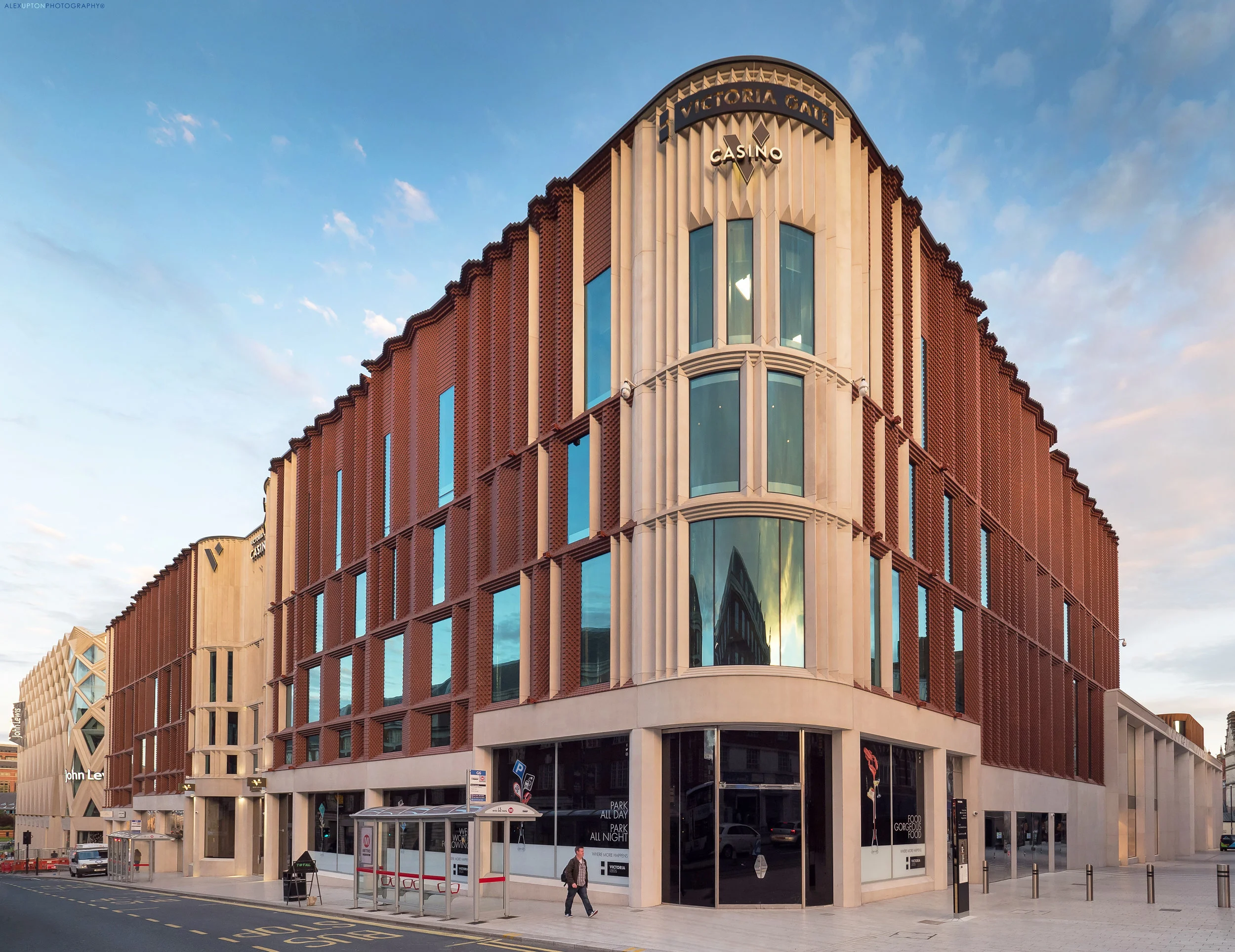
Victoria Gate Shopping Centre. Photography: Copyright © Alex Upton

Victoria Gate Shopping Centre. Photography: Copyright © Alex Upton

Location: 44 Victoria Gate, George Street, Leeds, LS2 7AU
Architect: Acme Architects
Developer: Hammerson

London architectural practice Acme have recently come to prominence with the completion of a number of notable schemes across the UK, picking up several awards in the process. One such award was the RIBA Yorkshire Building of the Year 2017 bestowed upon their Victoria Gate Shopping Centre in Leeds. Formally completed in 2016, with the odd bit of ongoing work still taking place externally, the building has become a distinguishedlandmark for the city.

Victoria Gate Arcade, Eastgate Road Elevation. Photography: Copyright © Alex Upton

Victoria Gate Arcade, Eastgate Road Elevation. Photography: Copyright © Alex Upton

Arriving in Leeds, weary and hungry, one early evening in late 2016 after working on several projects in Yorkshire i was greeted by a beautiful autumn sunset and a sky daubed with a wafer-thin layer of fluffy cloud. Realising this evanescent light would dissipate faster than i could satisfy my hunger i hastily ran back to my car to reunite with my camera. The following photographs, taken without a tripod, are what I managed to obtain during that brief moment.

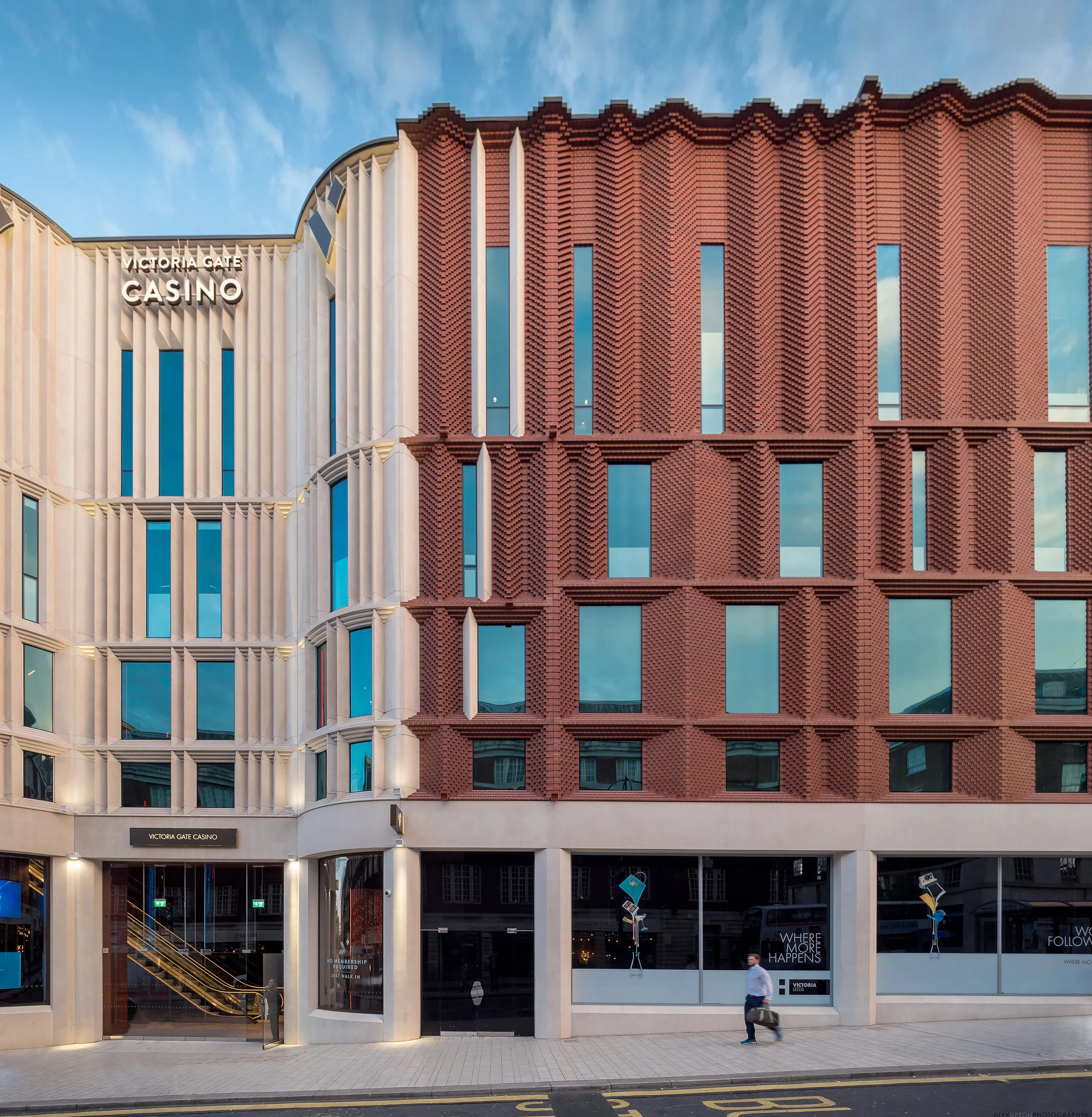
Victoria Gate Facade. Photography: Copyright © Alex Upton

Victoria Gate Facade. Photography: Copyright © Alex Upton

Both internally and externally you are greeted by the kind of opulence and grandeur that wouldn't be out of place on a religious edifice of times past - it certainly doesn't conform to the mediocrity that is inherent in most shopping centres found around the United Kingdom. Acme say that the main body of the Victoria Gate shopping centre - the section cloaked in intricate panels of terracotta - was influenced by the Art Deco and Victorian buildings that sit adjacent to the site.

Victoria Gate John Lewis Department Store. Photography: Copyright © Alex Upton

Victoria Gate John Lewis Department Store. Photography: Copyright © Alex Upton

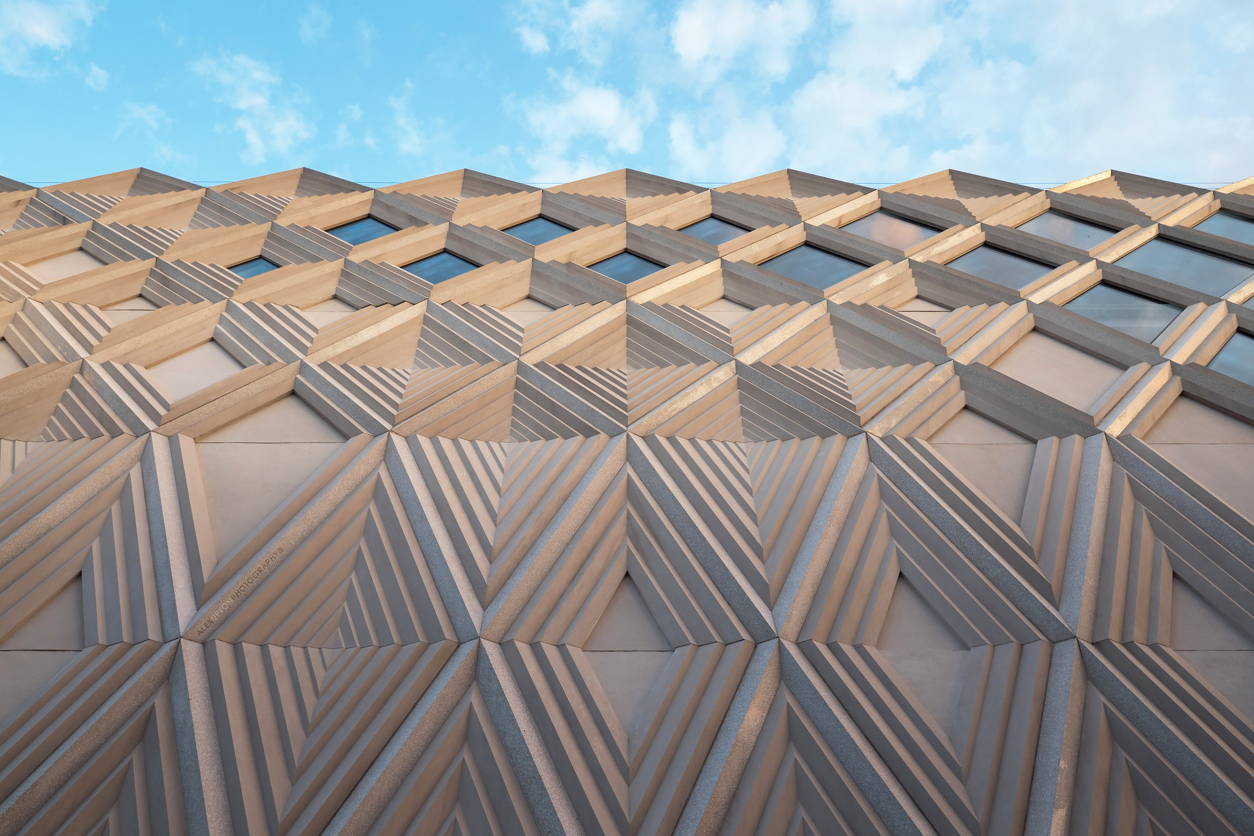
The John Lewis department store is adorned with an etched, white concrete, diamond-latticed facade, who's geometries again appears to be befitting of a structure of religious origin. Would it be too simple to conclude, here is the new Mecca of the 21st Century, one to consumerism? Probably it would. 

The asymmetrically placed diamond glass panels intermittently punctuate the concrete strips allowing natural light to enter the store. The varying depth and textures of these surfaces allow a cascade of light and shadow to gently trace their topography, making for beautiful photographs.

Victoria Gate John Lewis Diamond Latticed Facade.Photography: Copyright © Alex Upton

Victoria Gate John Lewis Diamond Latticed Facade.Photography: Copyright © Alex Upton

One thing that becomes immediately apparent when viewing the buildings is that the developer Hammerson has spared no expense when it comes to the buildings construction. The materials it employs, their intricacies and abundance can not have been cheap and its nice to see a scheme that hasn't fallen victim to devloper cutbacks.

Victoria Gate Lattice Roof Detail. Photography: Copyright © Alex Upton

Victoria Gate Lattice Roof Detail. Photography: Copyright © Alex Upton

Internally the architects maintain the grandeur found on the exterior - unfortunately due to the dimming light and lack of a tripod i was unable to photograph these areas. Designed to reference Leeds' historic shopping arcades the individual shops feature curving glass shopfronts and more high-quality detailing. Covering the arcade is a complex geometric roof formed of latticed steel and glass which allows natural light to illuminate the space below.

John Lewis Car Park Facade. Photography: Copyright © Alex Upton

John Lewis Car Park Facade. Photography: Copyright © Alex Upton

Adjoining John Lewis is a car park draped in spiralling sheets of metal, which in the afternoon sun began to look aflame. It was with this vision of fire in mind that i was suddenly reminded of food sizzling in a frying pan and my increasing hunger which accompanied such images. Putting away my camera I eagerly went in search of food. I hope to return to the site at a later date and photograph the building as a whole rather than simply focusing on details, since on this visit I was hampered by the lack of a tripod and the utility works cluttering the surrounding area.

Victoria Gate is a wonderful scheme by Acme which is likely to propel the relatively small and hitherto somewhat inconspicuous practice to a level of prominence which will hopefully see them receive further high-profile commissions where they can again demonstrate their innovative approach to design and architecture. For image sales of the Victoria Gate shopping centre please contact Alex.

Warwick Hall by Associated Architects by Alex Upton

Warwick Hall by Associated Architects - Photography Copyright © Alex Upton

Warwick Hall by Associated Architects - Photography Copyright © Alex Upton

Location: Warwick Hall, Myton Road, Warwick CV34 6PP
Architect: Associated Architects
Developer: The Warwick School
Client: Forterra

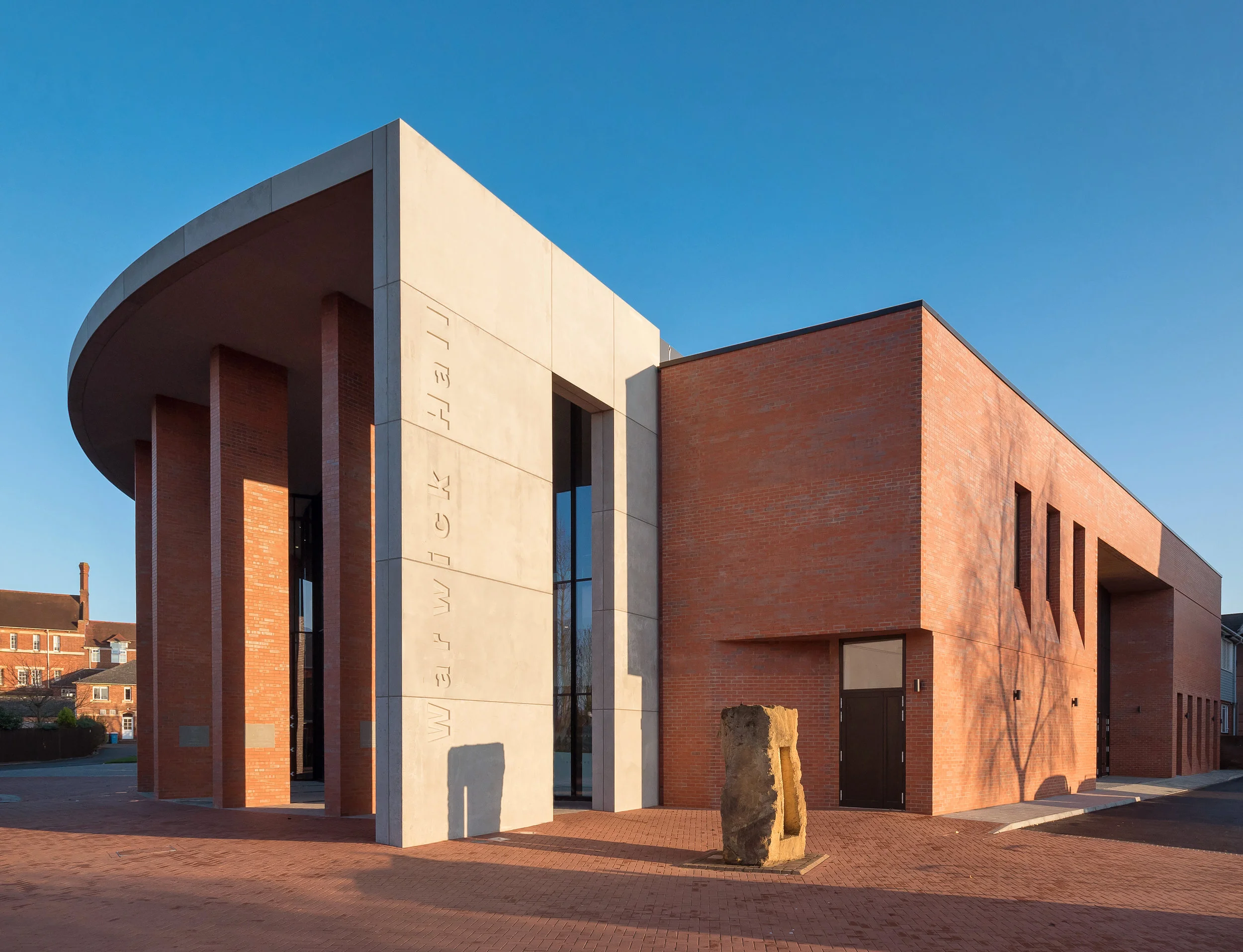
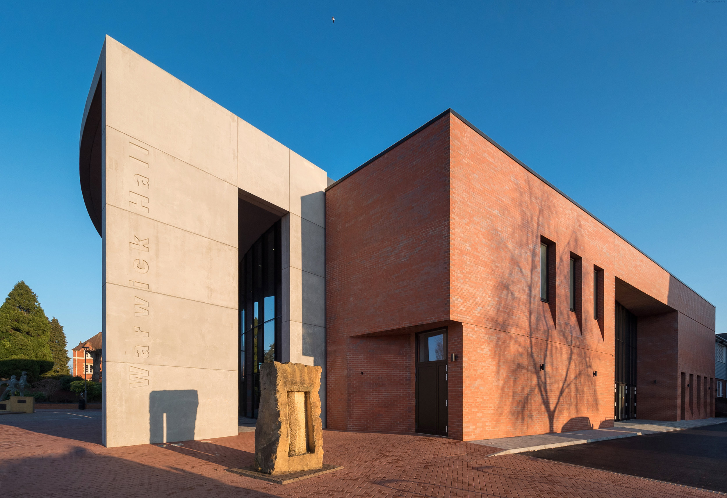
Formerly known as Guy Nelson Hall, the original 1960's building has recently undergone a dramatic transformation into a modern performing arts facility for The Warwick School. In the process it has gained a new name and is now known simply as Warwick Hall - at the expense of poor Guy Nelson, no longer held in regard by histories favour. The building was designed by Birmingham based architectural practice Associated Architects whom have built a reputation in the education sector, having recently completed a number of buildings for Birmingham University.

Warwick Hall Facade and Window Detail

Warwick Hall Facade and Window Detail

Photographing Warwick Hall

I was commissioned to photograph the building in late winter 2016 for Forterra Building Products, as the building was due to be entered into a brick awards competition later the following year. Arriving in the late afternoon I was greeted with a beautiful golden light and the outstretched shadows of neighbouring trees creeping up the buildings facade.

Architectural Photography of Warwick Hall Side Elevation

Architectural Photography of Warwick Hall Side Elevation

The structures design is unique when viewed from each elevation, the two sides and rear are flat with windows that intersect with cuts in the brickwork, while the front is cylindrical, made of glass and punctuated by brick columns. The red brick references the neighbouring Headmaster's House which is a grand historic building.

Warwick Hall Brickwork Detail

Warwick Hall Brickwork Detail

Associated Architects note that flexibility is the key to their design, with the building now containing telescopic theatre seats and a new balcony area which allows the transformation of the school assembly hall into a 1000 seat concert venue. Having not seen the buildings interior i can not comment but externally it is a nice design which sits quietly in its surroundings. A more detailed set of photographs documenting Warwick Hall will be added to my projects at a later date so please check back.

Seventy Wilson by Astudio Architects by Alex Upton

Seventy Wilson by Astudio Architects - Copyright © Alex Upton

Seventy Wilson by Astudio Architects - Copyright © Alex Upton

Architectural Photography of Seventy Wilson

Location: 70 Wilson Street, London
Architect: Astudio
Developer: Stanhope / Threadneedle / Low Carbon Workplace Trust

I encountered the small architectural gem that is Seventy Wilson purely by chance, when for reasons which evade memory, I diverged en route from my all to familiar amble back to Liverpool Street Station via Broadgate. The building, designed by London architectural practice Astudio, is located on Wilson Street and replaces a 1980's office development once known as Summit House. Incorporated into the new office is the grade II listed, 4-storey building visible to its left. The fortuitous excursion that led to these architectural photographs of Seventy Wilson was also aided by a momentary break from the rain, the clouds parting just above the building as I walked past, as if inviting me to photograph it in all its rain soaked splendor.

Seventy Wilson Street View - Copyright © Alex Upton

Seventy Wilson Street View - Copyright © Alex Upton

Rather than completely demolishing the original structure the new building is in fact a refurbishment and extension of the original, which, considering its radically divergent appearance is quite an achievement. It also boasts enviromentally friendly credentials, Astudio having worked in collaboration with Low Carbon Workplace to create a highly efficient office space, which achieved a BREEAM Excellent rating based on its low carbon standards.

Seventy Wilson Roof Detail - Copyright © Alex Upton

Seventy Wilson Roof Detail - Copyright © Alex Upton

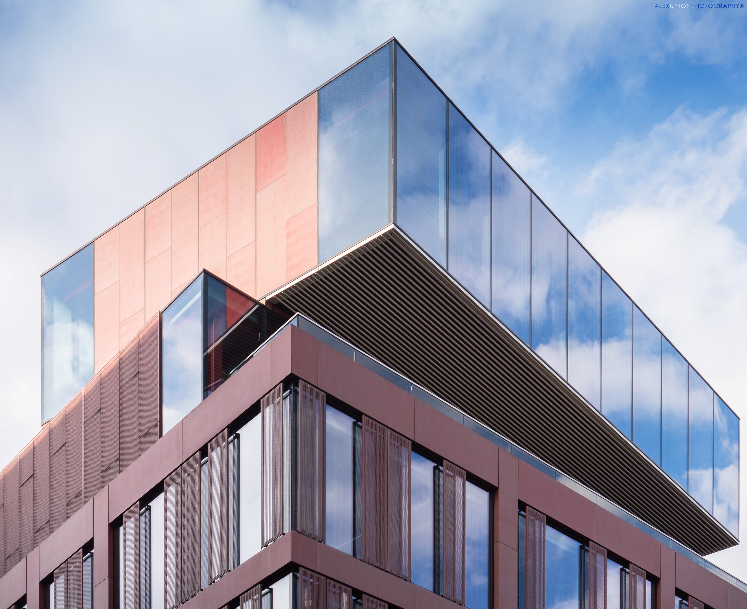
The building's distinctive roof is just one of its many defining features, with rectangular, glass blocks seemingly pivoted on top of one another at opposing angles. The reflective glass beautifully captures the sky, while panels of pastel red cladding, some perforated, add interest to the facade. The building also incorporates a deceptive feature, as one walks past the refurbished Grade II listed building it at first appears to come to an end, but after a few steps down Worship Street it magically reappears, albeit in a somewhat different form and composition. Unfortunately, by the time I had made this discovery the rain had stubbornly resumed and hence no photographs exist to evidence it.

Seventy Wilson Facade Detail - Copyright © Alex Upton

Seventy Wilson Facade Detail - Copyright © Alex Upton

Seventy Wilson, while possessing a name reminiscent of a 1980's production-line robot, is a wonderful building, which has utilised the existing structure and incorporated the Grade II listed element to great effect. It plays with levels, form and material in a unique way and offers technology companies a generous 71,000 sq ft of energy efficient, modern workspace. It is a great addition to the area and worth returning to, I will therefore endeavor to photograph the other elevation at a later date.